Table
A table is used to load, visualize, and interact with large datasets from your datastores.
Add data to a table
The data passed to a table component for visualization must be formatted as an array of objects, e.g.:
[
  {
    "city": "Toronto",
    "population": 2930000,
    "country": "Canada"
  },
  {
    "city": "New York",
    "population": 8419000,
    "country": "USA"
  }
]
If objects have fewer elements (key-value pairs) than other objects, the corresponding column in the table for this object and element remains empty.
Example
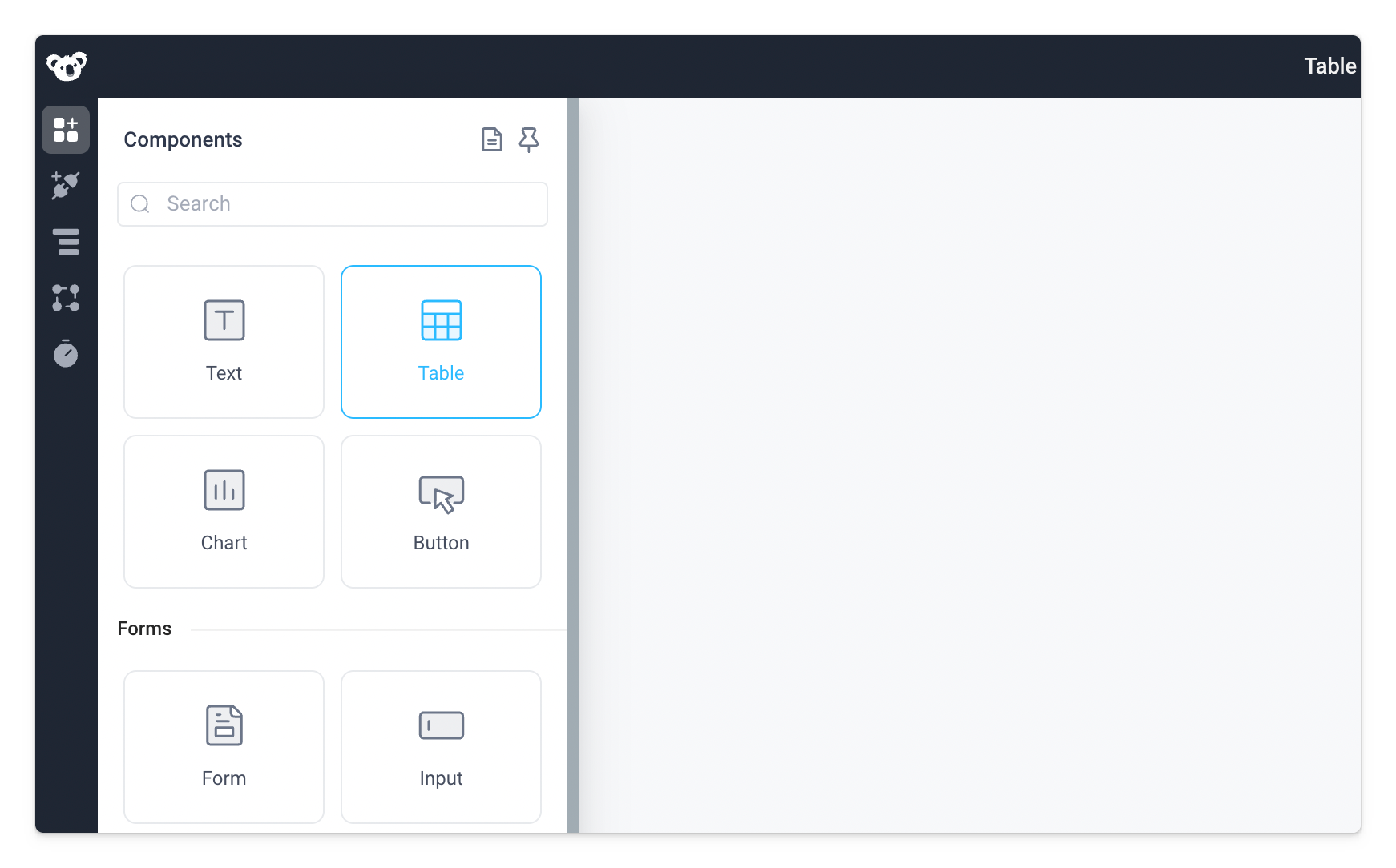
Start by dragging the Table component from the Components panel to the empty canvas.
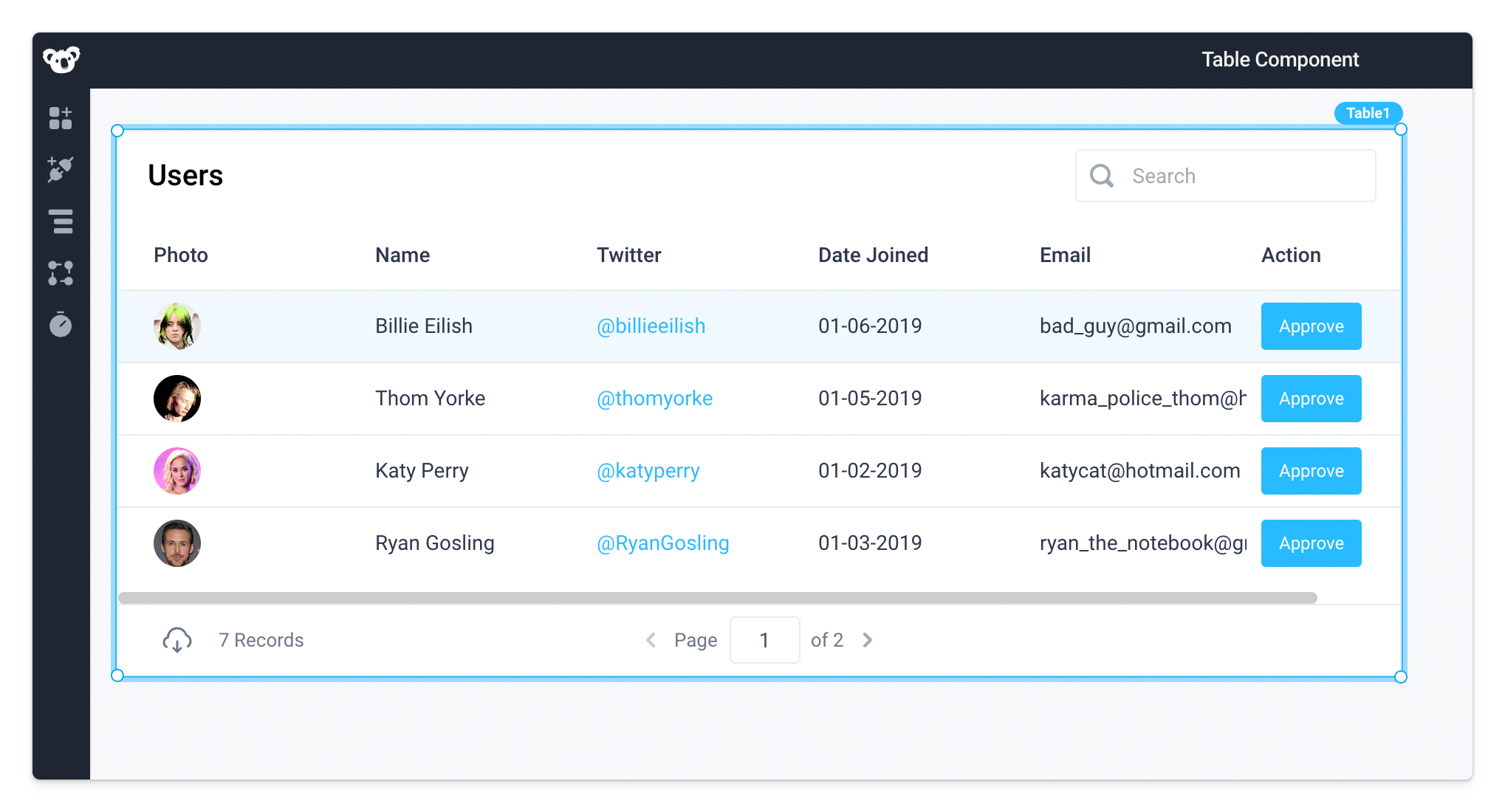
The table will load with an example dataset.
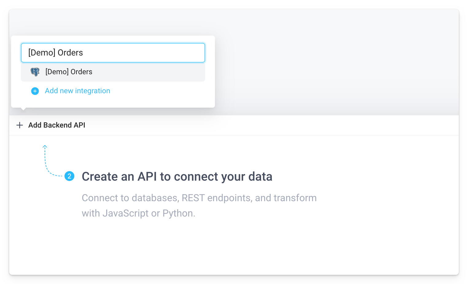
To populate the table from a database, you can use the API builder. A Superblocks API is a structured way to query across any datastores (Databases, Cloud Data Warehouse, Internal REST APIs, Spreadsheets, and more), merge the data, and load it in a UI component.
Click Add Backend API in the bottom panel and click on [Demo] Orders to create an API that uses the [Demo] Orders Postgres Database.
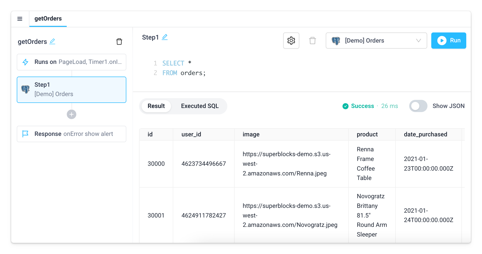
Use API1 to write a SQL query that fetches all the orders from the orders table in the demo database.
SELECT *
FROM orders
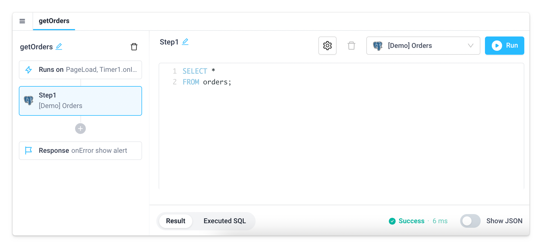
Click the Run API button to execute the API, which will run the query and post the execution result below.
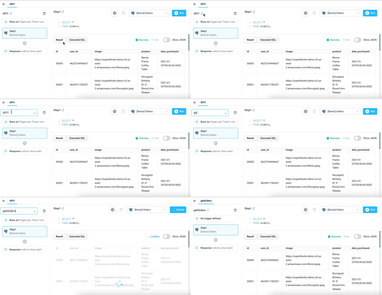
Finally, since we are using API1 to query all our Orders, let’s rename API1 to getOrders.
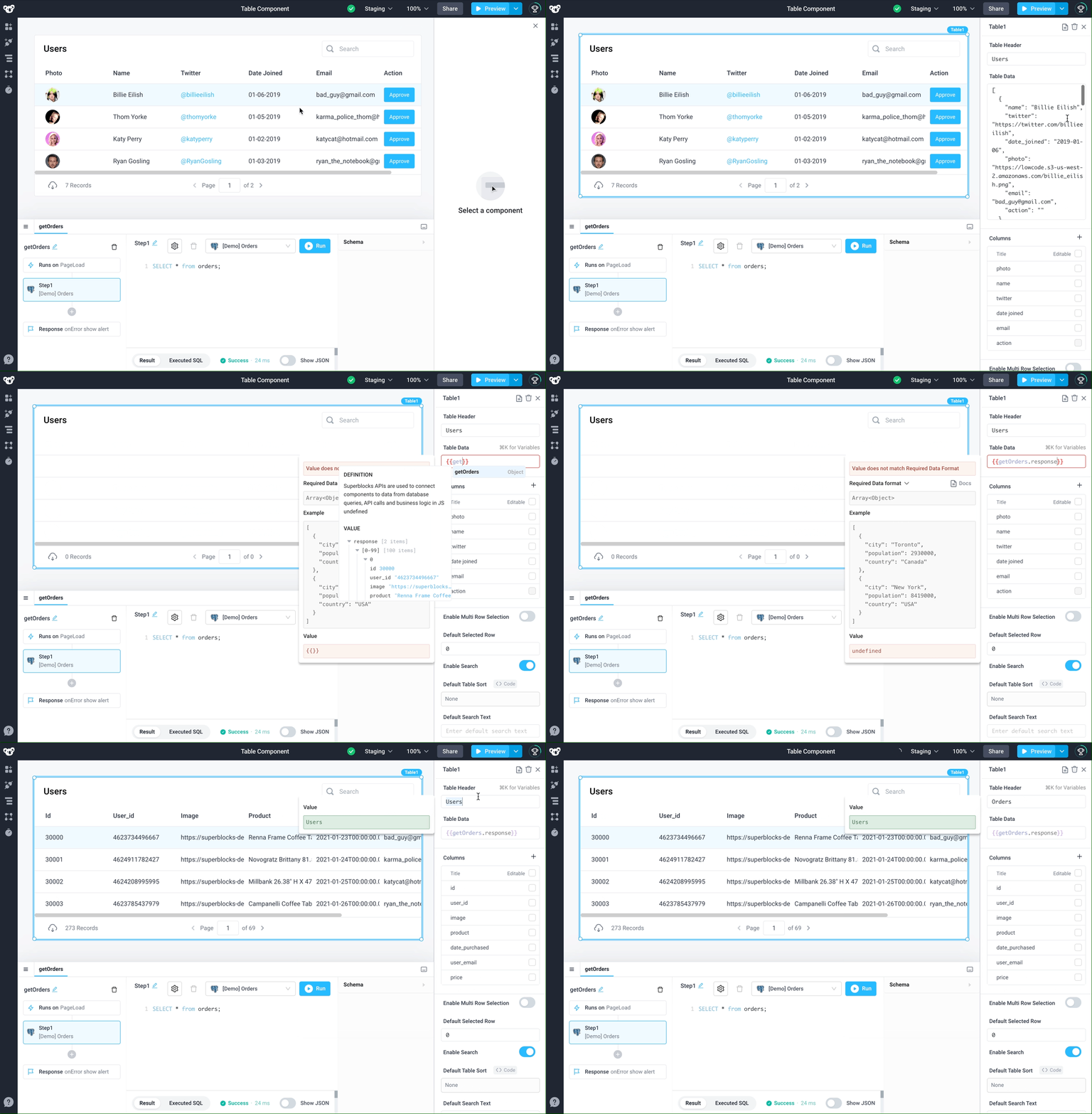
Click on the table to open the Properties panel. The Properties panel allows you to configure components by changing their UI design, adding event triggers, and most importantly, connecting API responses to UI elements.
To display the results from the getOrders backend API in the table component in the application's frontend, use frontend bindings and replace the example JSON with {{getOrders.response}} in the Table Data field using the autocomplete:
Columns
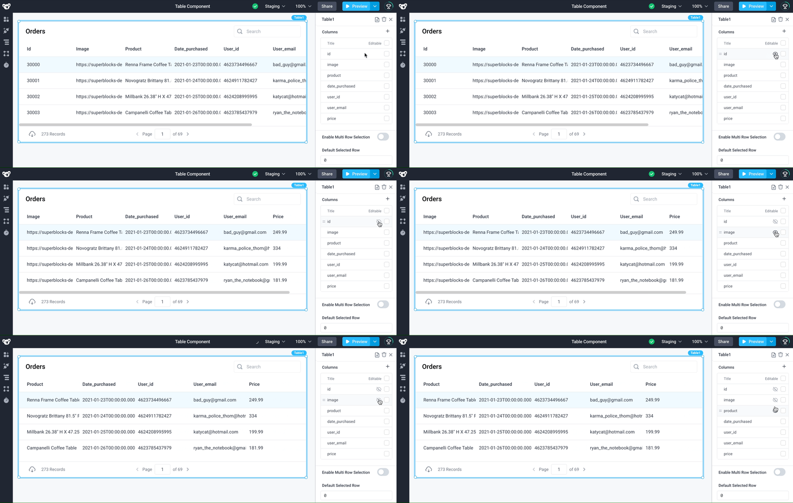
Rearrange and hide columns
To move the user_id column to be next to the user_email column, click on the table component to open the Properties panel on the right side of the screen and drag the user_id column to be right above user_email.
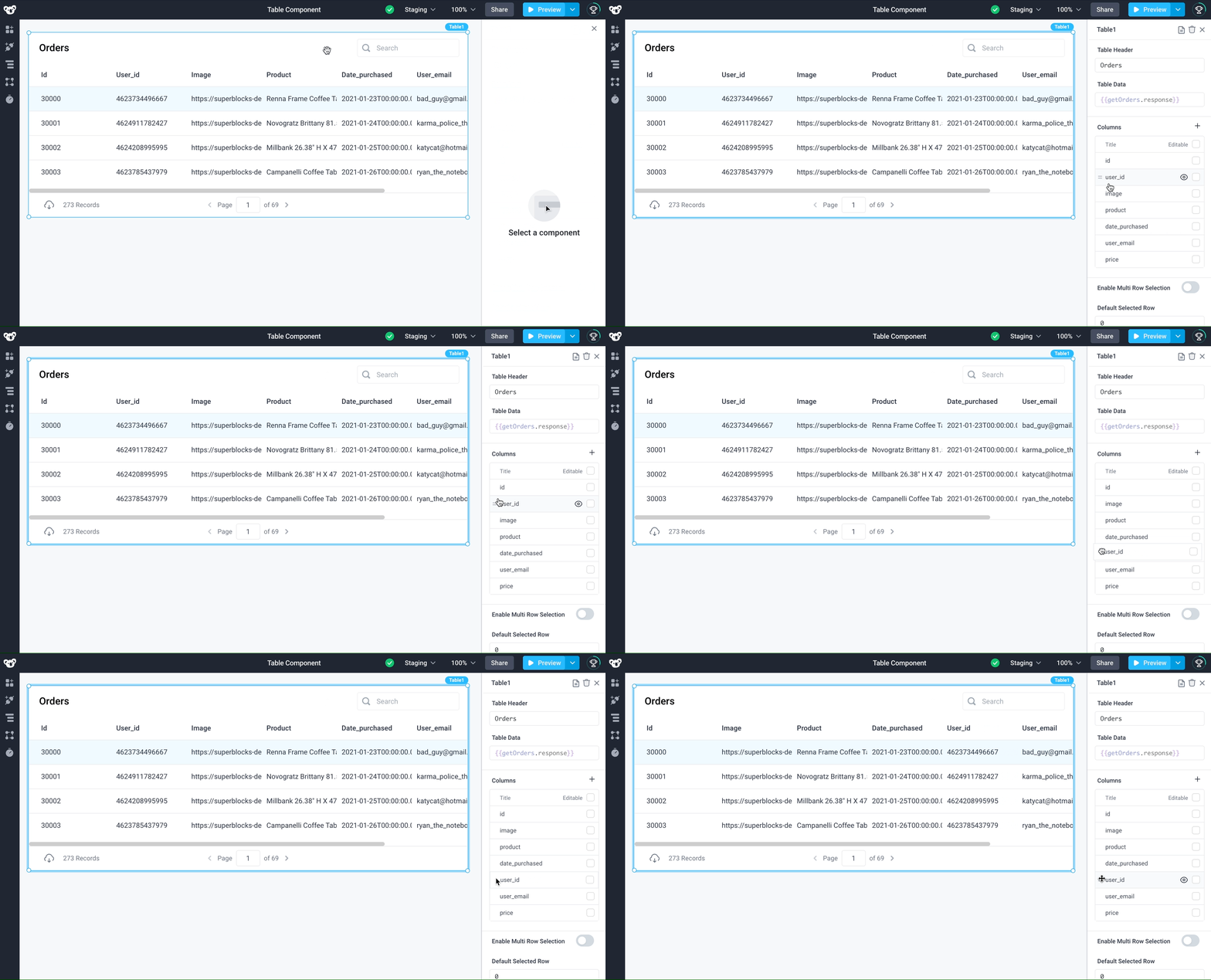
To show/hide columns, click on the table component to open the Properties panel and then click on the visibility icon in the Columns section next to show or hide columns:
Freeze columns
To freeze/unfreeze columns, click on the down arrow in the column header to open the column properties panel, then select Freeze/Unfreeze Column. Now you can scroll the table sideways and the frozen column will stay pinned to the left side of the table.
Freezing columns from the column headers do not persist beyond the length of the specific user's session. If the application is refreshed, the frozen columns will reset back to the Table's default configuration. In order to freeze a column by default, enable Freeze Column in the Column Properties.
Format table columns
To add formatting on columns (e.g. convert an image URL to display an image), click on a column in the properties panel, which opens the column properties menu. Use the Column Type dropdown to configure the columns type as Number, Currency, Date, Image, Video, Button, Link, and more:
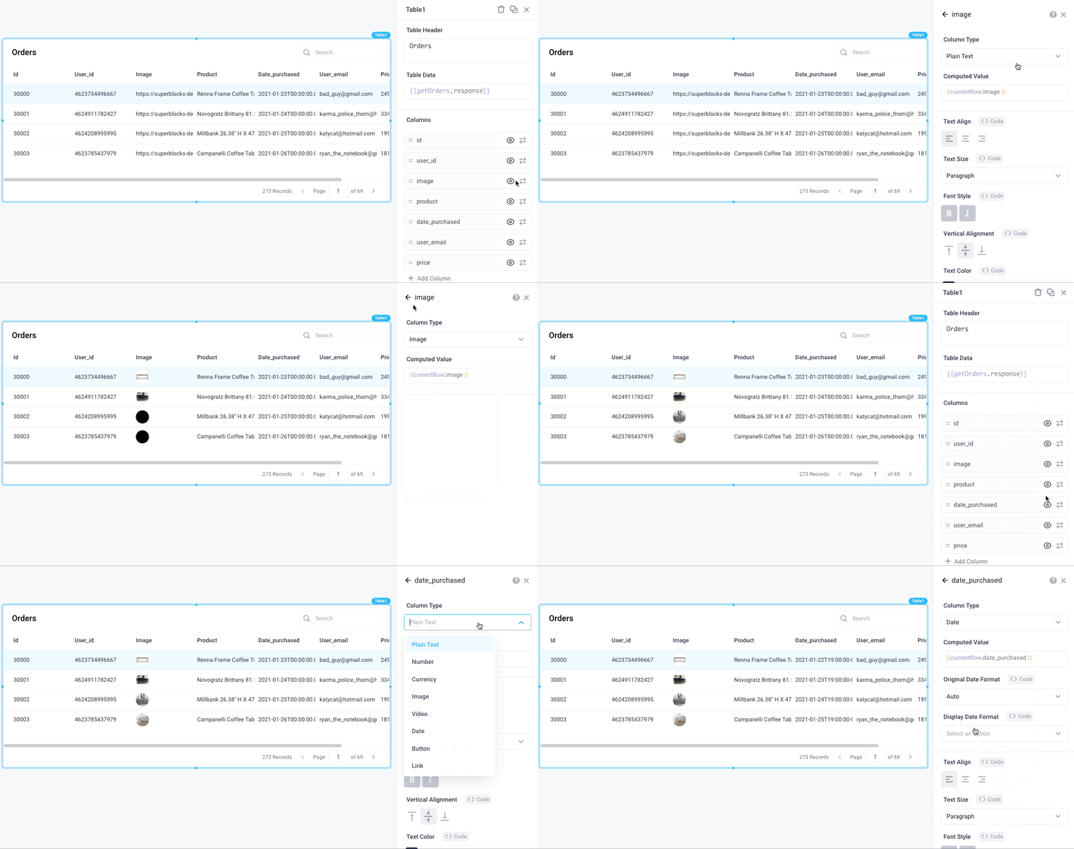
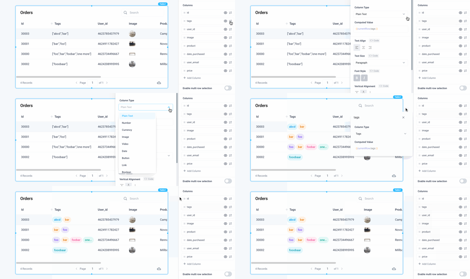
Next, let's organize the data better by adding Tags. A special column type Tags can be added to all columns that contain a list of strings as their value (e.g. ['foo', 'bar']). Make the following change to the Tags column in Table1:
- Tags > Column Type > Tags
Other column properties
This section is a compilation of table column properties that are explained in other parts of the documentation, providing a better contextual fit:
Trigger actions on row click
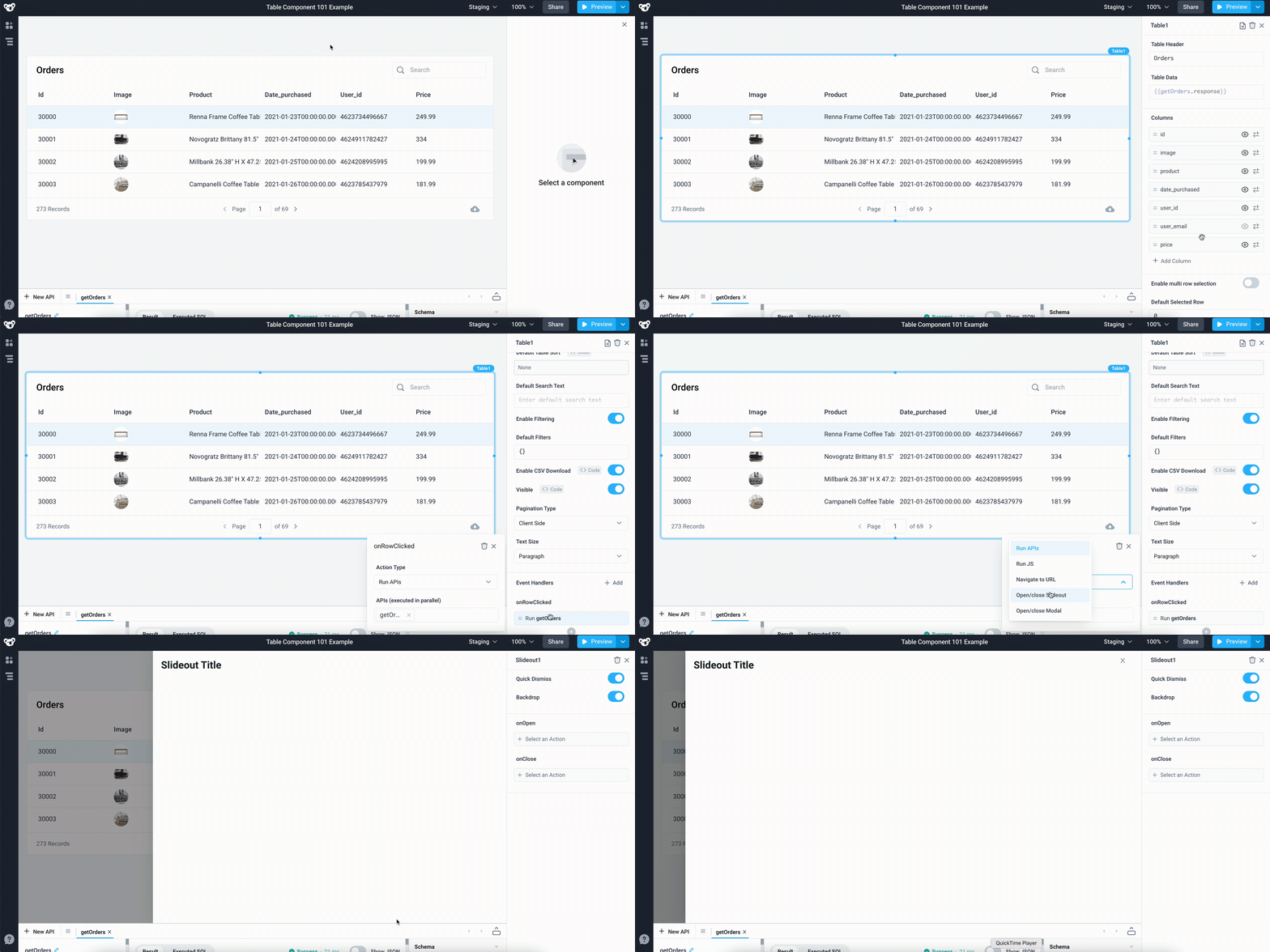
Table rows can trigger actions when clicked. You can use the Slideout component to display the order details when any row in the table is clicked. You can do this in two simple steps:
- Open a slideout component when the
onRowClickedevent is triggered - Populate the slideout with order details from a selected row using
{{Table1.selectedRow}}
To open a slideout component every time you click on a row, go to Properties panel > click on the onRowClicked field > choose Open/close Slideout as the Action Type and select New Slideout as the slideout panel to open.
You can reference the selected row’s data from any component or API. For example, drag an image component to Slideout1 > set the Image URL to {{Table1.selectedRow.image}}.
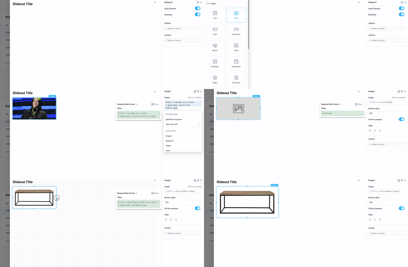
You can modify the code block to access any value from the table, e.g. {{Table1.selectedRow.price}} to give you the price of the selected row’s order, {{Table1.selectedRow.user_email}} will give you the email of the customer and so on.
When you click another row in the table, the slideout should automatically display that row’s order details.
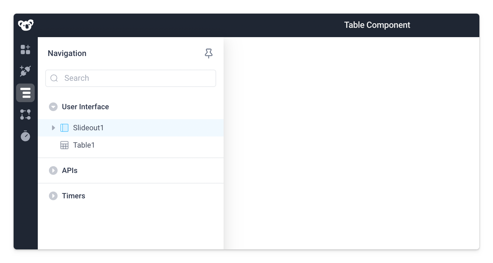
Slideout Navigation: The Slideout component is hidden from the canvas because it only opens when an event is triggered. One way to open and edit event-based components like the slideout panel is to click on Navigation > Slideout1.
Add action buttons
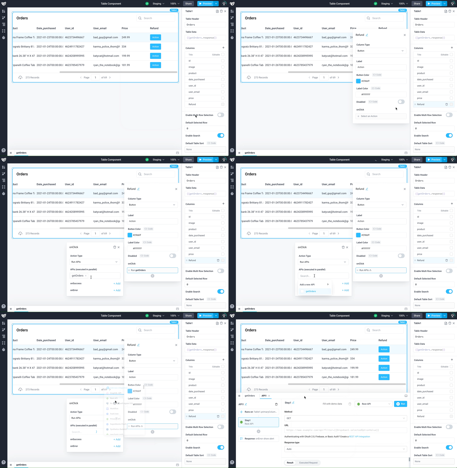
Let’s say you want to add an action button to the Orders table that allows you to refund an order quickly. First, add a new column from the properties panel of the table component by clicking in the plus-icon in the Columns section, then name the column Refund. Next, change the Column Type to Button.
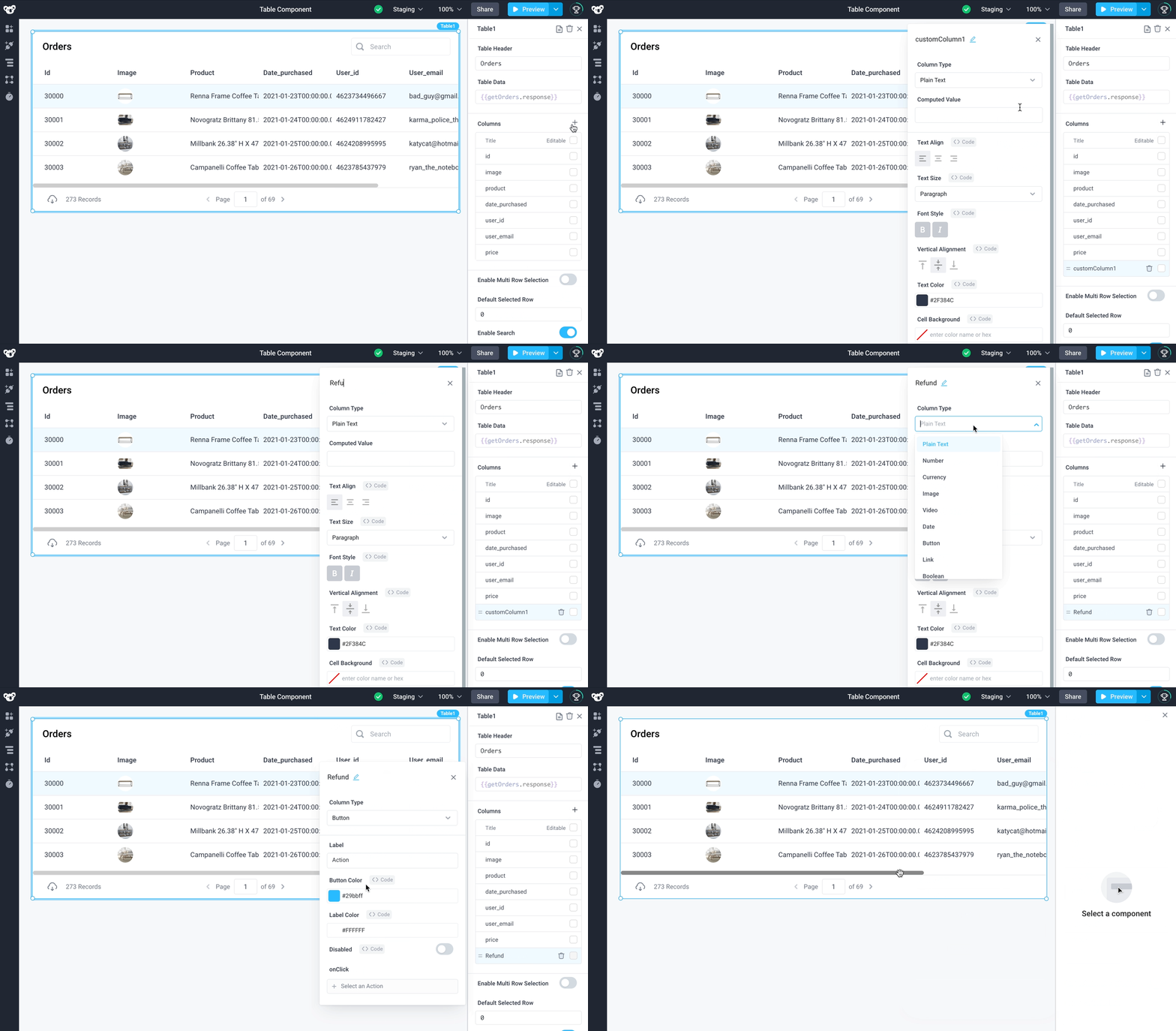
Choose Run API as the Action Type for the onClick trigger. Then add a new API that uses the REST API integration. We will use this API to call an internal API that refunds an order.
The internal API takes an Order ID alongside other fields of an order to process a refund. You can access the selected row’s fields such as an Order ID from an API with {{Table1.selectedRow.id}}.
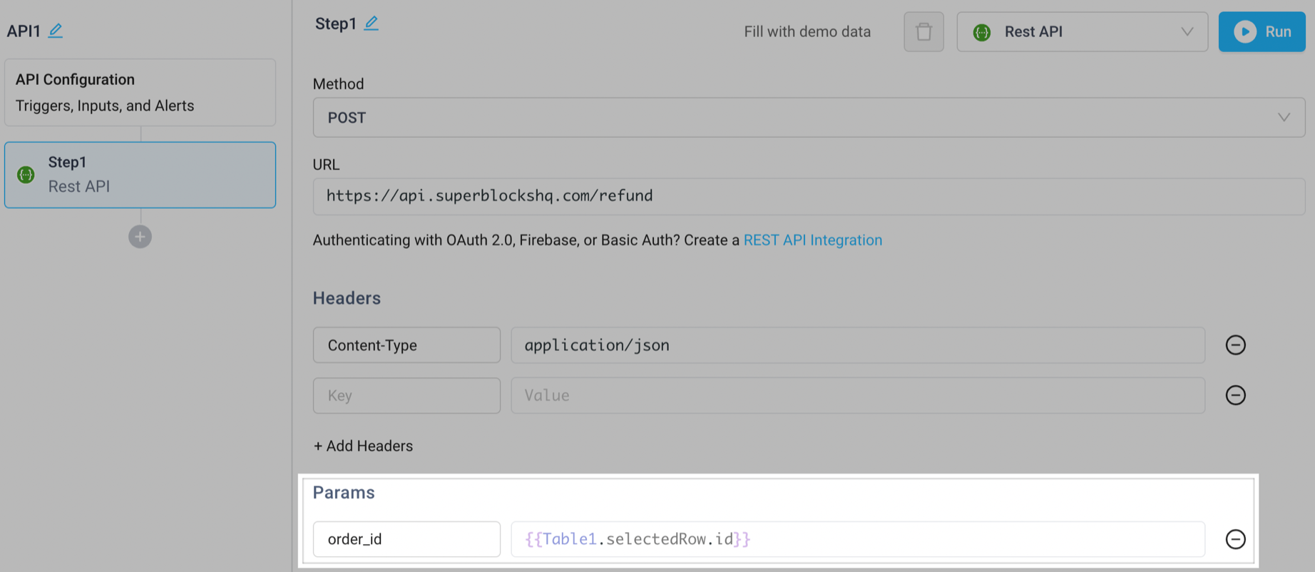
This is not a real API from Superblocks, only for illustration
Table Properties
Component Properties
| Property | Description |
|---|---|
| Table Header | Set the table title |
| Table Data | Takes in an array of objects to display rows in the table |
| Table Row Density | Select table view density: Extra Small, Small, Medium, or Large |
| Enable Row Insertion | Allow users to insert new rows into the table |
| Enable Row Deletion | Allow users to delete rows from the table |
| Show Column Borders | Show lines in table to divide columns |
| Columns | Adjust how the columns display |
| Enable Multi Row Selection | Allows user to select multiple rows when enabled |
| Default Selected Row | Index of the row to select and highlight by default (starts at 0) |
| Enable Search | Toggle the search bar on the table on/off |
| Default Table Sort | Allows specifying the sort options that will be used on page load |
| Default Search Text | Set the default text to appear within the search bar |
| Search Placeholder Text | Set the placeholder text to appear within the search bar when empty |
| Enable Filtering | Toggle per column filtering on/off |
| Default Filters | Allows specifying the filters that will be used on page load |
| Enable CSV Download | Toggle visibility of the data download |
| Visible | Toggle the visibility of the table component |
| Loading Animation | Controls the loading state of the component, values are a boolean |
| Pagination Type | Select the pagination type: None, Client Side, or Server Side |
| Text Size | Select the size of the text: Heading 1, Heading 2, Heading 3, Paragraph, or Paragraph 2 |
| Max lines for wrapping | Maximum number of lines a row can take up when a column has Text Wrap enabled |
Settable Properties
| Property Via Form / Via RunJS | Type | Example Value |
|---|---|---|
Selected Row / selectedRowIndex | number | 0 |
Selected Rows / selectedRowIndices | Array<number> | [0, 1] |
Filters / filters | {"byColumn": Object} | {"byColumn": {"name": {"condition": {"type": "textStartsWith", "param": "b"}}}}. Note: The Value must be wrapped in bindings. |
Search Text / searchText | string | "Search value" |
Page Number / pageNo | number | 2 |
Hidden Columns / hiddenColumns | Array<string> | ["name", "date"] |
Functions
In addition to the standard component functions in Run JS, table components offer a few custom functions to allow developers to easily programmatically manipulate table data.
| Function | Arguments | Description |
|---|---|---|
| updateRows() | (rows: { [index: number]: Row}, { absoluteIndices?: Boolean }) | Update one or more rows in a table based on their indices. Each row can be specified as a partial update. By default, indices will be relative (based on the filered table data) but you can optionally specify absoluteIndices: true to update the absolute position of the rows (based on Table1.allEdits) |
| insertRows() | (startIndex: number, rows: Row[]), | Insert one or more contiguous rows beginning with a start index. Each row can be specified as a partial update. |
| deleteRows() | (rowIndices: number[]) | Delete one or more rows based on their indices |
You can learn more about how to apply these functions and see examples in the documentation on programmatically manipulating table edit state.
Reference Properties
Properties can be accessed from other frontend components and backend APIs by adding the name of the Table, and dot referencing the property. For a Table named Table1:
| Property | Description |
|---|---|
Table1.selectedRow.<KEY> | Access data from the selected row, for example Table1.selectedRow.product |
Table1.tableData | Access data from the table |
Table1.filteredTableData | Access data from the table preserving column ordering and filtering |
Table1.selectedRowIndex | Access the index of the selected row, returned as a number, the first row starts at 0 |
Table1.filters | Access the filters object for the currently selected filters on the table |
Table1.isVisible | Returns the boolean value of the table's visibility (True, if it is visible) |
Table1.pageNo | Access the table's current page number |
Table1.pageSize | Access the table's current number of rows per page |
Table1.searchText | Access the table's current inputted search text |
Table1.selectedRows | Access the selected rows as an array |
Table1.editedRows | An object containing the inserted rows (.insertedRows), deleted rows (.deletedRows), and updated rows (.deletedRows) in the table, useful for table bulk edit |
Table1.editedRowIndices | An object containing the indices of edited rows in the table. Currently only includes deleted rows (.deletedRows) in the table. For more information on programmatically editing table data, refer to programmatically manipulating table edit state. |
Table1.allEdits | An array containing the table's active edit state including any inserted rows but excluding any deleted rows |
Table1.currentEditValue | A string containing the cell value of the in-progress edit (loses context when cell is unfocused by the user) |
Default Filters
You can also set default filters for your table. In order to use these filter conditions by default, follow this format:
- Filter by Condition
- Filter by Value
{
  "byColumn": {
    "<COLUMN_NAME>": {
      "condition": {
        "type": "<CONDITION_TYPE>",
        "param": "<PARAM_VALUE>"
      }
    }
  }
}
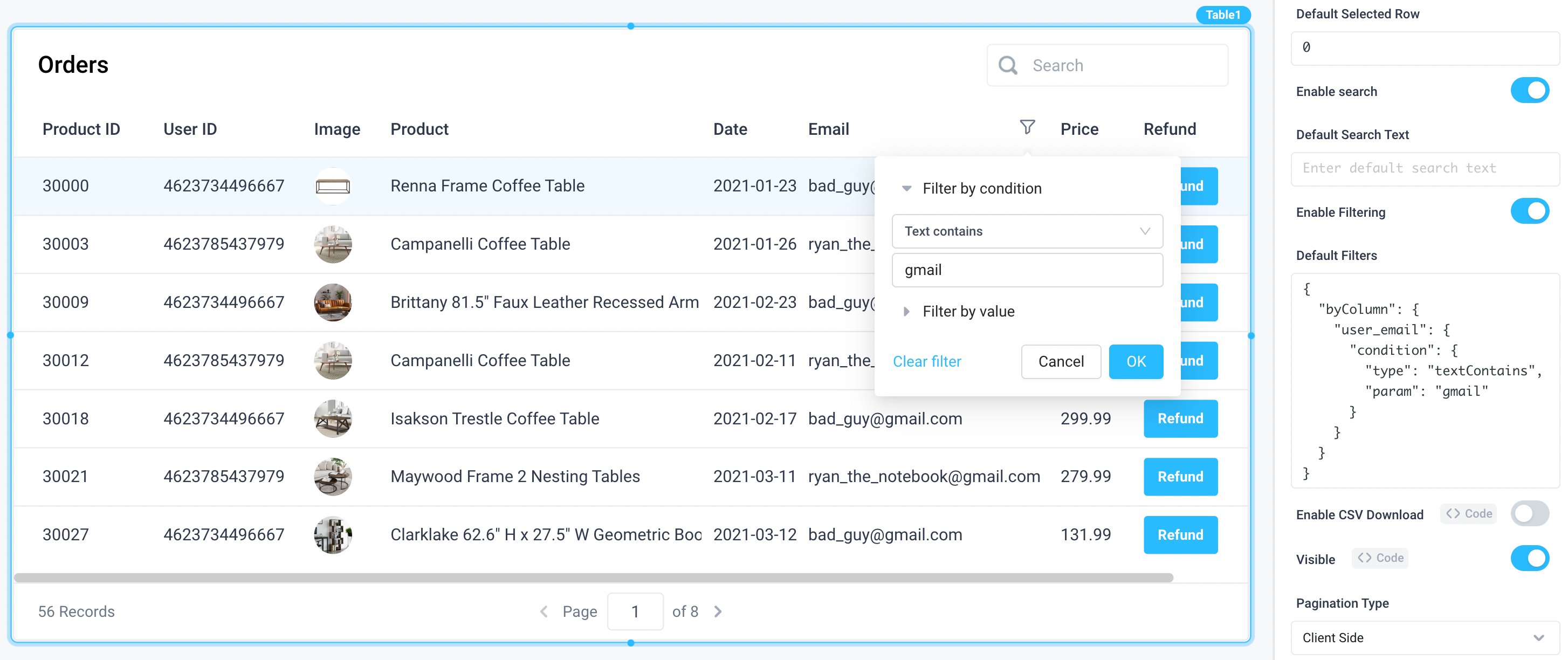
For example, this is how the following code snippet would look within your application:
{
  "byColumn": {
    "user_email": {
      "condition": {
        "type": "textContains",
        "param": "gmail"
      }
    }
  }
}
{
  "byColumn": {
    "<COLUMN_NAME>": {
      "byValue": {
        "excluded": [
          "<EXCLUDED_VALUE1>",
          "<EXCLUDED_VALUE2>",
          ...
        ]
      }
    }
  }
}
Note: Filtering by Value behaves as a deny list
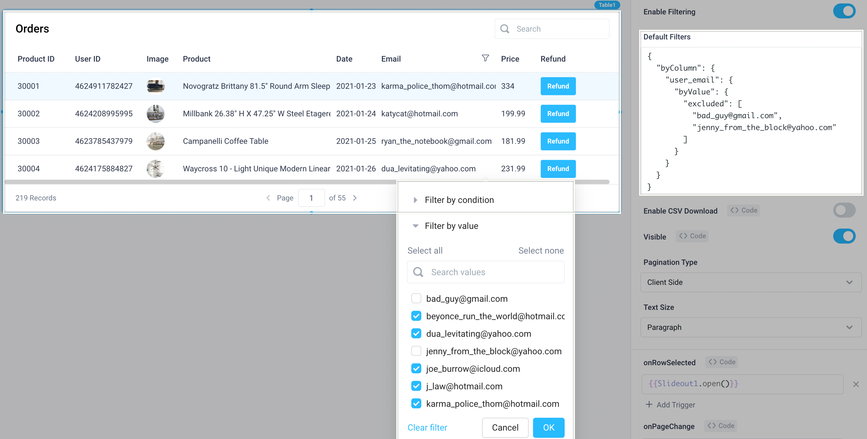
For example, this is how the following code snippet would look within your application to exclude specific e-mails:
{
  "byColumn": {
    "user_email": {
      "byValue": {
        "excluded": ["bad_guy@gmail.com", "jenny_from_the_block@yahoo.com"]
      }
    }
  }
}
Filtering Properties
Tables support filtering columns by the following condition types:
isEmpty
isNotEmpty
textIs
textContains
textDoesNotContain
textStartsWith
textEndsWith
isEqualTo
isNotEqualTo
isLessThan
isLessThanOrEqualTo
isGreaterThan
isGreaterThanOrEqualTo
isBetween
dateIs
dateIsBefore
dateIsAfter
dateIsBetween
Events
The following events are triggered by user interactions with Table components. Use event handlers to trigger actions in response to user events.
| Event | Arguments | Description |
|---|---|---|
| onRowClicked | row, rowIndex | Triggers an action when a table row is clicked |
| onRowSelected | row, rowIndex | Triggers an action when a table row selection is changed |
| onRowInserted | row, rowIndex | Triggers an action when a new row is inserted |
| onRowsDeleted | rowIndices | Triggers an action when a row is deleted |
| onPageChange | Triggers an action when a table page item is changed | |
| onFiltersChanged | Triggers an action when a table filter is changed | |
| onSaveChanges | Triggers an action when table edits are saved | |
| onCancelChanges | Triggers an action when table edits are canceled |
Column Properties
| Property | Description |
|---|---|
| Column Type | Select how the column's data is displayed, see this section for more details |
| Computed Value | Set the value of the column, use {{currentRow.*}} syntax to set dynamically |
| Visible | Set true to show and false to hide. Set dynamically using JavaScript with {{}} |
| Text Align | Left, center or right alignment |
| Text Size | Set the size of text to be displayed |
| Font Style | Bold or italicize the text |
| Vertical Align | Top, middle, or bottom alignment |
| Text Color | Set the text color using the color picker or hex value |
| Cell Background | Set the cell background color using the color picker or hex value |
| Freeze Column | Freezing a column keeps it visible on the left-hand side of the table while scrolling horizontally |
| Editable | Makes the column editable in line, values are a boolean |
| Editing Type | Set the input type while editing. Options are: Text, Number, Email, Dropdown, Checkbox, DatePicker |
| Text Wrap | If enabled, the text will wrap within the cell |
Column types
When referencing a row in column properties, use {{currentRow.<column_property>}} in order to specify how a column is populated.

Plain Text
Value of cell will be treated as plain text. Text styling options are available such as size, alignment, and color.
Number
Value of cell will be treated as a number. The following options are available:
- Number Formatting
- Minimum Fraction Digits
- Maximum Fraction Digits
Currency
Formats the current cell as a currency value. The following options are available:
- ISO Currency Code
- Number Formatting
- Minimum Fraction Digits
- Maximum Fraction Digits
Percentage
Formats the current cell as a percentage. The following options are available:
- Minimum Fraction Digits
- Maximum Fraction Digits
Image
If the value of the cell is a URL to an image, the image column type will display the image rather than the URL.
Supported file types are jpeg, jpg, gif, and png.
Video
If the value of the cell is a URL to a video, the video column type will display an icon that opens the video when clicked.
Date
Formats the field to a specific date format, this allows for translation from one format into another. The following options are available:
- Original Date Format
- Display Date Format
Button
Display a button within each cell. The following options are available:
- Label
- Button Color
- Label Color
- onClick Trigger
Link
Value of cell will be displayed as a clickable link, the label of the link can be altered with the Link Label option. The following options are available:
- Link URL
- Link Label
- Open in new tab
Boolean
Accepts expressions that evaluate to true or false and displays accordingly. True values will display as check marks, false values will display based on the selection of the False Value property:
Tags
Formats each item in the field with a separate color. If the value is an array (e.g. ['foo', 'bar']) each value in the array will be tagged separately.
To customize tag colors, click the + sign next to Custom Tag Colors. For the newly added tag, select an available option in the dropdown or type to add a new one. Use the color picker to the left of the tag to assign a color to that tag along with configurable opacity.
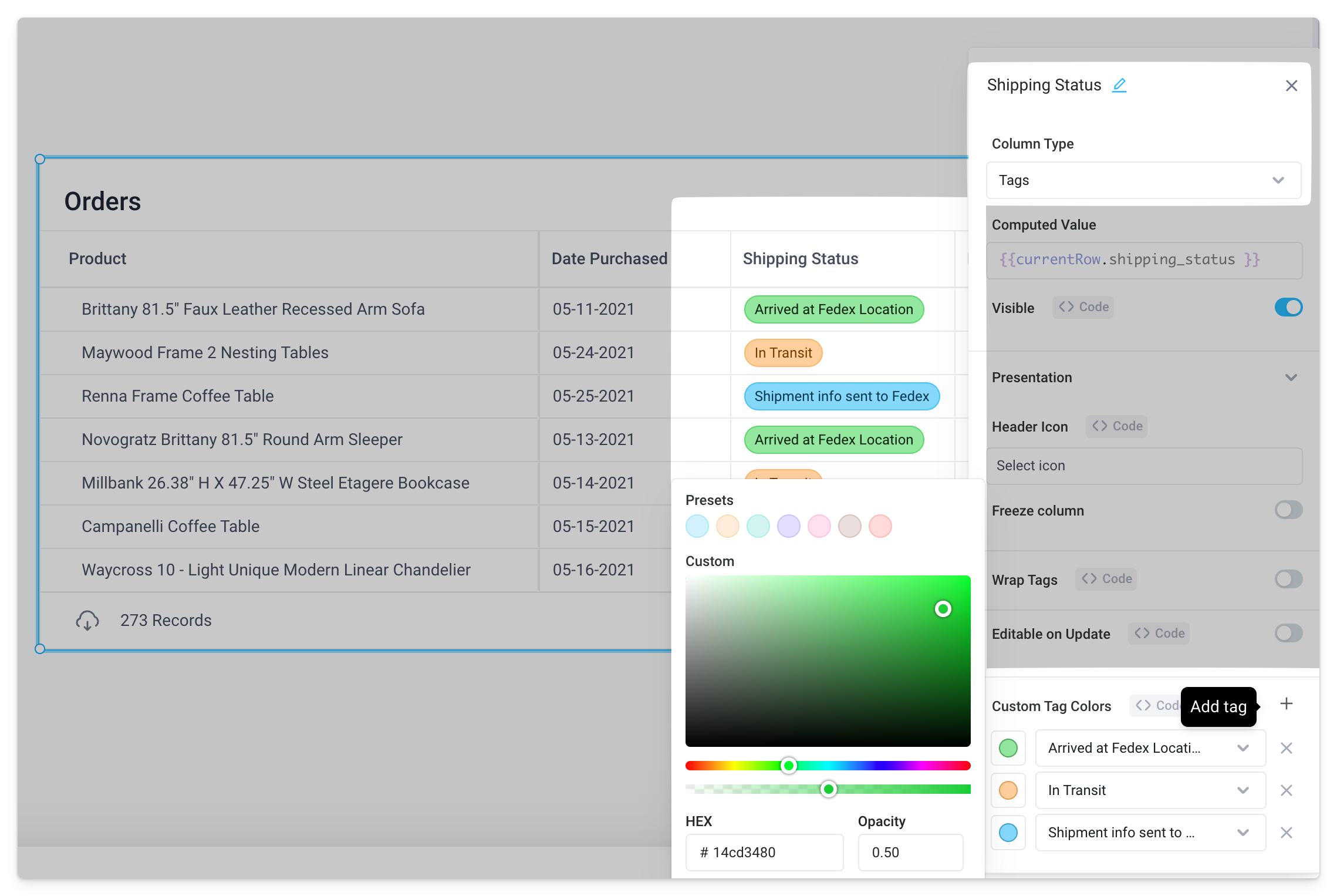
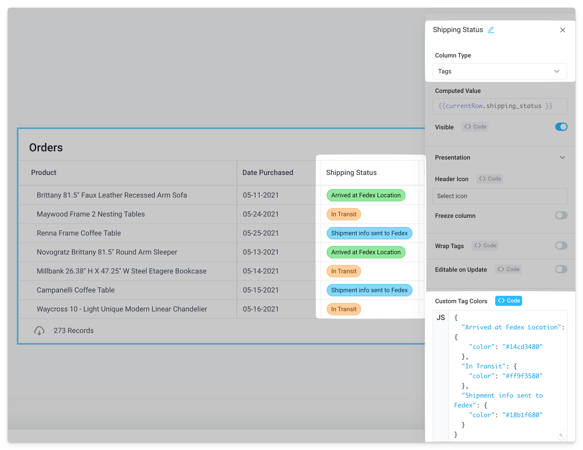
Alternatively, custom tag colors can be configured with the <> Code tab using a JSON object:
{
  "TAG_NAME_1": {
    "color": "HEX_CODE"
  },
  "TAG_NAME_2": {
    "color": "HEX_CODE"
  },
  ...
  "TAG_NAME_N": {
    "color": "HEX_CODE"
  }
}
Email
Value of cell will be treated as plain text. Text styling options are available such as size, alignment, and color. If Editable is enabled, the default Editing Type is Email.