Link
The Link component allows developers to easily build hyperlinks in apps to link to other pages in the app or external websites.
You'll commonly use the Link component to build Navigation Bars, Breadcrumbs, and more in apps.
The Link component renders a standard HTML hyperlink (anchor element), providing all the standard browser behavior around links such as
- Cmd/Ctrl + Click to open in new tab
- Right-click context menu to open in new tab, copy link URL, etc
- Link previews in browser

Styling links
For conveninece, Superblocks provides out-of-the-box configurations to style the Link as a standard hyperlink or as a Primary, Secondary, or Tertiary button. These presets simply apply the relevant styling properties to the Link component in the properties panel.
Link Properties
Component Properties
| Property | Description |
|---|---|
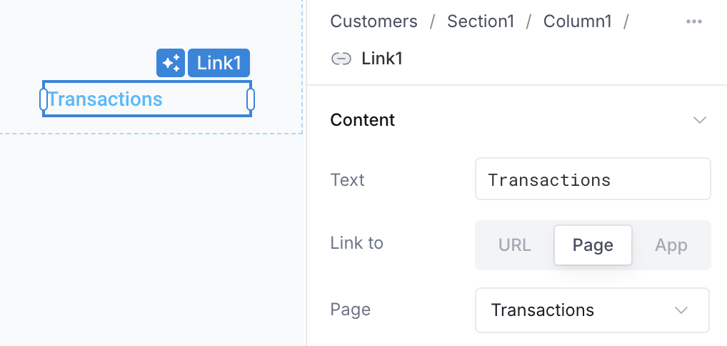
| Text | The text that will be displayed for the Link |
| Link to | Where you would like to link to. You can link to another Page in the App, another App, or any external URL |
| Page | Select the page to link to in this app. Only present when you've selected to link to a page. |
| URL | Provide the URL to link to. Only present when you've selected to link to a URL. |
| Deployed app | Select another deployed app in your organization to link to. Only present when you've selected to link to a deployed app. |
| Route parameters | Specify values for any route parameters required by the page you are linking to. Only relevant when linking to a page that has a dynamic route. |
| Query parameters | Specify any query parameters to be included in the URL. Only relevant when linking to a page or app (when linking to a URL, simply supply query parameters directly in the URL) |
| Keep existing query parameters | When enabled, new query params are merged with any existing query params. When disabled, existing query params will be discarded |
| Open in new tab | Opens the link in a new tab. When disabled, users will still be able to open in new tab using Command/Ctrl + Click or the browser-provided right-click context menu |
| Link style | Select a preset styling configuration for the Link to display it as a Link or a Button |
| Icon | Select an icon to be displayed beside the link text |
| Icon position | Specify whether the icon should be displayed left or right of the text |
| Text alignment | Set the horizontal alignment of the text relative to the width of the component |
| Text style | Set the typography of the link text |
| Background | Set the background color of the Link |
| Border | Set the border color and border width of the Link |
| Border radius | Set the border radius of the Link |
| Loading animation | Controls whether the Link should display a loading animation when a dependent API is running |
| Padding | Controls the space between the link text and the border of the component |
| Width | Controls the width of the component |
| Height | Controls the height of the component |
| Visible | Controls whether the component is visible |
| Collapse when invisible | When enabled, other components shift to occupy the space left by the invisible component / area |
| Disabled | Controls whether the component is enabled or disbaled |
Reference Properties
Properties can be accessed from other frontend components and backend APIs by adding the name of the Link component, and dot referencing the property. For a Link named Link1:
| Property | Description |
|---|---|
Link1.isVisible | Returns whether the Link is visible |
Link1.text | Returns the text of the Link |
Link1.isDisabled | Returns whether the Link is disabled |