Themes
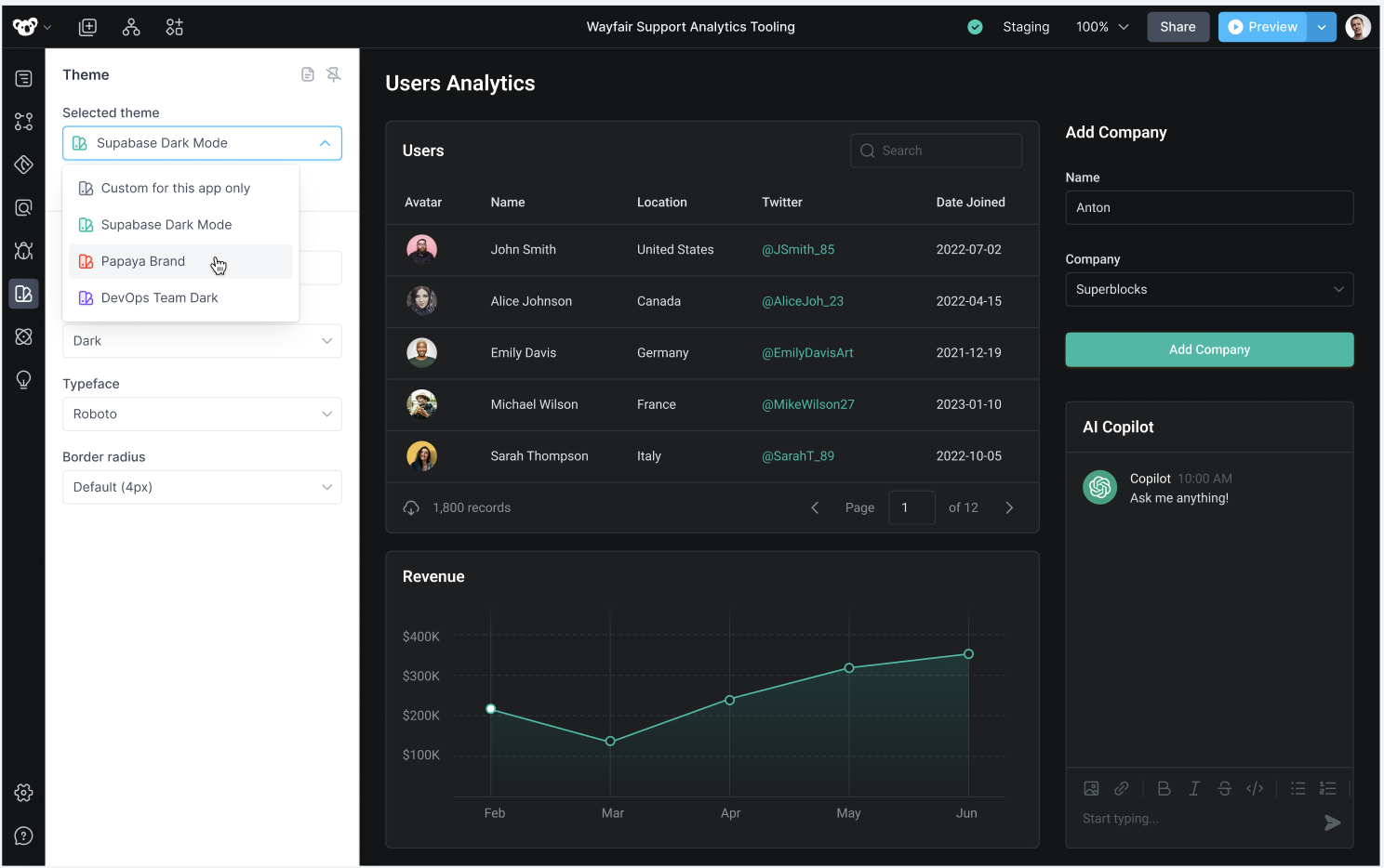
Superblocks Themes give you the full power of a design system, with simple control to alter themes that give you stunning applications every time.
Changing the theme of an app
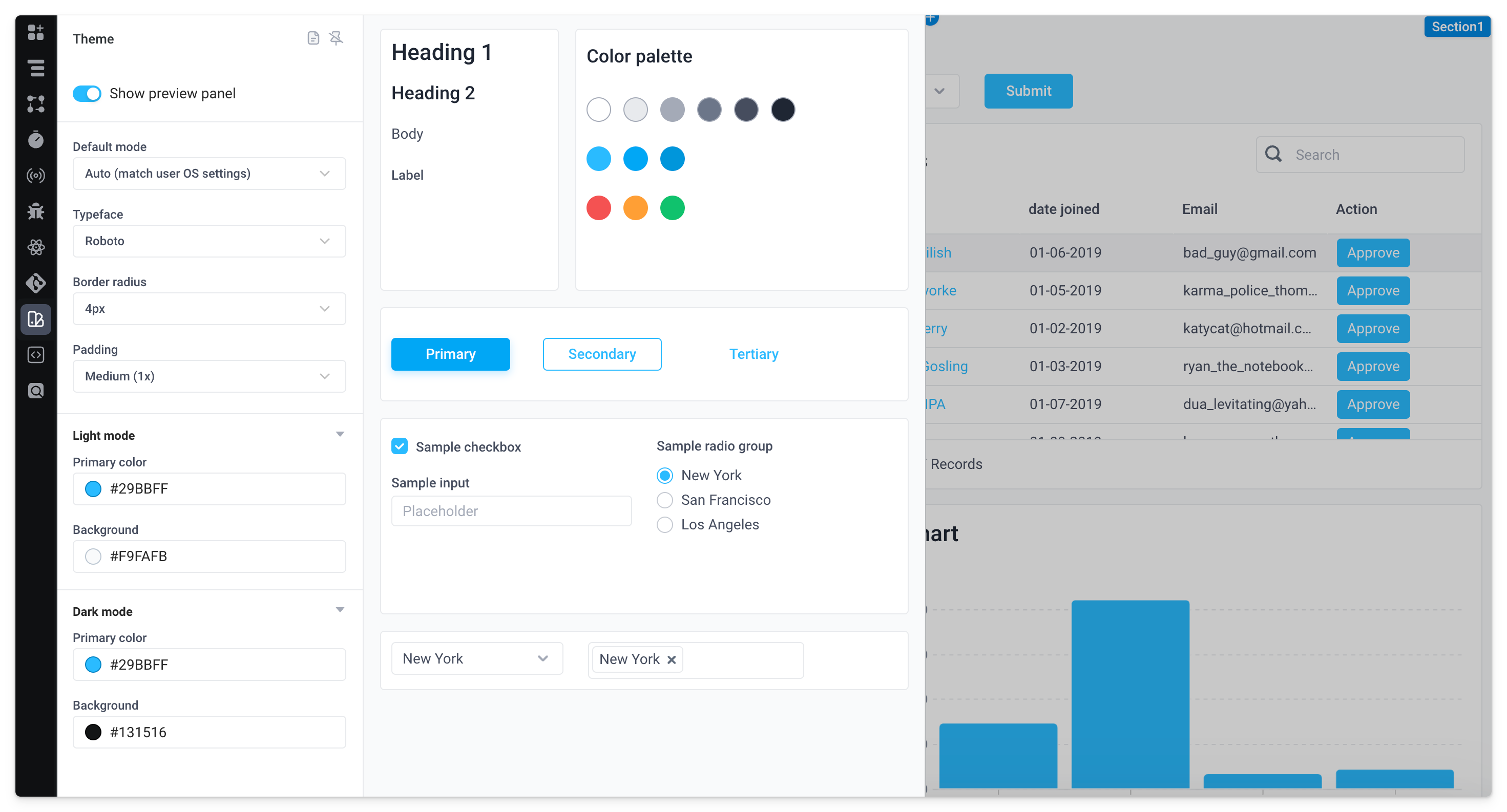
Select the Theme icon from the left navigation inside an application to open up the theme settings and preview panel. The following settings are configurable:
| Setting | Description |
|---|---|
| Default mode | Choose between Light, Dark, or Auto (match user OS settings) modes. The default mode is the one your end users will see when opening the application. |
| Typeface | Font family and style (Roboto, Inter, Poppins, Noto Sans, Work Sans, DM Sans) |
| Border radius | Roundedness of corners for components like containers, inputs, buttons, and more |
| Padding | The space between components and their container border |
| Primary color | Main color used in the design system. All other colors from the theme are based on this color automatically (configurable for light and dark mode) |
| Background | The background color of the application canvas (configurable for light and dark mode) |
| Typography | Configure the text styles for your app |
Overriding themes at the component level
To override theme settings at the component level, users can configure styles for a component in the properties panel. For example, here a button inside a table has a Background color set separately from the application's primary color.

Typography
Theme typography allows you to configure the text styles used throughout your app. Each app theme comes with a substantial set of text styles out of the box. You can customize these text styles and add your own custom text styles to ensure your app perfectly matches your brand guidelines and mocks!
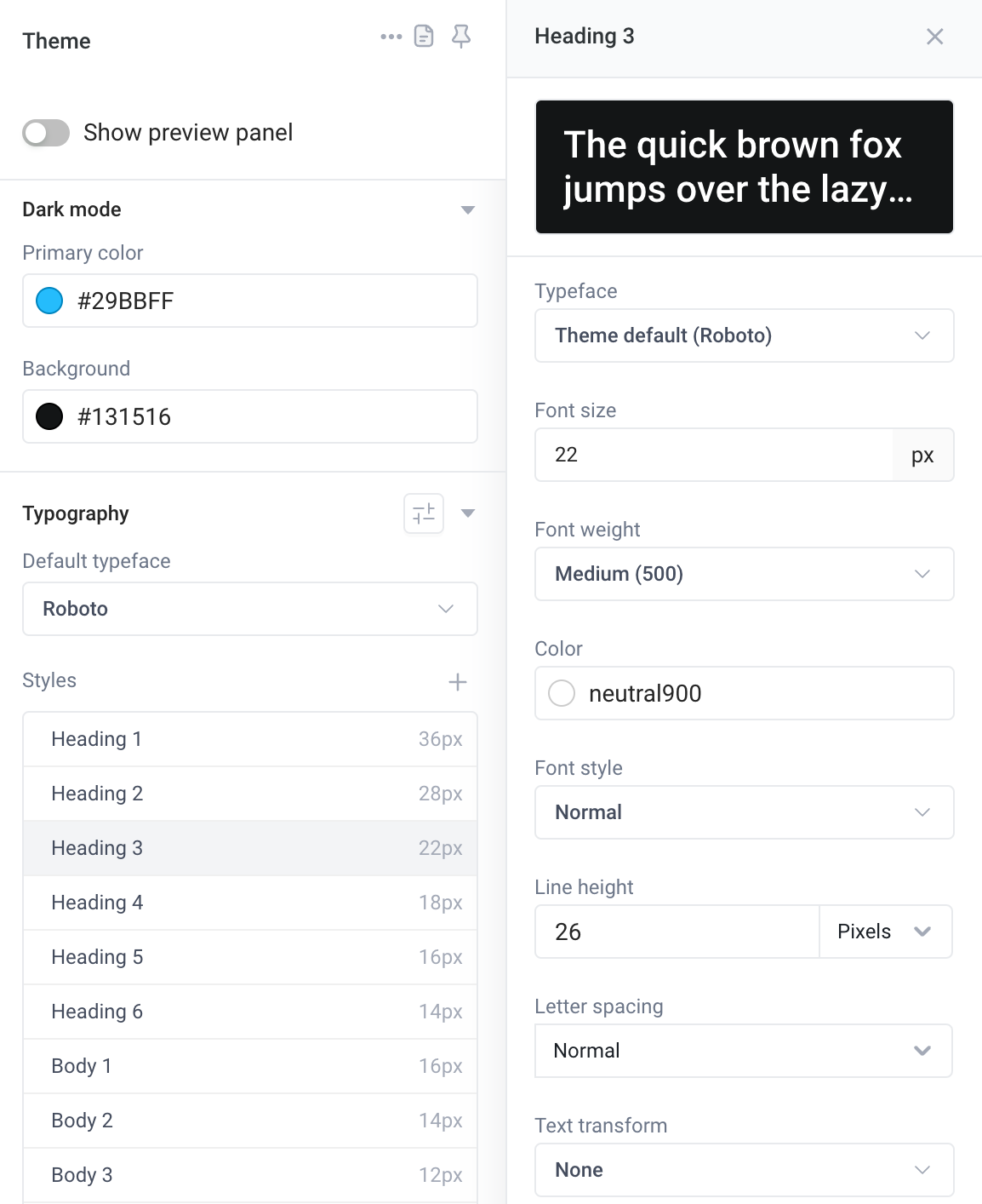
Superblocks components are composed of one or more pieces of text, each of which is tied to a specific text style by default. For example, an Input component has two pieces of text - the Label text and the Input text. Using theme typography, you can specify separate styles for the Label text and the Input text individually.
In the properties panel for a given component, you will see a property for the text style of each piece of text. The text will use a specific text style from the theme by default. You can select a different text style from the dropdown, or create a custom text style inline.
Styles
Typography styles can be created in the Theme panel and reused across components. By clicking on any existing style, you can edit the theme. In addition to editing the default styles, new ones can be added by clicking the + icon next to the Styles option.
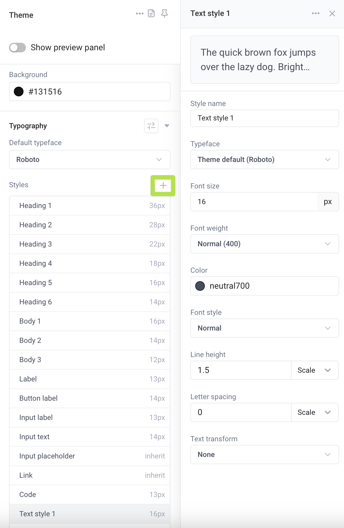
Adding styles within the Theme panel creates styles that can be reused across components. For each component with a text style property, you can either apply a style from the Theme panel or create a custom style for the component itself. Custom styles created within the component property panel are unique to the component and are not intended for reuse across other components.
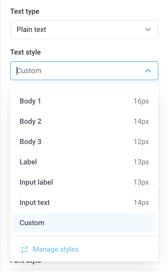
The following settings are available for styles created in both the Theme panel and within a component:
| Setting | Description |
|---|---|
| Typeface | Font family and style (Roboto, Inter, Poppins, Noto Sans, Work Sans, DM Sans) |
| Font Size | The size of the text in pixels |
| Font Weight | How thin or bold the text is |
| Color | The color of the text. Properties that use this style will default to this color |
| Font Style | Normal or Italic |
| Line Height | The amount of space each line of text takes up vertically |
| Letter Spacing | The amount of space between each letter. Can be set to Normal to use default for the style's typeface |
| Text Transform | Can be set to Uppercase, Lowercase, Capitalize, or None |
Manage Typefaces
Each style created in the Theme panel has an associated typeface (also known as Font family). To manage the available typefaces, click the Manage Typefaces option next to the Typography header in the theme panel. Here, you can select the typefaces that can be used across the application. You can also create a custom typeface by uploading the URL of a hosted CSS file that defines the typeface (example).
Unless explicitly set to another typeface, each style will use the default typeface chosen below the Typography header.
Using themes in embedded applications
When embedding a Superblocks application into another site, set the Background and Primary color of your theme to match the host app's style guide. Once updated, your Superblocks app will seamlessly match the theme colors of the parent application.
Use the Superblocks embed SDK to programmatically change the current color scheme of the app when a user toggles between light and dark mode in the host application. For details on how to configure this, see the embed docs for changing the color scheme.
Managing themes for your organization (coming soon)
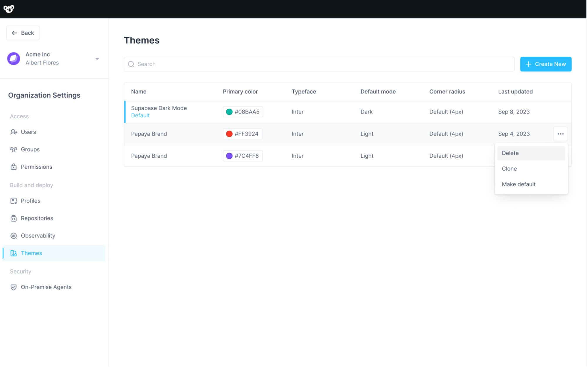
Admins can add themes from the Organization Settings -> Themes page. You can create, update, delete, clone and make default themes for all new apps from here.
Creating a new org-wide theme (coming soon)
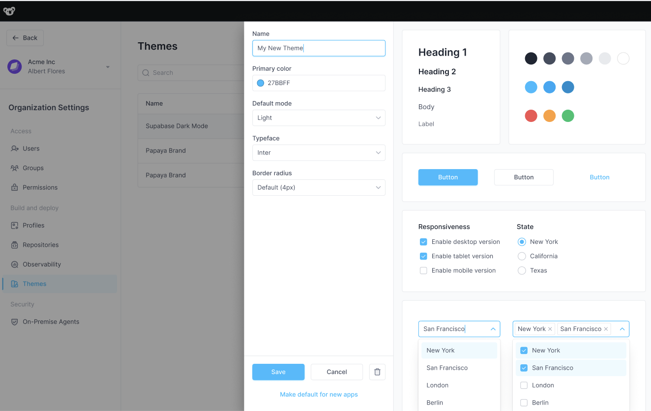
Click Create New to create a new theme with its own name and properties. Simultaneously preview the theme in the panel on the right.
Applying an org-wide theme (coming soon)
Within an application, users can apply a specific saved theme from the Selected theme dropdown.
