Components
Overview
Components are the building blocks of Applications. They can be dragged onto the canvas from the Component Library and modified within the Properties Panel without needing to write any code, however, frontend JavaScript can be used to further customize the components when needed. Event Handlers in Components allow end users to trigger APIs and Workflows when specific actions are taken.
Adding and moving components
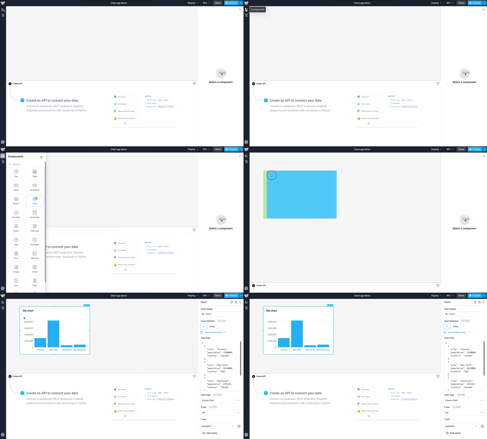
Drag and drop any components from the left hand Component Library on to the canvas. They can be moved around and resized by dragging the edges. A blue shadow implies that the component can be added or moved to the current hover location, whereas a red shadow implies that it is not an allowable location.
Select multiple components
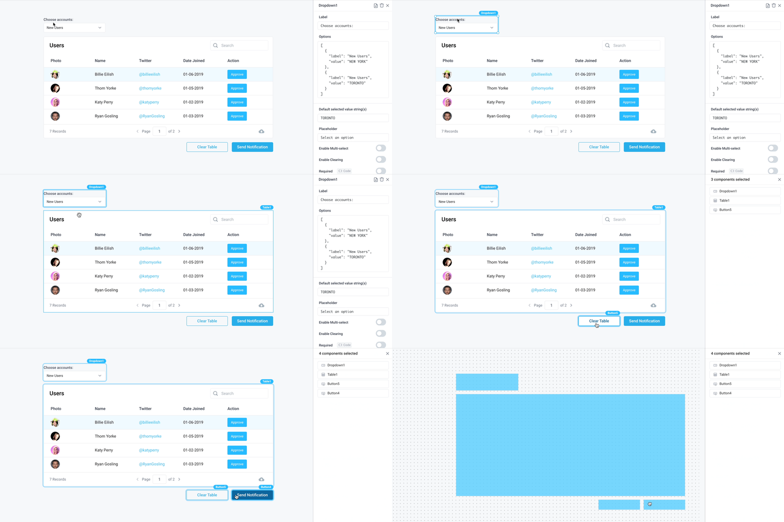
In order to move multiple components at once, simply shift+click, to select multiple components. Once grouped, the components can be moved on the canvas while maintaining their relative locations.
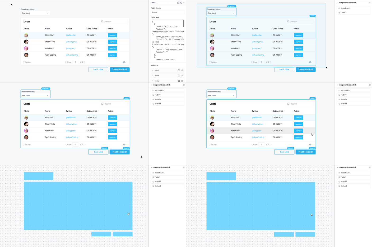
Click and drag is also supported to create a selection rectangle and move multiple components.
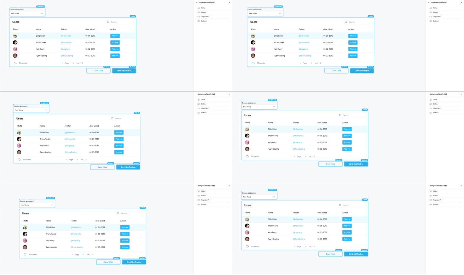
In addition to dragging multiple components, use keyboard shortcuts to copy (command/ctrl+c) or cut (command/ctrl+x) and paste (command/ctrl+v) mutliple components to the canvas.
Nudge components
Components can be nudged across the canvas by single- or multi-selecting components and using the arrow keys in order to move them 1 unit on the canvas. Additionally, holding shift while using the arrow keys to move the components will move them 5 units.
Component properties
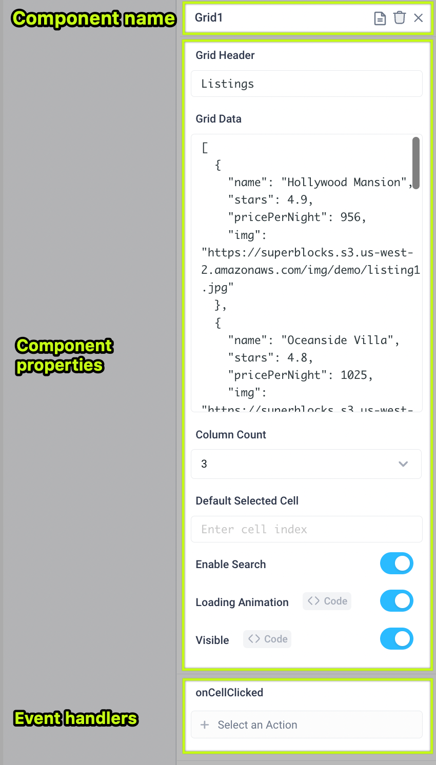
Each Component has a set of Properties in the right side Properties Panel such as the data field, a toggle for disabling the component, or stylings like a background color.
Properties Panel
The Properties Panel is on the right side of the canvas when you click on to a component. Each component has its own list of properties tied to it. To read more about a specific component's properties, navigate to that specific component's page via the Components Library.
Control properties using code
Properties can use bindings to inject data and dynamically render different states for the components through the use of JavaScript code.
For specific examples, see our application guides section.
Component event handlers
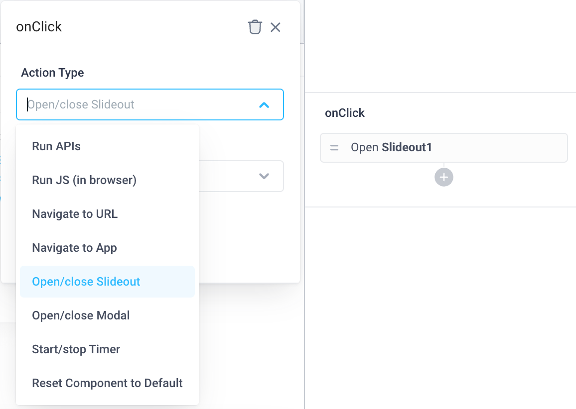
Event Handlers are also found in the Properties Panel and are used to trigger:
- APIs
- Workflows
- Built-in functions
- Slideouts opening/closing
- Modals opening/closing
- Timers starting/stopping
Use JavaScript with components
Utilize frontend JavaScript within components to further customize their functionality and appearance.