Layouts
Superblocks Layouts give you the dynamic power of Flexbox and CSS grid on the web. Build any dynamic layout with zero frontend expertise using the native layout controls and drag-and-drop interface in Superblocks.
The core concepts and features for building with Layouts include:
- Sections and columns - Segment app into multiple areas like header, body, and footer
- Layout modes - Apply ideal spacing and alignment with fixed grid, vertical stacks, or horizontal stacks
- Containers - Combine vertical and horizontal stacks with nested layouts
- Dynamic size - Dynamically resize components based on data returned or available space
- Dynamic visibility - Dynamically show and hide components without leaving any blank space
- Screen responsiveness - Optimize apps for desktop, tablet, and mobile
- Fixed headers - Keep the header section fixed while scrolling down a page
Sections and columns
The layout system is based on sections and columns:
- Sections are full width “rows” that divide a page.
- Columns divide the space within a section into separate full height areas (up to 12).
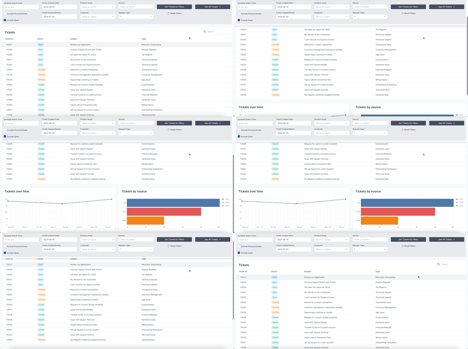
An application page starts with a single section, containing a single column. Add sections by clicking the + icon on the section border in the canvas, or clicking "Add section" in the page's properties panel.
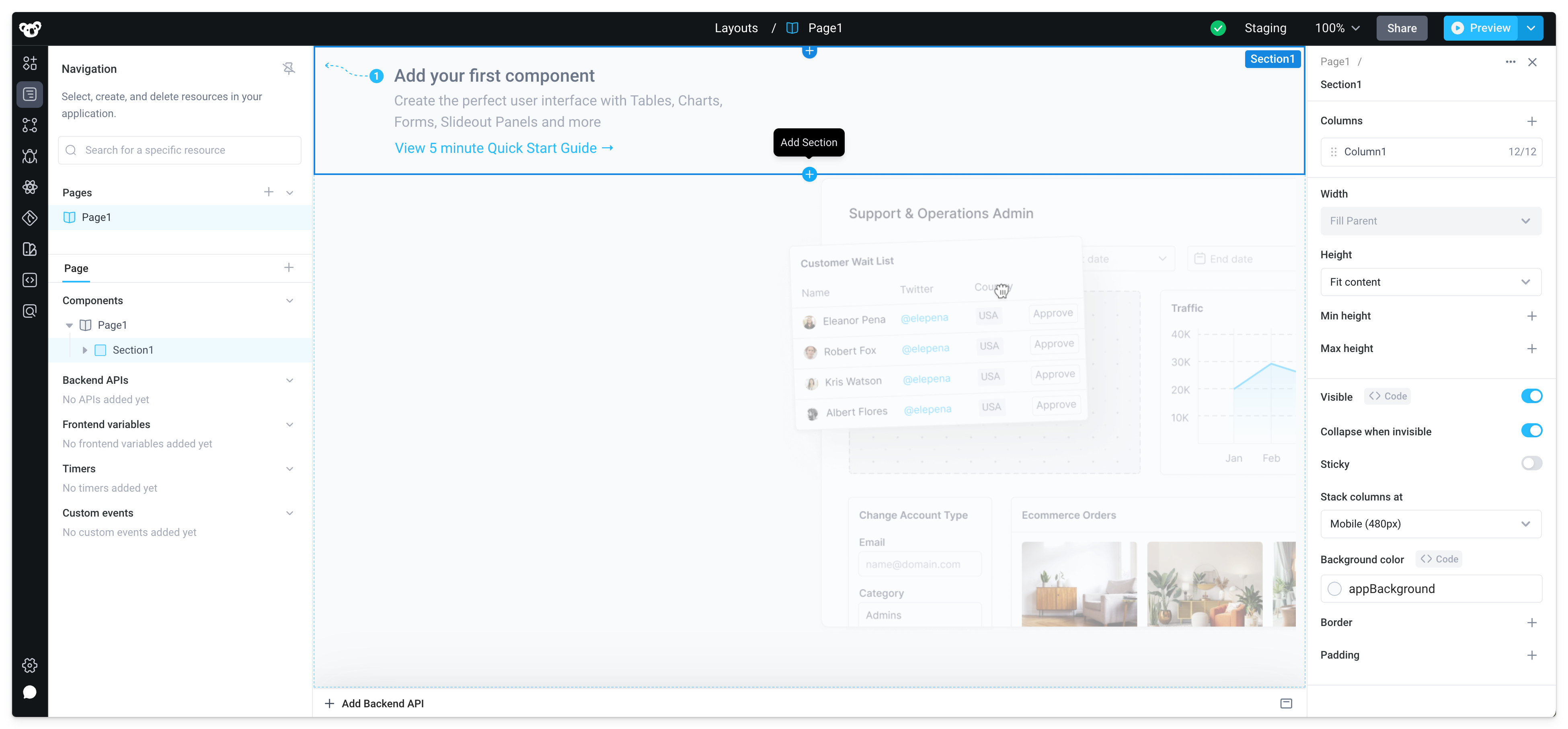
For example, the application below is divided into two sections. Section1 serves as a header containing components for filtering, and Section2 displays the primary content below that.
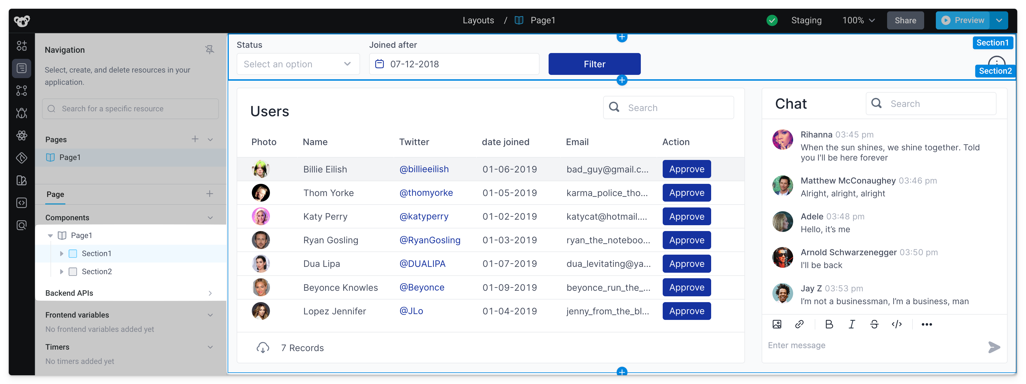
Furthermore, Section2 is divided into two columns. Note, columns can be resized by dragging the column handles in intervals based on a 12 column grid.
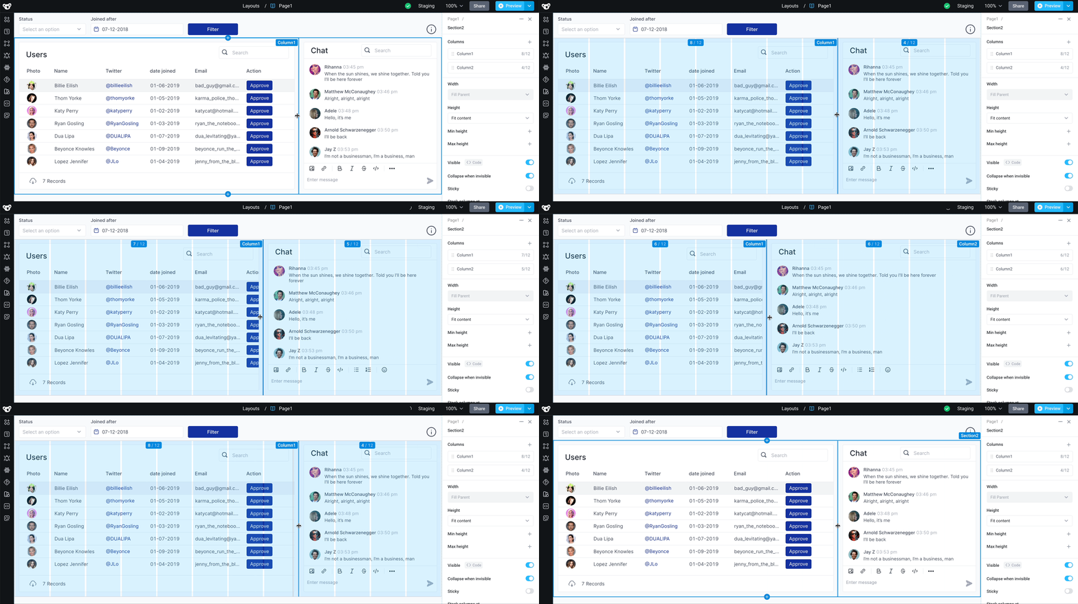
Sections and columns can be reordered by dragging to rearrange the names in the properties panel.

Layout modes
Areas of the application canvas (like a section's columns or individual containers) support three layout modes:
- Grid - Default fixed grid, allowing for freeform placement of components (see the components docs for adding and moving components)
- Vertical stack - Components stacked top-to-bottom
- Horizontal stack - Components stacked side-by-side
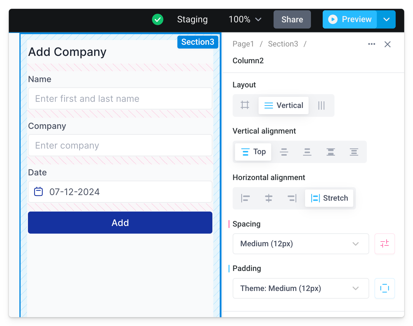
Vertical stack
A vertical stack is a layout in which elements are stacked one after the other in a vertical sequence. Vertical stacks have the following configurable properties:
- Vertical alignment - Set to Top, Center, Bottom, Space between, or Space around
- Horizontal alignment - Set to Left, Center, Right, or Stretch
- Spacing - Controls the vertical space between two adjacent components
- Padding - Controls the space between the column / container and inner components
Horizontal stack
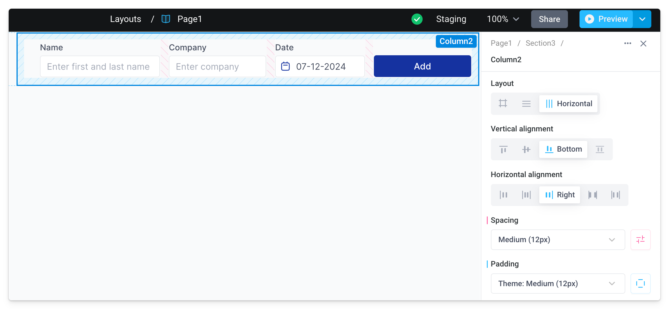
A horizontal stack is a layout in which elements are arranged one after the other in a horizontal sequence. Horizontal stacks have the following configurable properties:
- Vertical alignment - Set to Top, Center, Bottom, or Stretch
- Horizontal alignment - Set to Left, Center, Right, Space between, or Space around
- Spacing - Controls the horizontal space between two adjacent components
- Padding - Controls the space between the column / container and inner components
Containers
Containers in layouts are used the same way an HTML <div> groups and organizes a set of elements on a web page.
Vertical and horizontal stacks can also be used inside any container-based components (Container, Form, and Tabs). This is especially powerful for achieving more complex nested layouts that combine horizontal and vertical stacks.
For example, imagine we start building the form below by adding multiple components to a single vertically stacked column, where all components stretch to the width of the column.
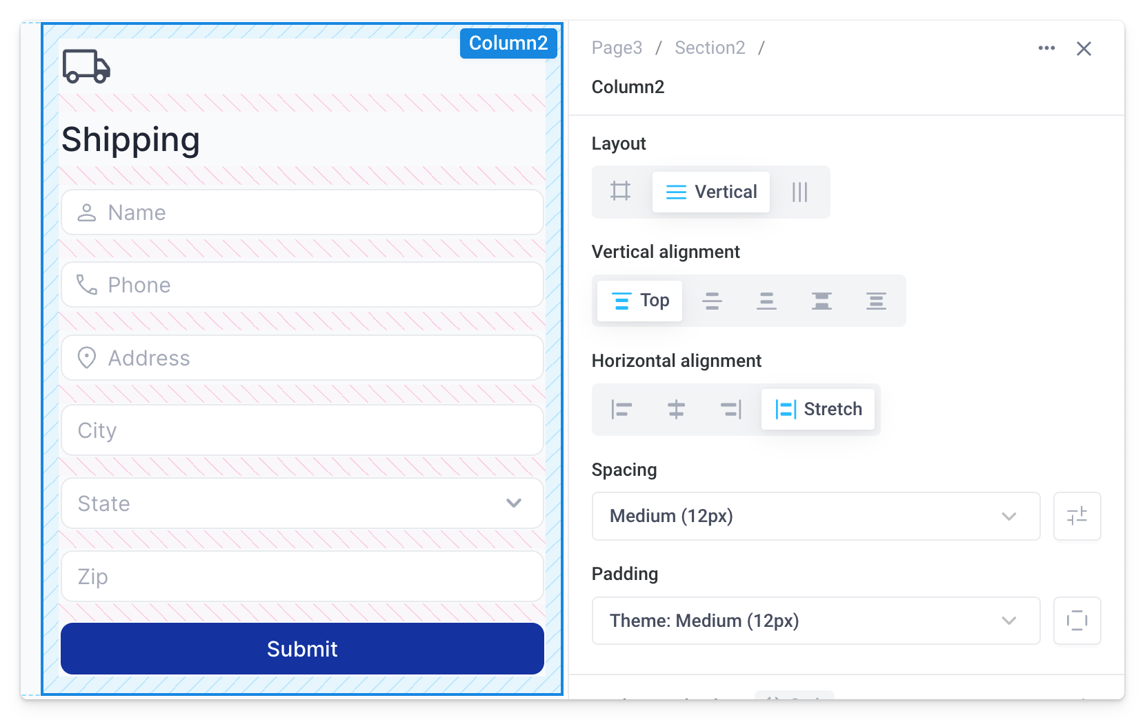
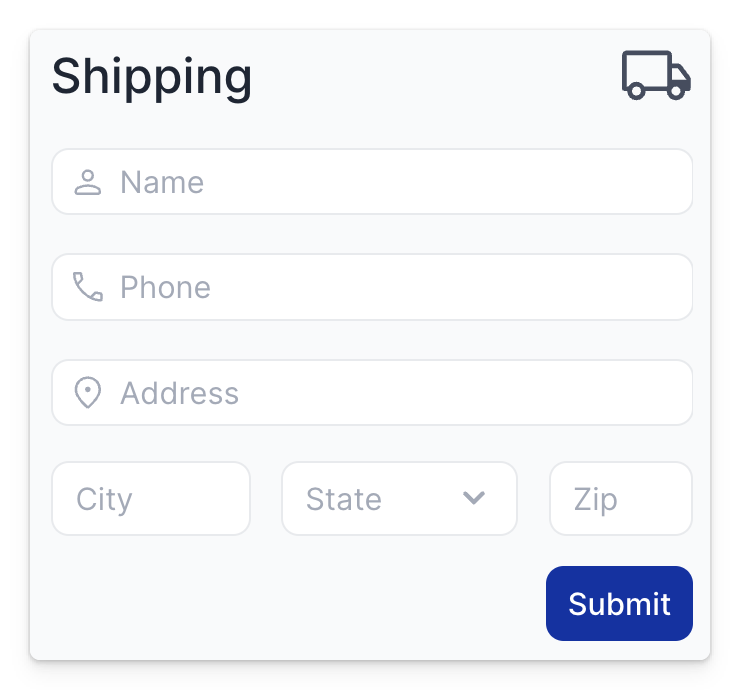
However, we want to rearrange some components so that:
- The icon is moved to the same line of the header text and aligned to the right side of the form
- The city, state, and zip are on the same line
- The button is only as wide as its label and aligned to the right side of the form
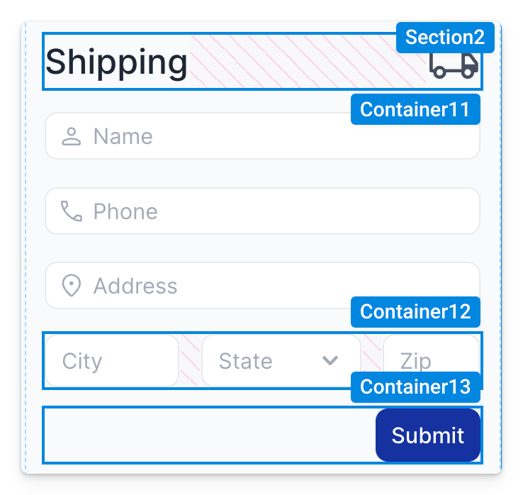
To accomplish this, we can group elements into separate containers. This can be done by dragging a container into the column manually and moving components inside it, or simply selecting multiple components then clicking Group into Container (command/ctrl+G).
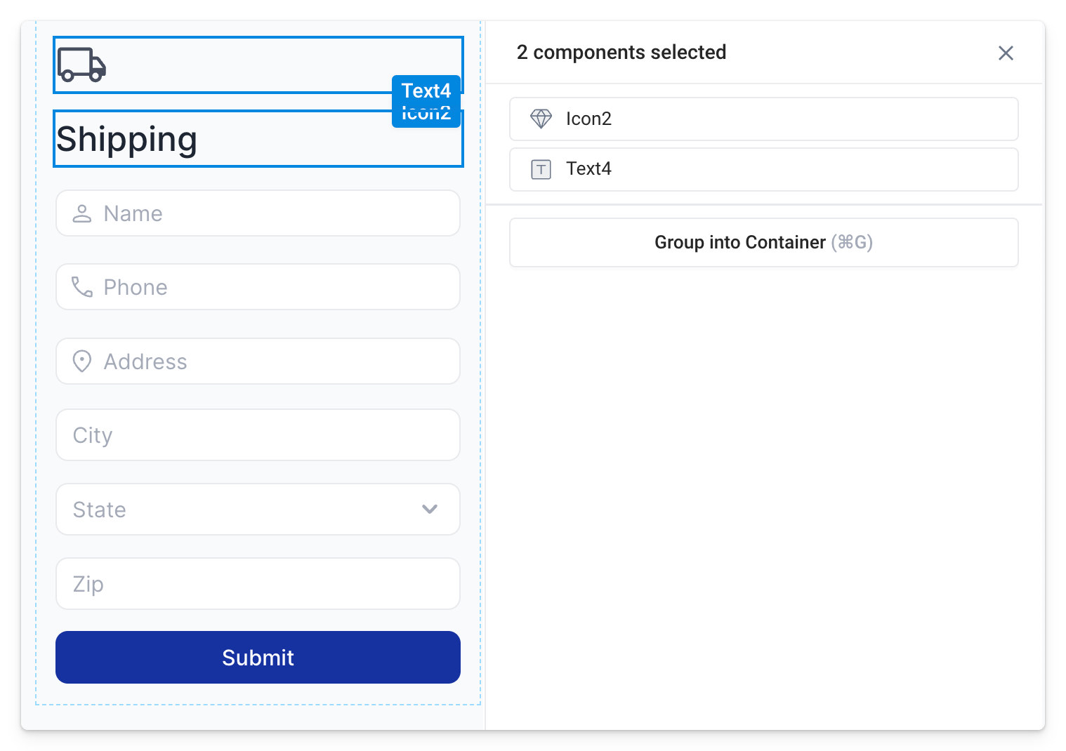
Once the components are grouped into a container, we can adjust the layout configuration as needed, independent of the larger vertical stack.
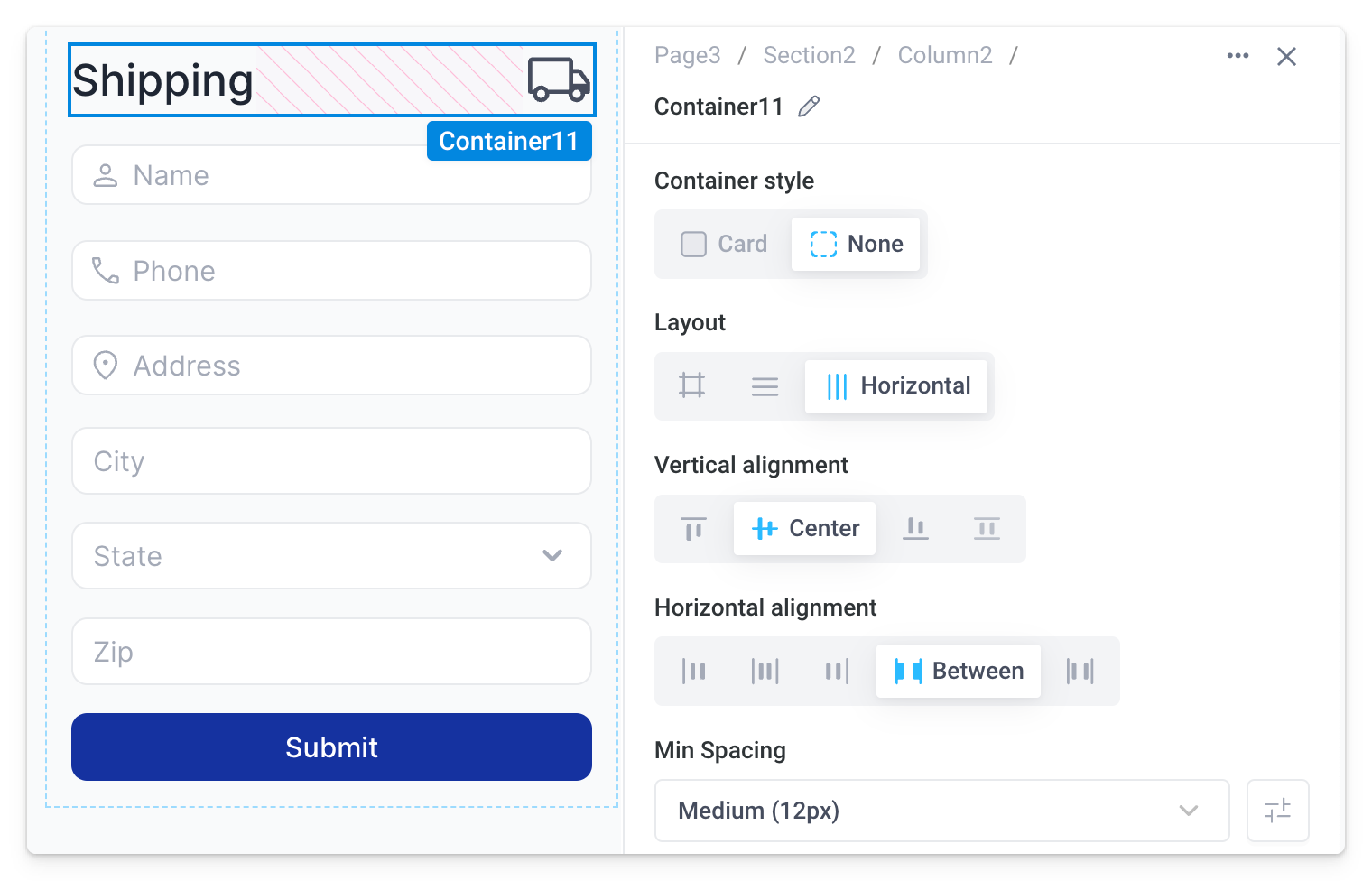
Note, when grouping components into containers with multi-select or the keyboard shortcut, the Container style is automatically set to None. This removes all preset styles so the container blends in with the larger layout. In comparison, the Card style container (default when dragging a container into the cavas) displays preset styles like padding, border, border-radius, and background.
By adding the remaining components into separate horizontally stacked containers, we can complete the form design requirements.
Dynamic size
All components, columns, and sections have Height and Width properties that allow for configuring the size of elements or areas of the page. By default, size can be manually adjusted by dragging the component, section, or column border handles to the desired dimensions. For example, when resizing a table:
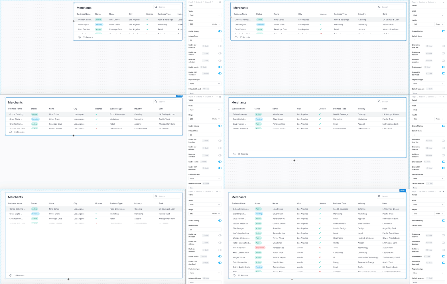
When manually resizing components, sections, or columns like this, the possible values for the underlying size properties are some combination of Pixels and Fluid.
Alternatively, components, sections, and columns can be made to dynamically resize using Fit content, Fill parent, and Fill viewport.
The table below summarizes all possible size values. As noted under "Applies to", whether or not one of these size values is available depends on the component and / or layout configuration.
| Value | Type | Description | Applies to | |
|---|---|---|---|---|
| Height | Width | |||
| Pixels | Manual | Size in pixels that remains constant |
| All components, only in vertical and horizontal stacks |
| Fluid | Manual | Width in columns that adjusts based on the browser width | Not applicable - width only setting |
|
| Fit content | Dynamic | Automatically adjust the size based on the content |
| Certain components, only in vertical and horizontal stacks |
| Fill parent | Dynamic | Expand to fill the remaining space in the parent container | All components, only in vertical and horizontal stacks | All components, only in vertical and horizontal stacks |
| Fill viewport | Dynamic | Expand to fill the remaining screen space | Sections | Not applicable - height only setting |
Fit content
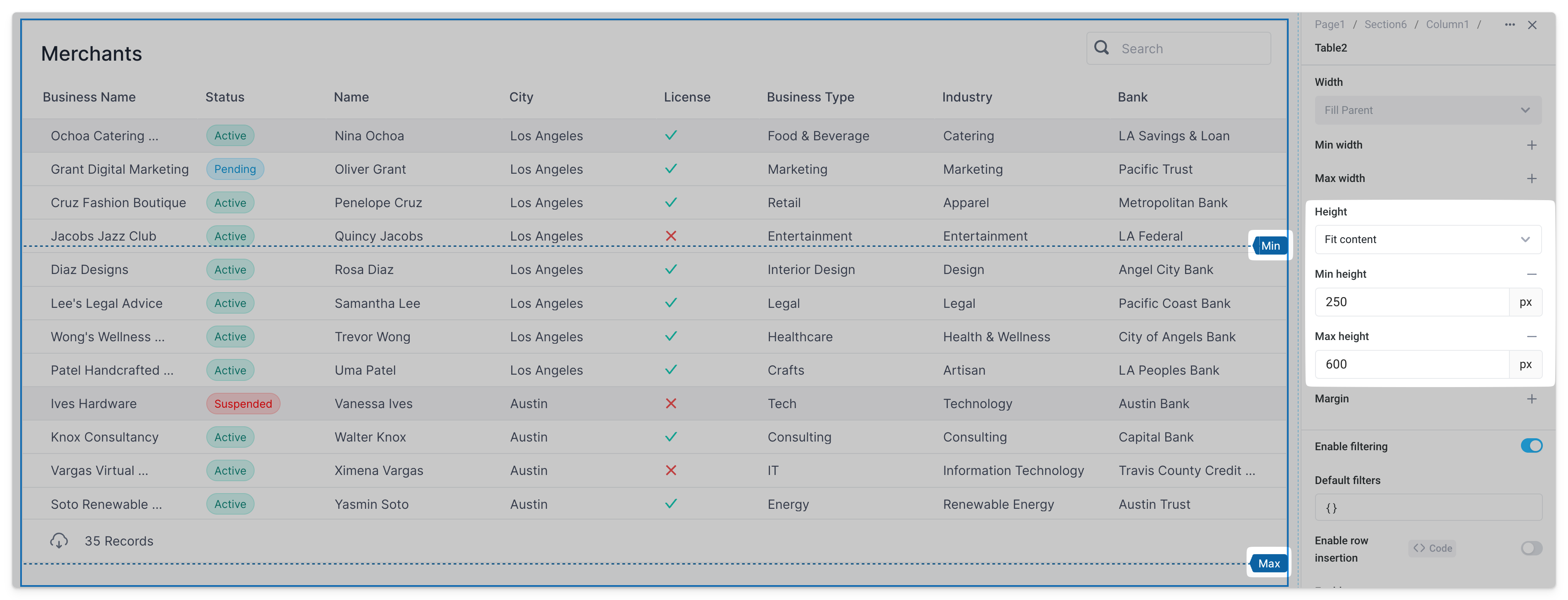
To achieve a dynamic size based on the content of the component, set the height / width values to Fit content. For example, the table below will adjust automatically to fit the number of records, within a configurable Min height and Max height.
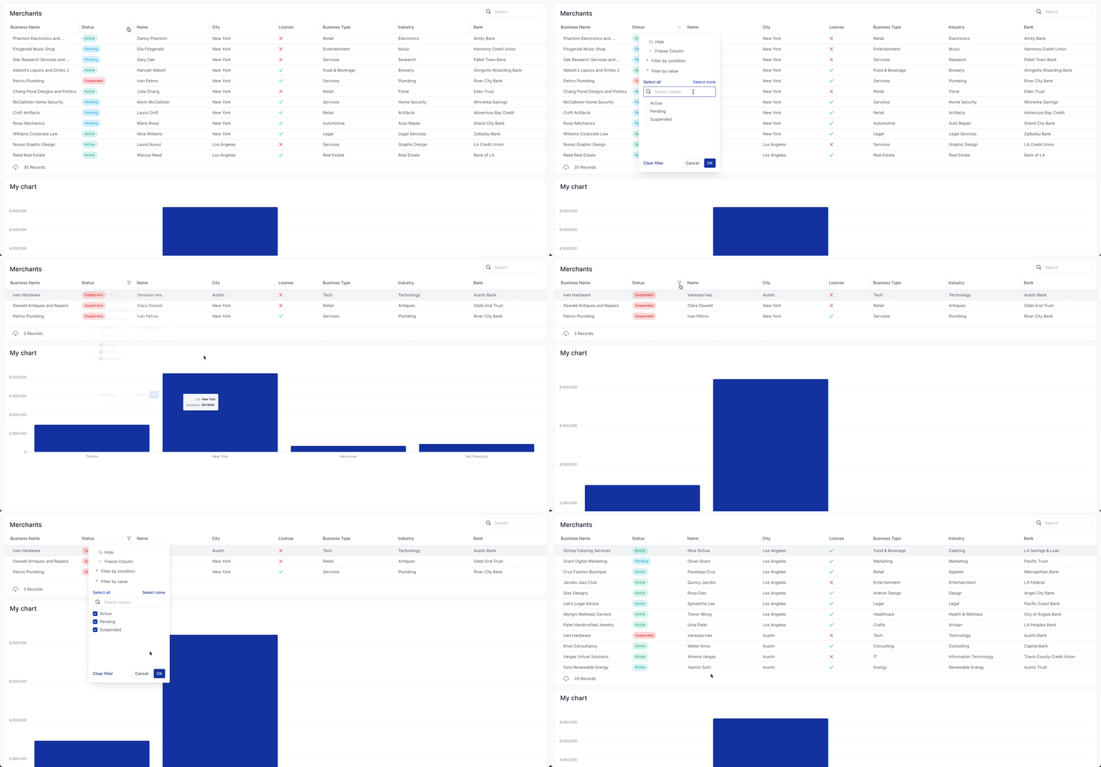
Filtering the table now results in the table shrinking to accomodate only the filtered records, while the chart below flows up to fill the space.
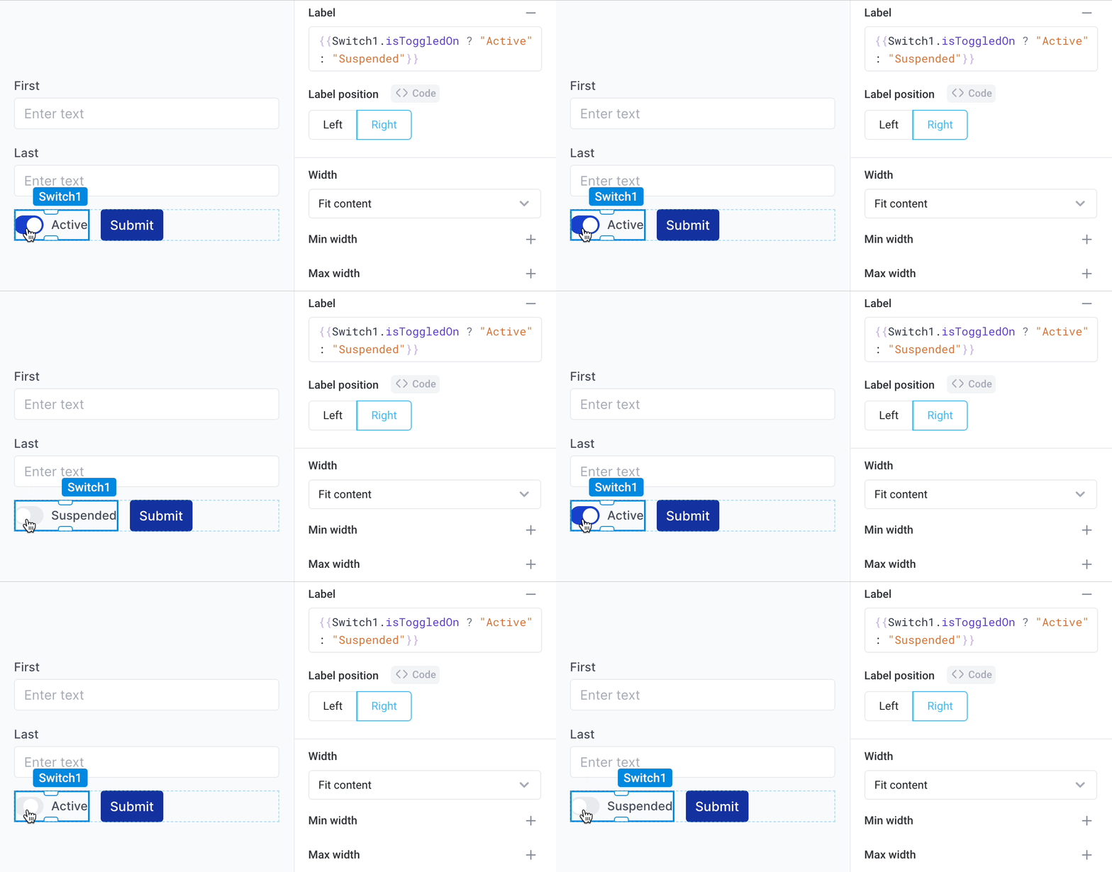
Fit content can also be applied to the width of certain components when the layout mode is set to horizontal. This includes components like Text, Buttons, and Switches where the content may change horizontally. For example, the width of the switch below expands / shrinks to fit the content of the label depending on the toggle state, shifting the button over in the process.
Fill parent
Fill parent is available only in vertical and horizontal stacks.
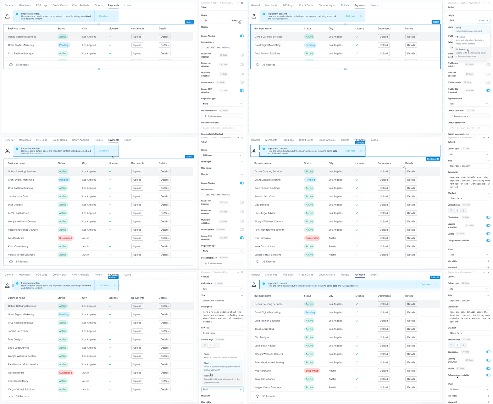
Set the height / width properties to Fill parent so components expand to fill the remaining space in their parent container. For example, the table below fills the height of the tabbed container and the callout expands to the available width of its horizontal container layout.
Fill viewport
Fill viewport applies only to sections.
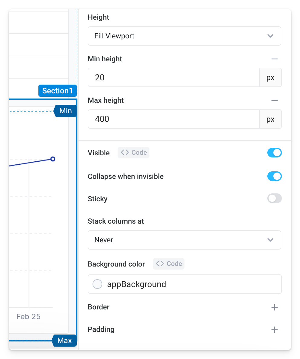
In sections, set height to Fill viewport so the section automatically expands or shrinks to fit the browser or screen it’s being displayed on. To prevent components from stretching or shrinking to unusable sizes, bound how large or small the section can get by setting a Min height and / or Max height.
Dynamic visibility
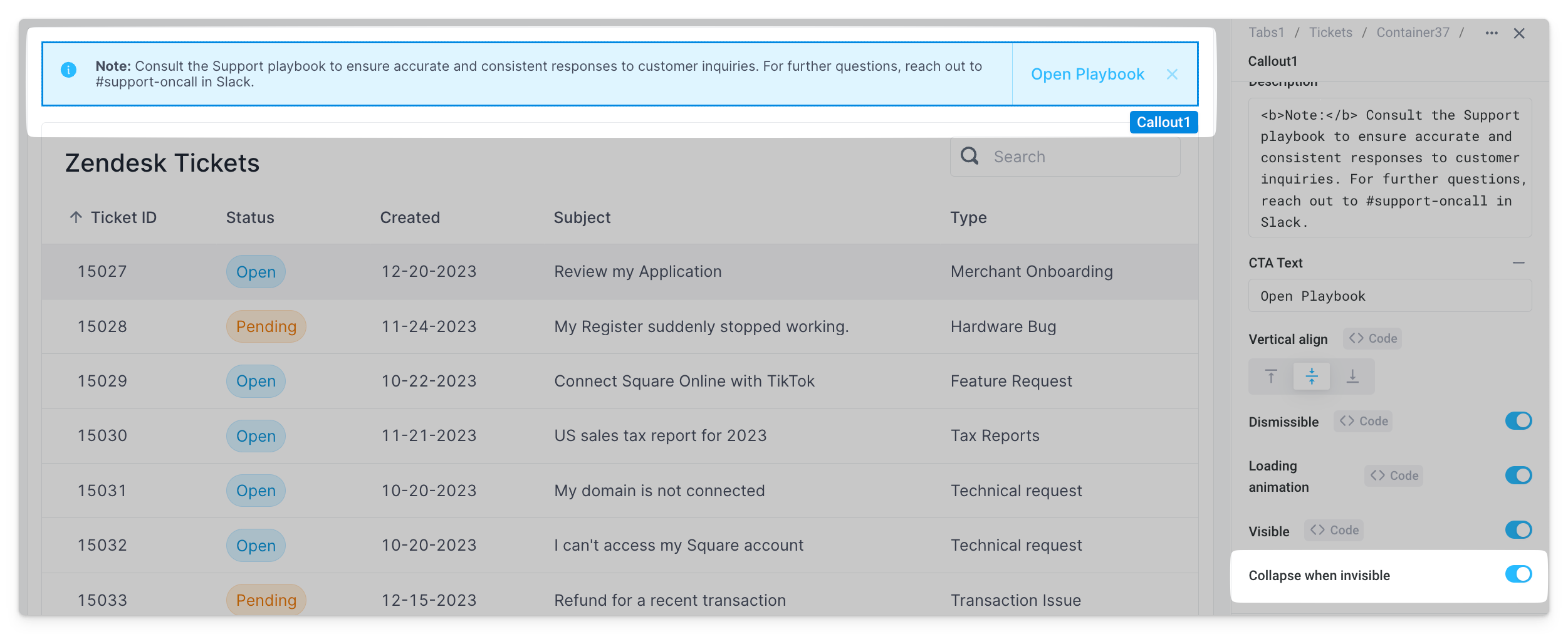
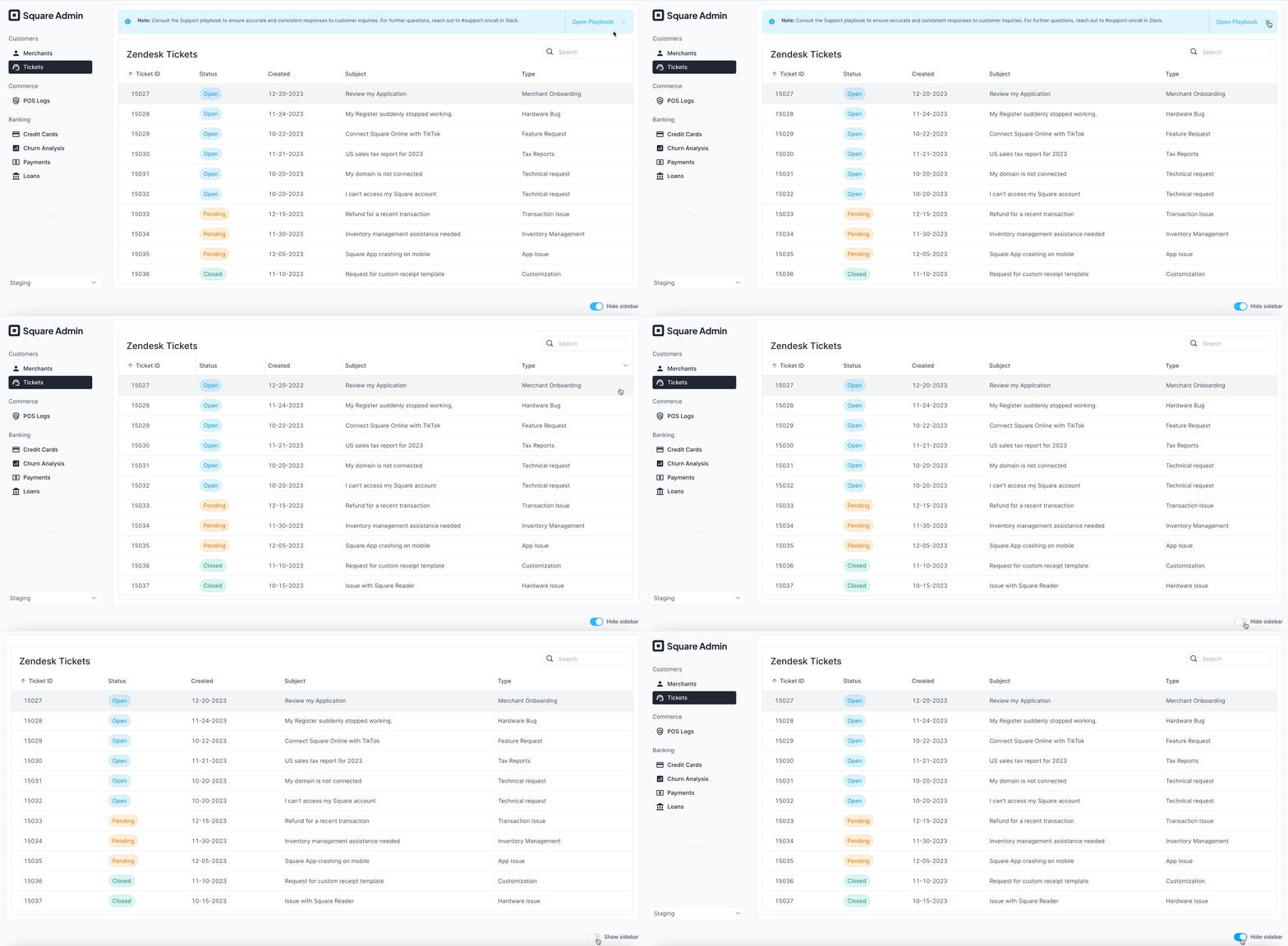
All components, sections, and columns have a Collapse when invisible property. When enabled, other components shift to occupy the space left by the invisible component / area. Note, this can only be observed in Preview and Deployed mode. If this setting is disabled, the component is hidden but leaves blank space.
Screen responsiveness
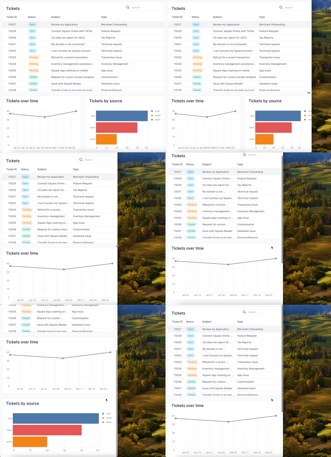
By combining layout features like sections and columns, vertical and horizontal stacks, and dynamic size properties, users can build highly responsive applications in Superblocks. This also includes making apps fully responsive to the window size across desktop, tablet, and mobile.
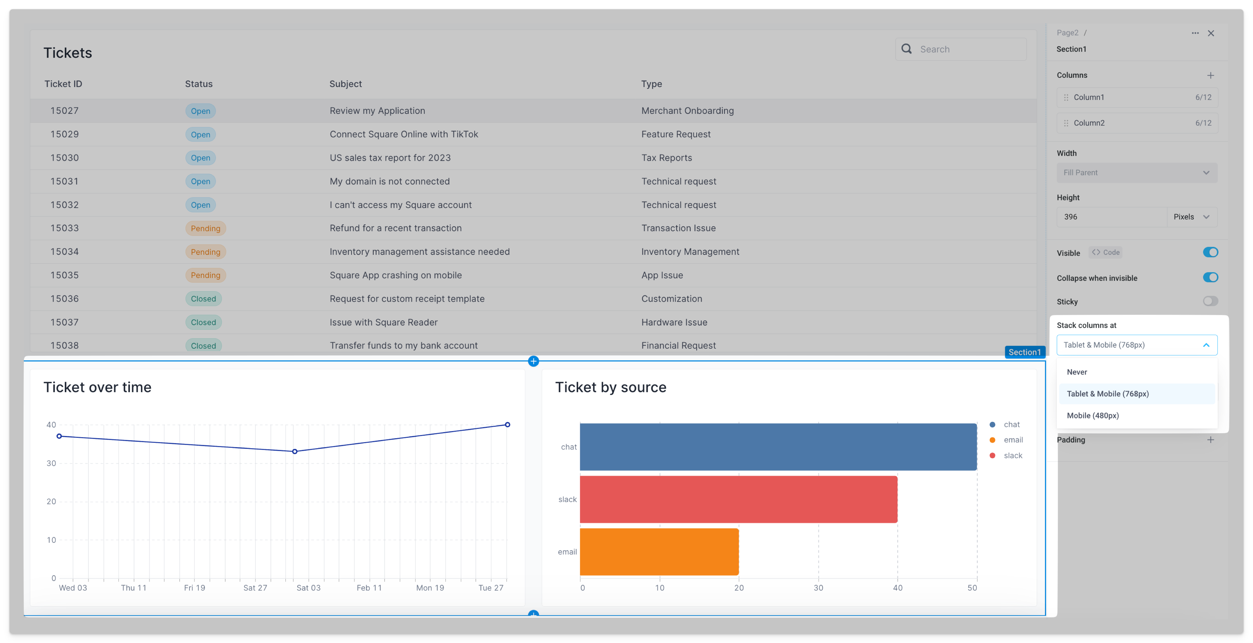
From example, to accomodate different window sizes for desktop apps, sections can be made to automatically expand or shrink to fit the browser with Fill viewport. Alternatively, to optimize apps for tablet and mobile screens, set Stack columns at to configure columns within a section to stack vertically at specific breakpoints.
Fixed headers
To build a fixed header, add a top section to the page and enable the section's Sticky property.
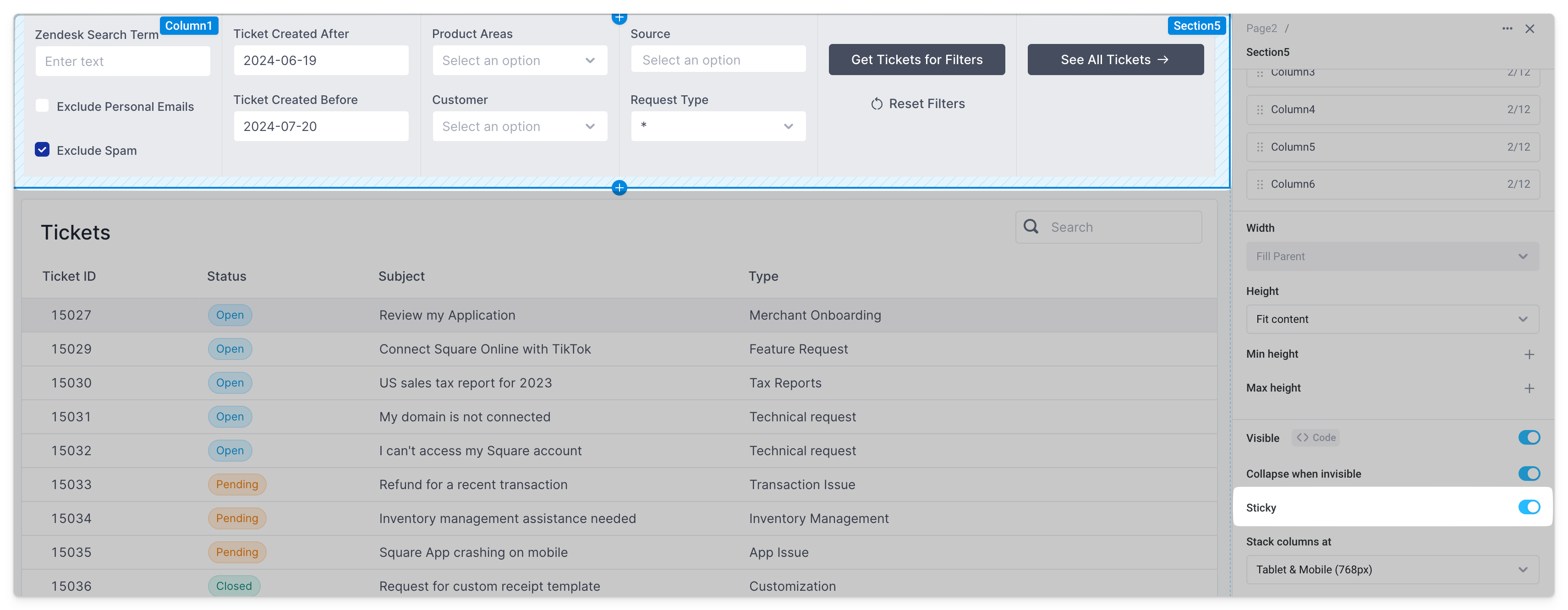
The header is now fixed as you scroll the page.
