Form
Allows you to capture data from end users while automatically establishing a parent-child relationship with any components placed inside it, enabling the Form component to efficiently manage its child components.
Form Properties
Component Properties
| Property | Description |
|---|---|
| Layout | |
| Layout | Set layout system for components in the form |
| Vertical align | Vertical distribution of components in the form |
| Horizontal align | Horizontal alignment of components in the form |
| Spacing | Space between components in the form. If the alignment is space-between or space-around, this is the minimum spacing between items |
| Padding | Controls padding |
| Width | Controls the width of the form component |
| Height | Controls the height of the form component |
| Interaction | |
| Scroll contents | Enable scrollability within the container component |
| Visible | Controls the visibility of the component, values are a boolean |
| Collapse when invisible | Controls what happens when the component is invisible. When true, other components shift to fill its space; when false, it leaves a blank space. This has no effect in edit mode. |
| Appearance | |
| Background color | Changes the color of the background, takes in HTML color names, HEX, RBG, or RGBA values |
| Border | Controls the border of the component |
| Border radius | Controls the border radius of the component |
Form Reference Properties
Properties can be accessed from other frontend components and backend APIs by adding the name of the Form component, and dot referencing the property. For a Form named Form1:
| Property | Description |
|---|---|
Form1.isVisible | Returns the boolean value of the form's visibility (true if it is visible) |
Form1.isValid | Returns a boolean value indicating the form's validity—true if all inputs in the form are valid, and false if at least one input is invalid. |
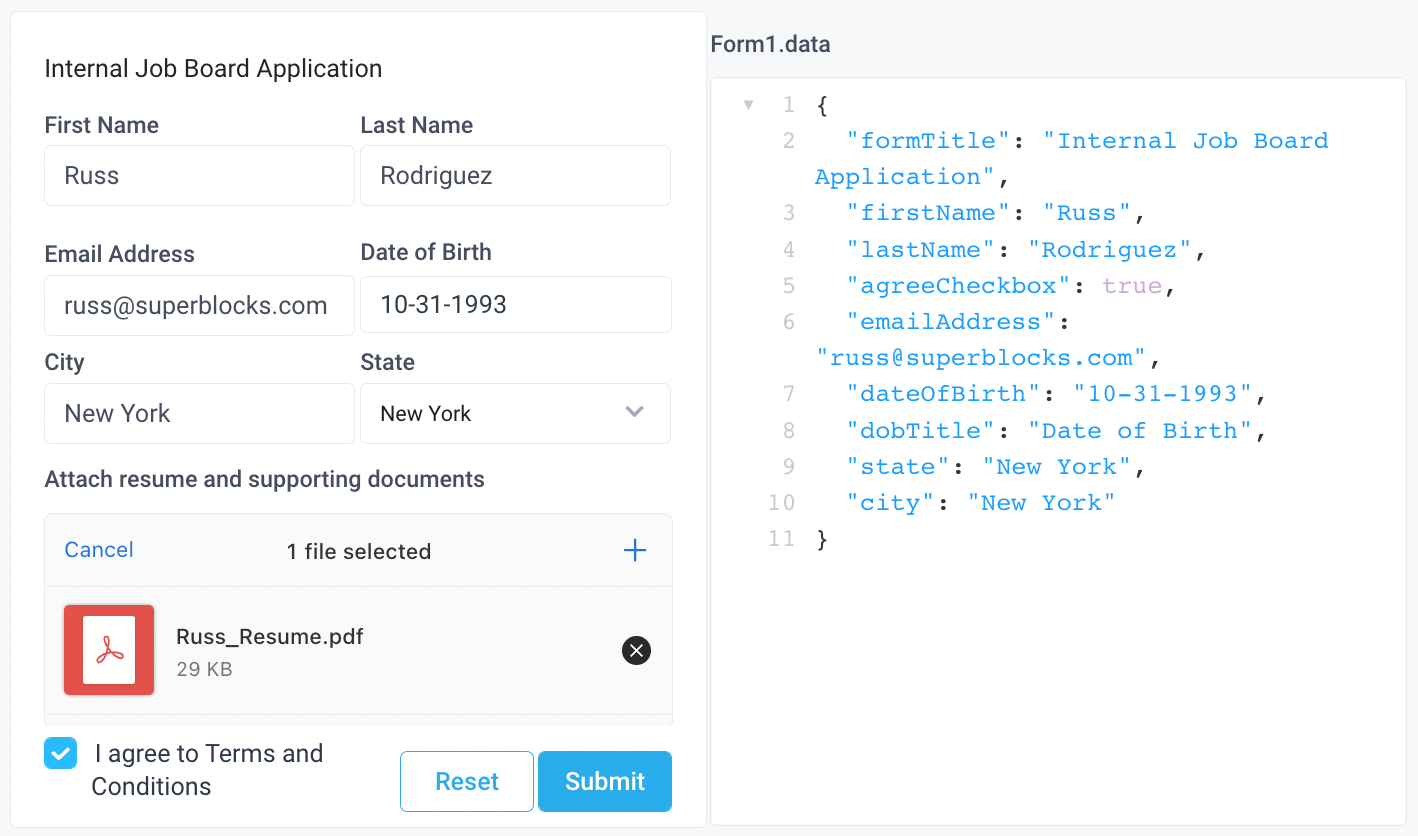
Form1.data | Returns an object of the current state of the form (see example below) |

Form Button Properties
| Property | Description |
|---|---|
| Content | |
| Label | Sets the label of the button |
| Appearance | |
| Button Style | Changes the style of the button, options are "Primary", "Secondary", or "Danger" |
| Loading animation | Controls the loading state of the component, values are a boolean |
| Interaction | |
| Disabled Invalid Forms | Disables the button when the parent form has a required component that is not filled, values are a boolean |
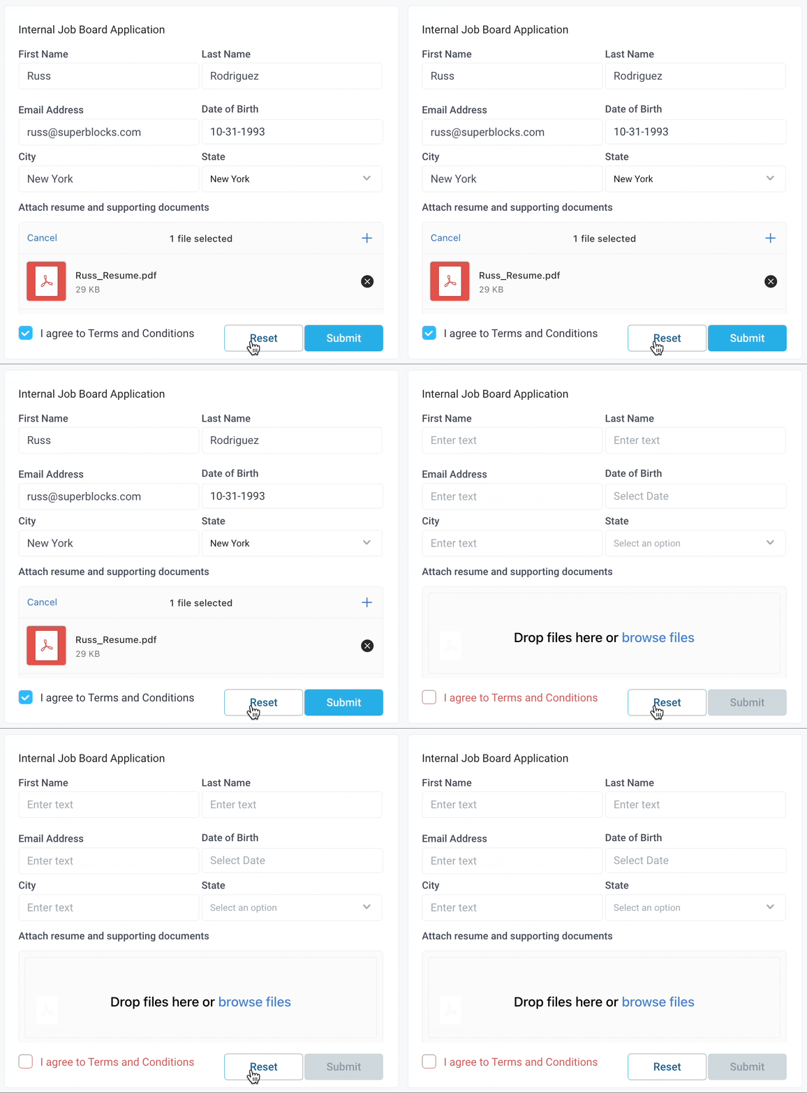
| Reset Form on Success | Resets the fields within the parent form when the click action succeeds, values are a boolean (see example here) |
| Layout | |
| Visible | Controls the visibility of the component, values are a boolean |
| Collapse when invisible | Controls what happens when the component is invisible. When true, other components shift to fill its space; when false, it leaves a blank space. This has no effect in edit mode. |
| Width | Controls the width of the component |
| Height | Controls the height of the component |
Form Button Reference Properties
Properties can be accessed from other frontend components and backend APIs by adding the name of the Form Button component, and dot referencing the property. For a Form Button named FormButton1:
| Property | Description |
|---|---|
FormButton1.isVisible | Returns the boolean value of the button's visibility (True, if it is visible) |
FormButton1.isDisabled | Returns the boolean value of the button's disabled state (True, if it is disabled) |
FormButton1.text | Returns the button's label as a string |
Form Button Event Handler
| Table Reference Property | Description |
|---|---|
| onClick | Triggers an action when the button is clicked |
Example Usage:
Form Buttons
By default, Form components have two Form Buttons included, Reset and Submit, which are similar to Button components, but with special properties to interact with the Form component's children. The two properties that differentiate Form Buttons from Button components are Disabled Invalid Forms and Reset Form on Success.
Submit Form Button
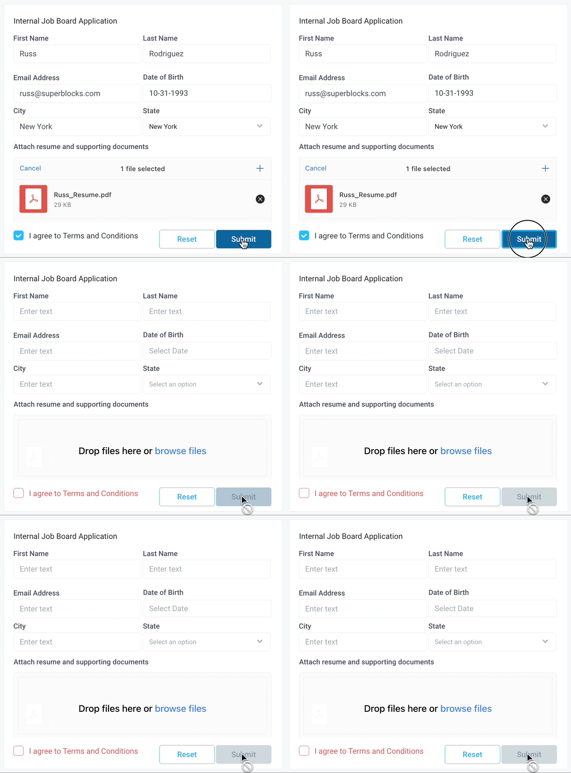
By default, a Submit Form Button will have Disabled Invalid Forms and Reset Form on Success enabled. This means, that the Submit button will be disabled until all required components in the Form are filled out. Similarly, when the Submit button is clicked, all child components will be reset to their default values.

Reset Form Button
A Reset Form Button interacts similarly to a Submit Form button, but the Disabled Invalid Forms is not toggled on by default, thus allowing users to reset all child components while filling out the form and start over.
