Code Editor
This component is an interactive text box that allows you to edit and test code. It can be used to let users validate JSON or work with code in languages such as Ruby, HTML, Markdown, and more.
Code-Editor Properties
Component Properties
| Code Editor Property | Description |
|---|---|
| Content | |
| Label | Sets a label text for the code editor |
| Language | Select from HJSON (human readable), JSON (strict), Ruby HTML Template (ERB), HTML, or Markdown |
| Default value | Values to be shown in the code editor component by default |
| Appearance | |
| Label style | Changes the style (font, size, color, etc.) of the code editor's label text. Configure styles in the Typography settings |
| Line wrapping | Whether code editor should scroll or wrap for long lines, values are a boolean |
| Line numbers | Whether code editor should number each line |
| Loading animation | Whether code editor should show loading animation when a dependent API is running, values are a boolean |
| Layout | |
| Width | Controls the width of the component |
| Height | Controls the height of the component |
| Visible | Controls the visibility of the component, values are a boolean |
| Collapse when invisible | Controls what happens when the component is invisible. When true, other components shift to fill its space; when false, it leaves a blank space. This has no effect in edit mode. |
| Interaction | |
| Newline Character | Determines the newline character used in the code editor and its output |
| Disabled | Prevents editing, values are a boolean |
| Required | Makes input to the component mandatory, values are a boolean |
| Validation | Custom rule that must evaluate to a boolean |
Settable Properties
| Property Via Form / Via RunJS | Type | Example Value |
|---|---|---|
Current Value / value | string,null | "const count = 3;" |
Reference Properties
Properties can be accessed from other frontend components and backend APIs by adding the name of the Code Editor component, and dot referencing the property. For a Code Editor named CodeEditor1:
| Property | Description |
|---|---|
CodeEditor1.parsedValue | Access the parsed value of the code block as an array in the Code Editor |
CodeEditor1.stringValue | Access the string value of the code block in the Code Editor |
CodeEditor1.isValid | Validates the code block, returns a boolean |
Events
The following events are triggered by user interactions with Code Editor components. Use event handlers to trigger actions in response to user events.
| Property | Description |
|---|---|
| onChange | Triggers an action when the code block is changed |
Example Usage:
Use Code Editor to Visualize Data
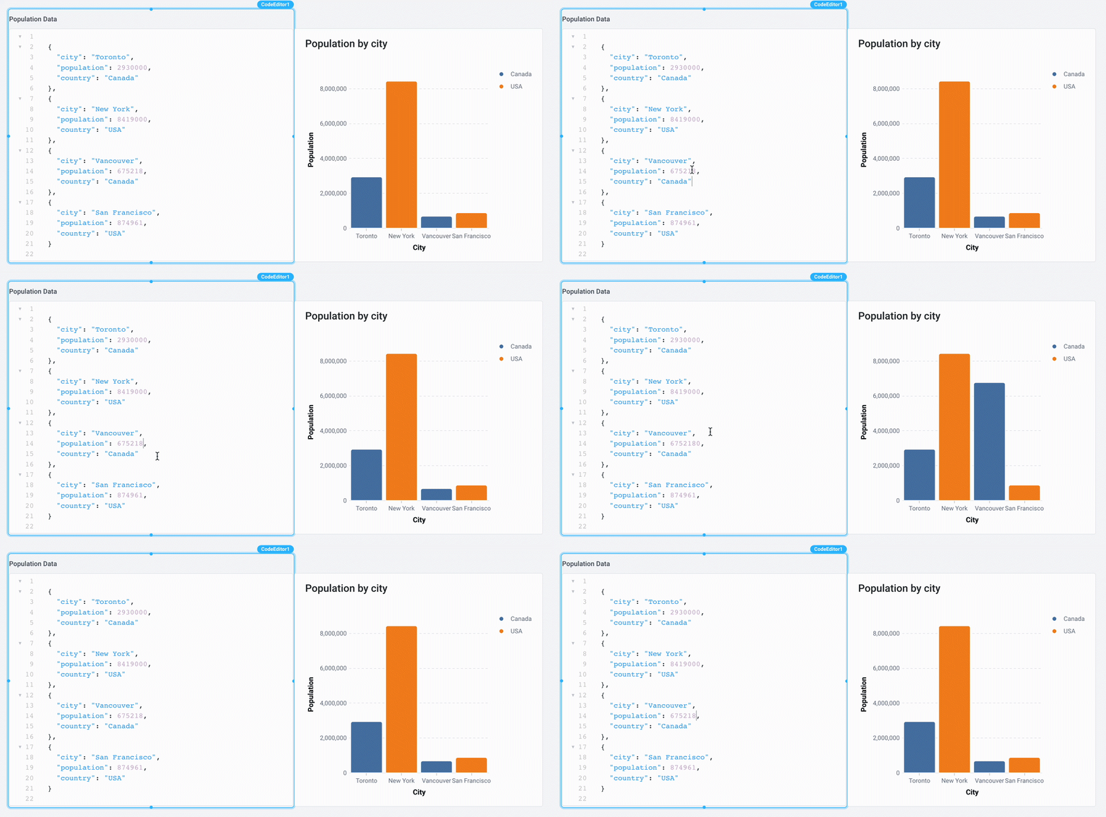
You can leverage the Code Editor component combined with a Chart component in order to have an interactive tool to visualize your data. In the Chart component, set the Chart Data to {{CodeEditor1.parsedValue}} and you'll be able to visualize the data as seen below:

Sample data in JSON
[
  {
    "city": "Toronto",
    "population": 2930000,
    "country": "Canada"
  },
  {
    "city": "New York",
    "population": 8419000,
    "country": "USA"
  },
  {
    "city": "Vancouver",
    "population": 675218,
    "country": "Canada"
  },
  {
    "city": "San Francisco",
    "population": 874961,
    "country": "USA"
  }
]
Displaying HTML Templates
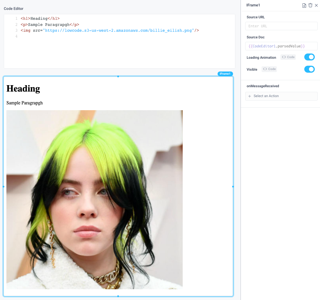
You can leverage the Code Editor in combination with an iFrame Component to validate, edit, and display HTML code. Be sure to set the Source Doc parameter to the parsedValue of your Code Editor.

Displaying read only structured data
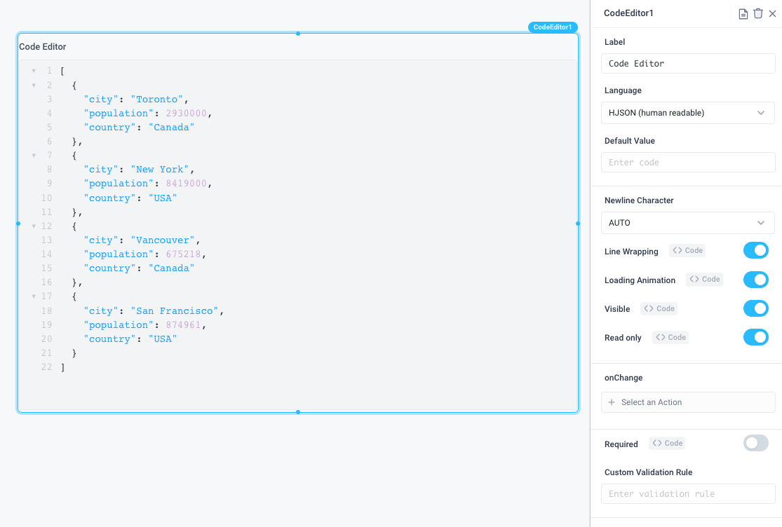
By setting a code editor to read only mode, you're able to view code, for example config files, and validate JSON.

Use custom validation rules
Use the .test() method to evaluate an expression to detect the validity of a user's code. For example, the following regex pattern could be used to ensure that a markdown image is properly formatted (It is assumed that the Language Property of the Code Editor is set to Markdown):
{{/(\!)(\[(?:.*)?\])(\(.*(\.(jpg|png|gif|tiff|bmp))(?:(\s\"|\')(\w|\W|\d)+(\"|\'))?))/gm.test(CodeEditor1.stringValue)}}
