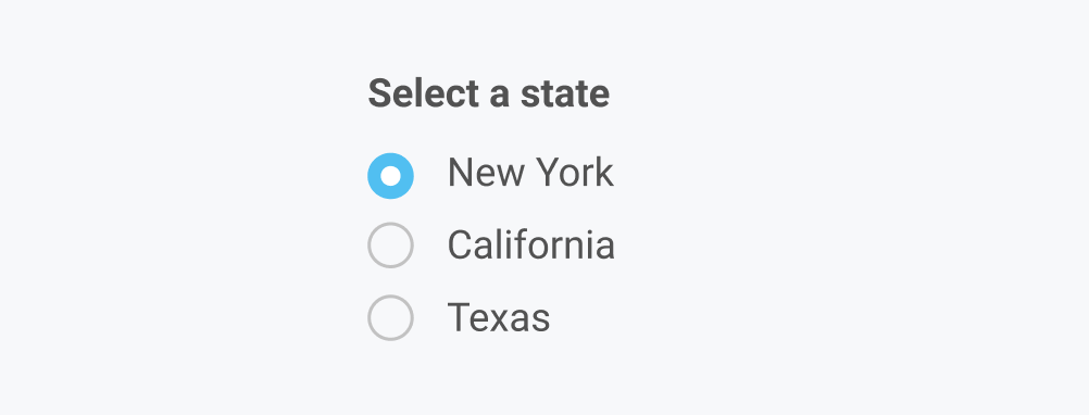
Radio Button
Capture user input where a user must choose one option from a set of options.

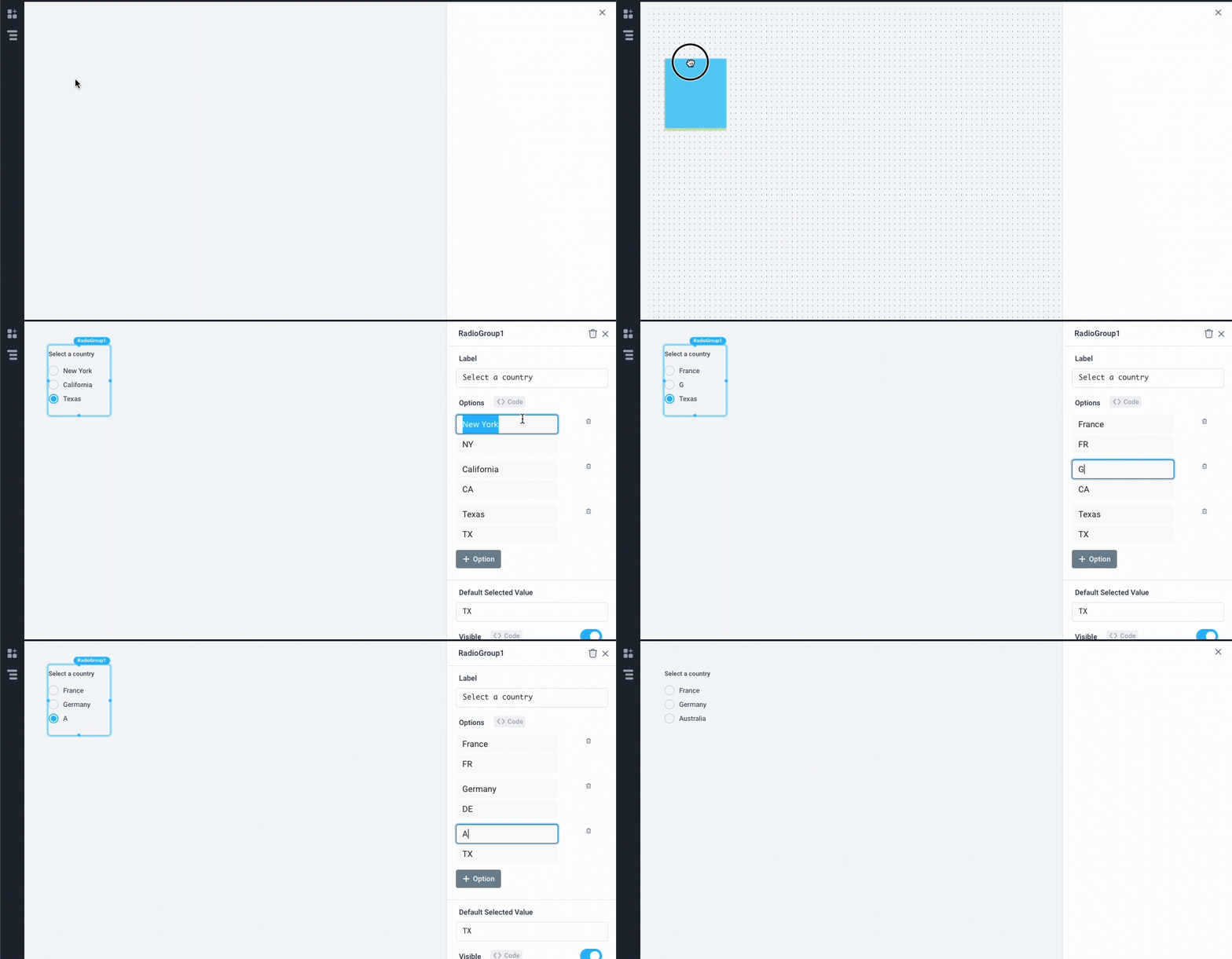
Set radio group label and options
- Drag a Radio component from the Components panel
- In the Properties panel, change the Label and change the label/value pairs for each option

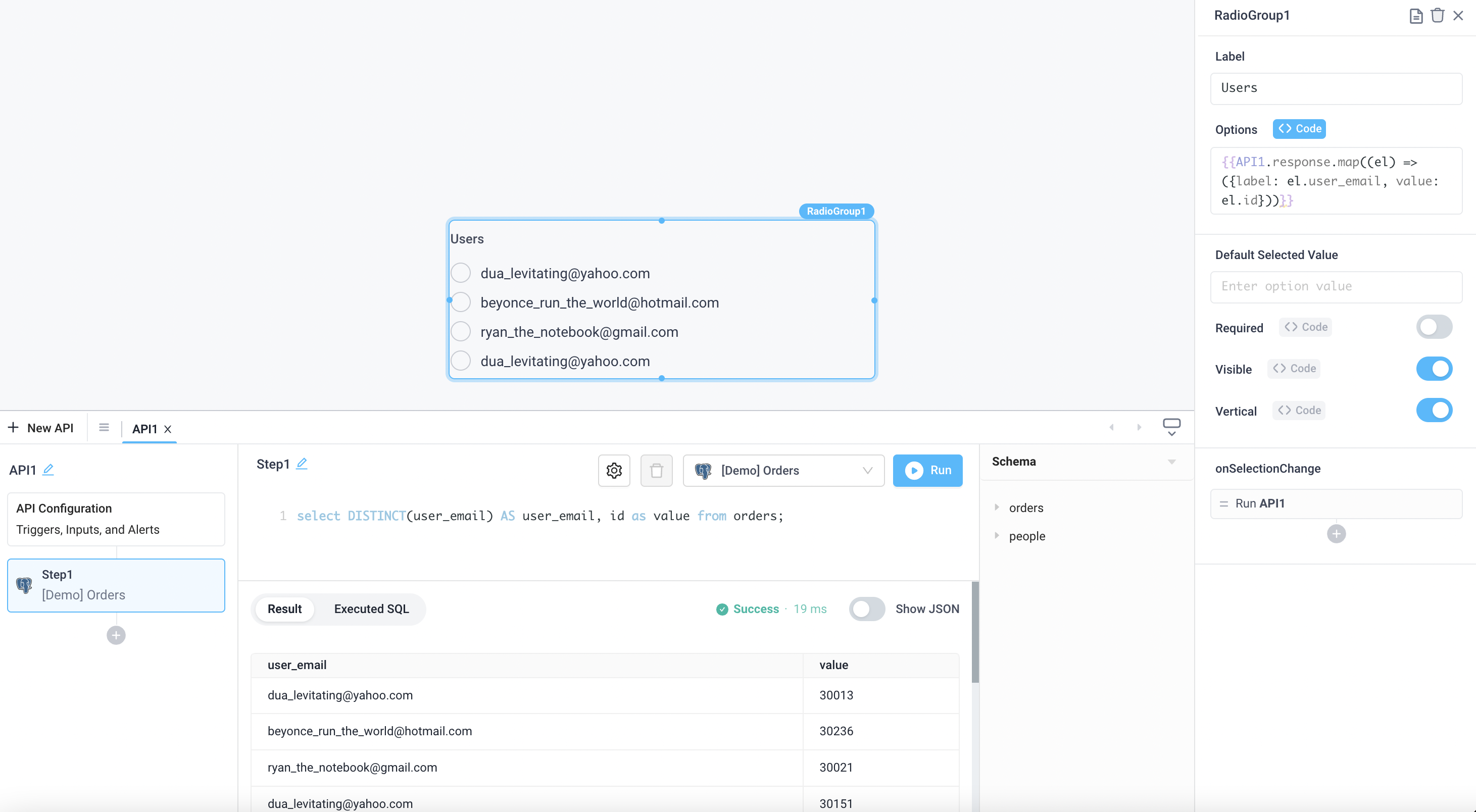
Dynamically set radio options from API response
- Create an API to load data from a data source
- In the Properties panel, change the Options to
code - Select the API response in the code box
The output from the API must be in the following format:
[
  {
    "label": "New York",
    "value": "NY"
  },
  {
    "label": "California",
    "value": "CA"
  }
]
The following example builds the required output directly from a SQL statement:
select DISTINCT(user_email) AS user_email, id as value from orders;
The following example shows how a javascript arrow function can be used to transform data into the required JSON format:
{{API1.response.map((el) => ({label: el.user_email, value: el.id}))}}

Radio Button Properties
Component Properties
| Property | Description |
|---|---|
| Label | Set the text to be above beside the radio button options |
| Options | Add Display and Value of each option |
| Label Text Style | Changes the style (font, size, etc.) of the radio button's label text. Configure styles in the Typography settings |
| Label Text Color | Changes the color of the radio button's label text |
| Option Text Style | Changes the style (font, size, etc.) of the radio button's option text. Configure styles in the Typography settings |
| Option Text Color | Changes the color of the radio button's option text |
| Default Selected Value | Choose the default value |
| Visible | Set true to show and false to hide. Set dynamically using JavaScript with {{}} |
| Vertical | Toggles vertical and horizontal alignment of radio boxes |
| Loading Animation | Controls the loading state of the component, values are a boolean |
| Required | Makes checking this component mandatory, values are a boolean |
Settable Properties
| Property Via Form / Via RunJS | Type | Example Value |
|---|---|---|
Selected Option / selectedOptionValue | string | NY |
Reference Properties
Properties can be accessed from other frontend components and backend APIs by adding the name of the Radio Button component, and dot referencing the property. For a Radio Button named RadioGroup1:
| Property | Description |
|---|---|
RadioGroup1.options | Returns an array of all of the options |
RadioGroup1.selectedOptionValue | Returns a string of the selected value |
RadioGroup1.isVisible | Returns the boolean value of the component's visibility (True, if it is visible) |
RadioGroup1.isRequired | Returns the boolean value of the component's required state (True, if it is required) |
Events
The following events are triggered by user interactions with Radio Button components. Use event handlers to trigger actions in response to user events.
| Table Reference Property | Description |
|---|---|
| onSelectionChange | Run an API every time the Radio Button is clicked |