Image
Display images from any URL hosted in S3, Google or anywhere on the web
Superblocks can automatically render images from a URL. Image URLs can be hardcoded or dynamically generated by binding to other components.
Display an image
By URL
Start by dragging the Image component from the Components panel to the empty canvas. Enter the URL of your image to replace the default.
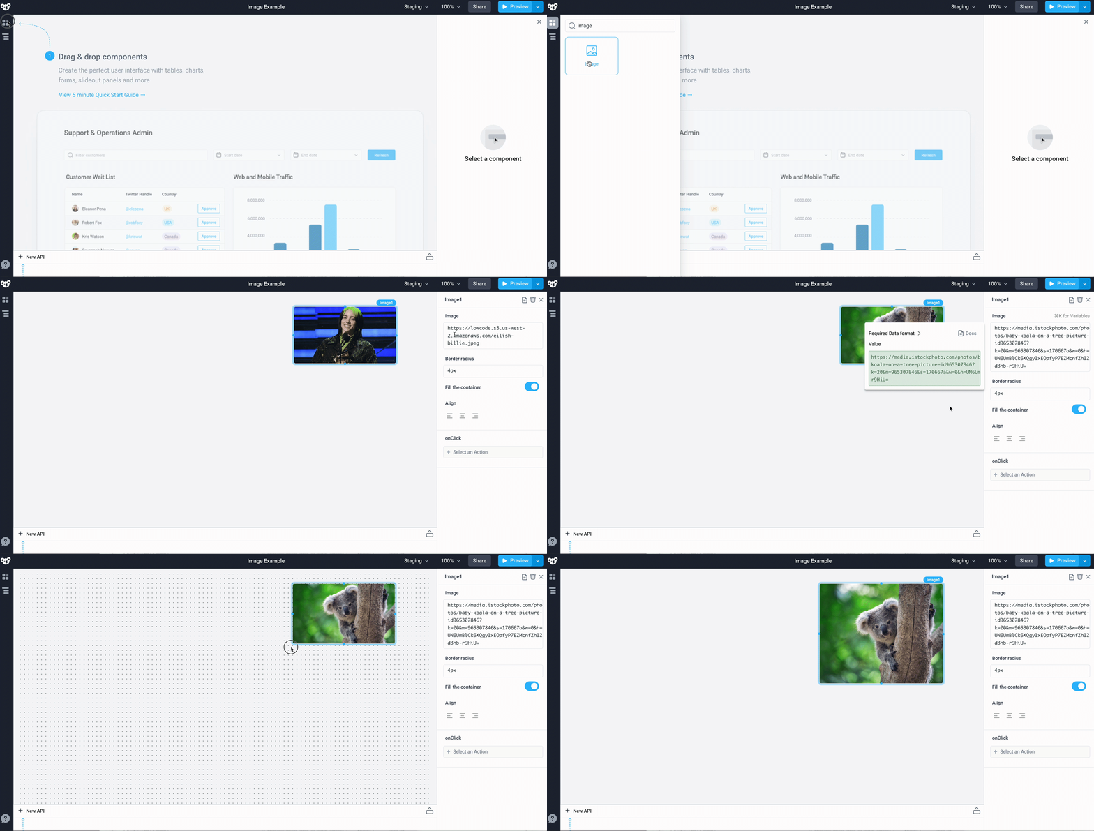
By Data URL / Data URI
Type a data URL into the image property to display the image. Example data URL with a base64 encoded image:
data:image/png;base64,iVBORw0KGgoAAAANSUhEUgAAAAUAAAAFCAYAAACNbyblAAAAHElEQVQI12P4//8/w38GIAXDIBKE0DHxgljNBAAO9TXL0Y4OHwAAAABJRU5ErkJggg==
By Table row selection
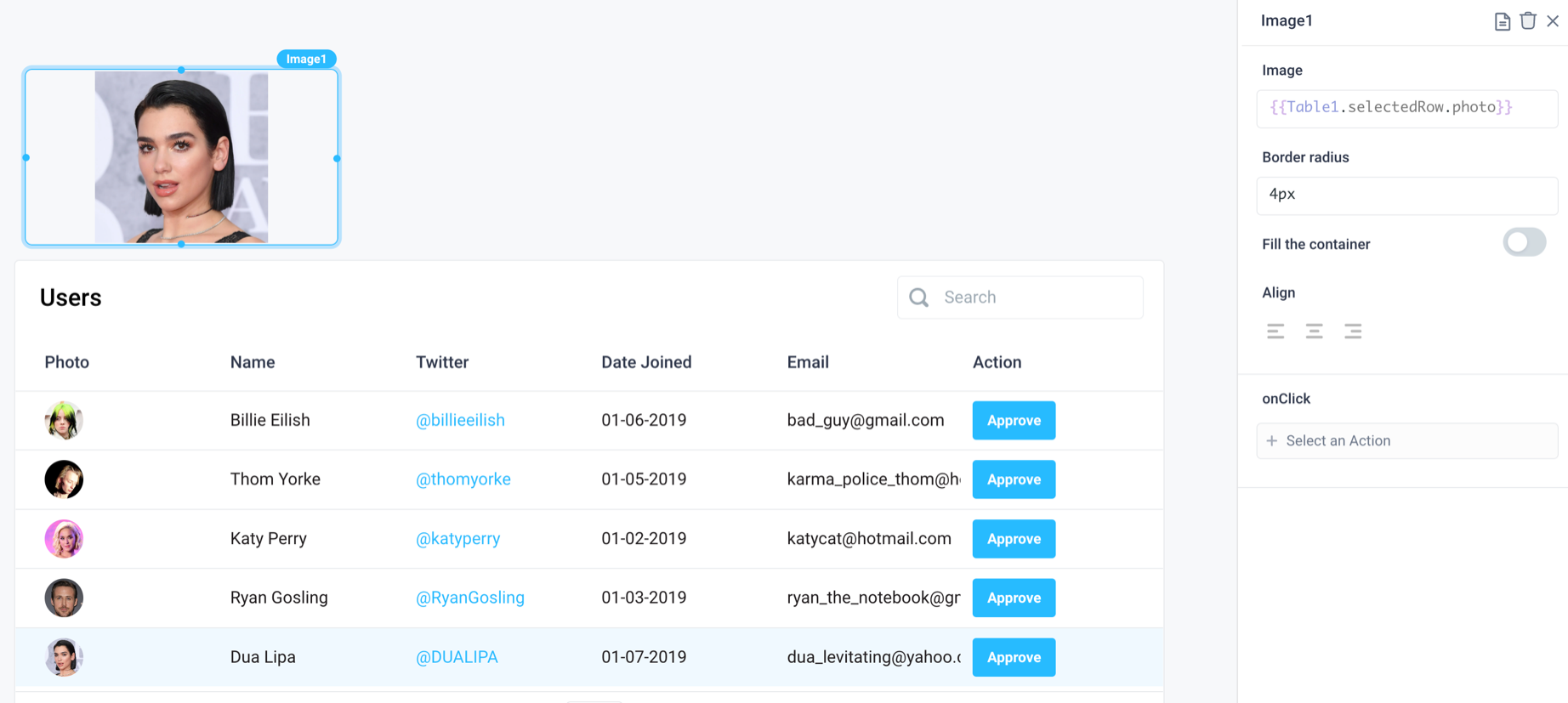
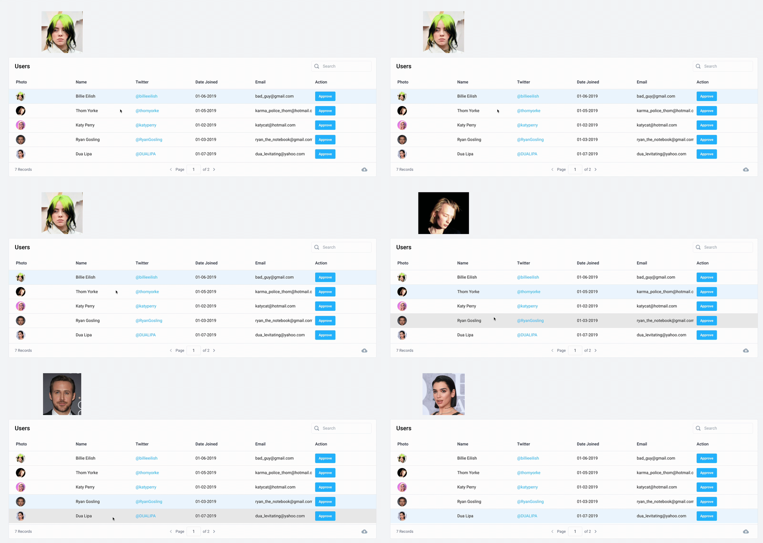
Dynamically populate an image based on another component, like the URL contained in the selected row of a Table:
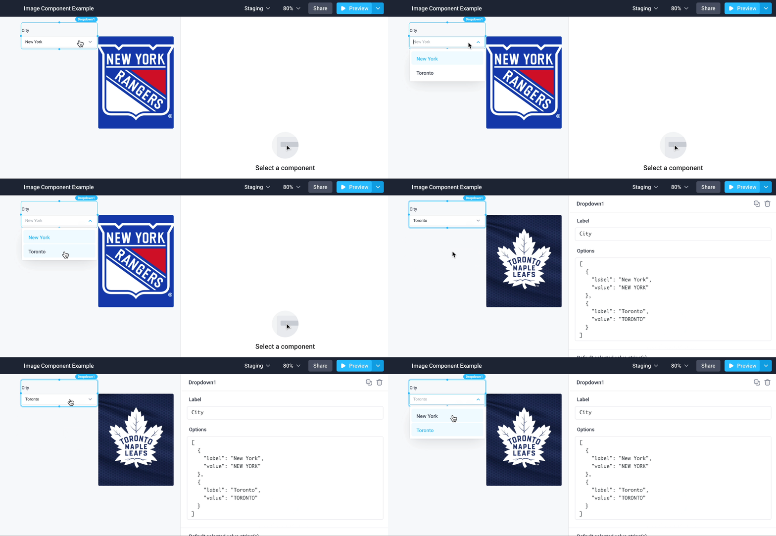
By Dropdown selection
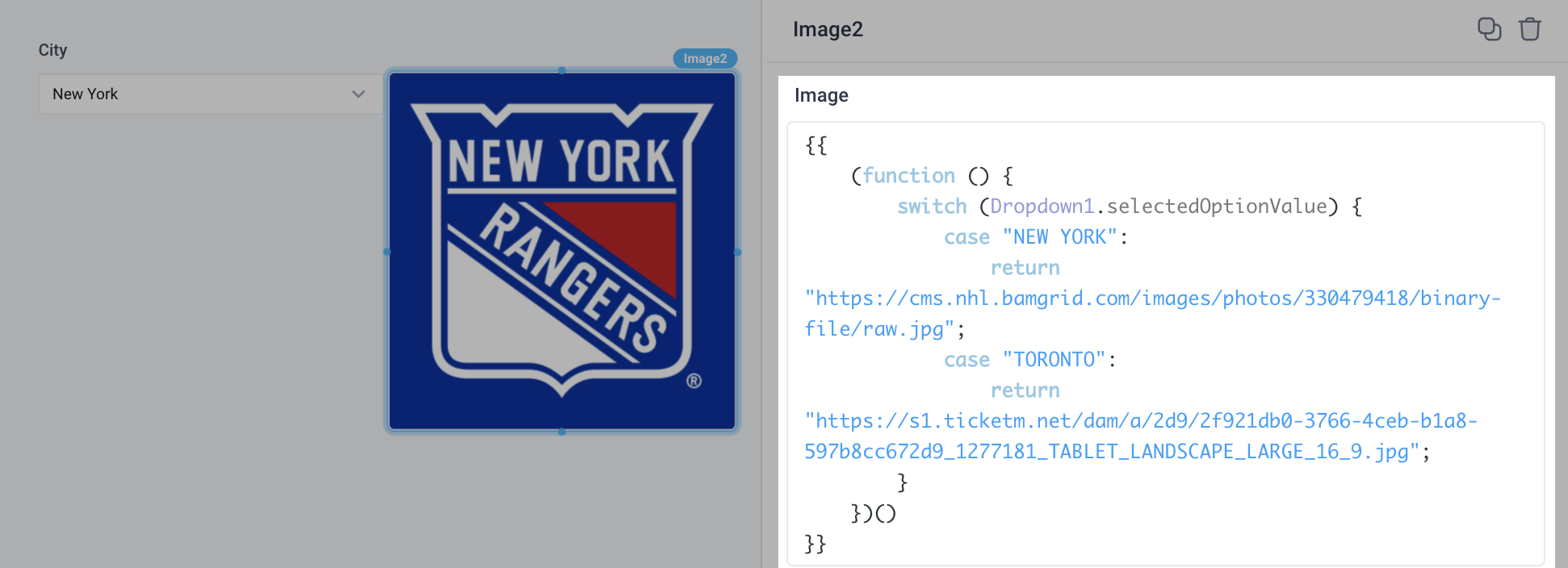
Similarly, use more complex JavaScript expressions to set the image URL. For example, display the image based on the value selected in a Dropdown:
Configure image size and position
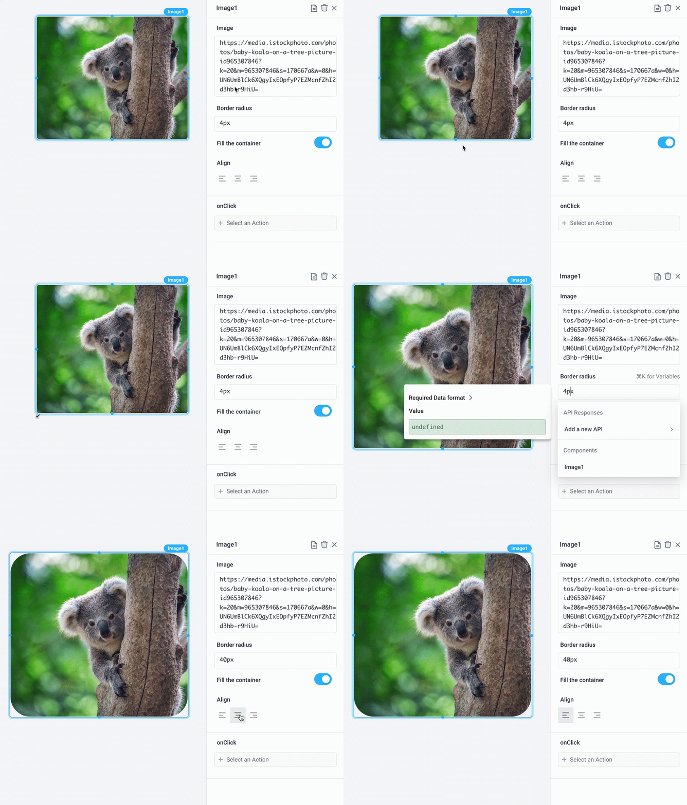
Drag the corners of the image to adjust its size. You can also modify properties for Border radius, Fill the container, and Align to achieve desired look and position of the image:
Add a Trigger on image click
Run any API or open a Slideout panel when the image is clicked.
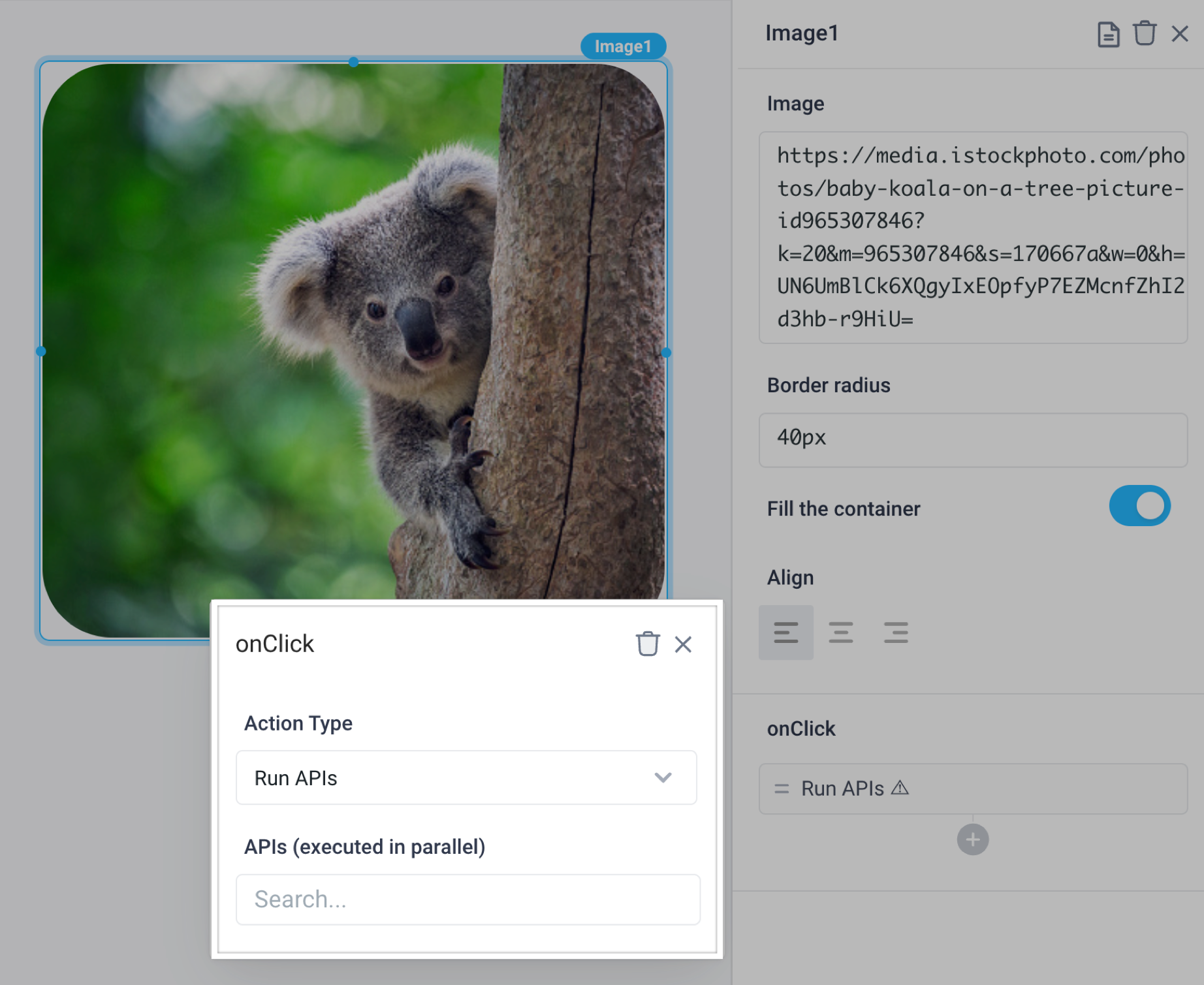
Image Properties
Component Properties
| Property | Description |
|---|---|
| Image | Set the URL or base 64 string of the image and it will automatically render |
| Border radius | Add rounded corners to an image |
| Fill the container | Set the size of the image to cover the available space or keep contained |
| Align | Set the alignment of the image - left, center, or right |
| Loading Animation | Whether iFrame should show loading animation when a dependent API is running, values are a boolean |
Reference Properties
Properties can be accessed from other frontend components and backend APIs by adding the name of the Image, and dot referencing the property. For a Image named Image1:
| Property | Description |
|---|---|
Image1.image | Returns the Image property as a string |
Image1.isVisible | Returns the boolean value of the component's visibility (True, if it is visible) |
Events
The following events are triggered by user interactions with Image components. Use event handlers to trigger actions in response to user events.
| Property | Description |
|---|---|
| onClick | Run an API every time the Radio Button is clicked |