Slideout
Use a Slideout component to open up an overlay within an Application
Create a Slideout
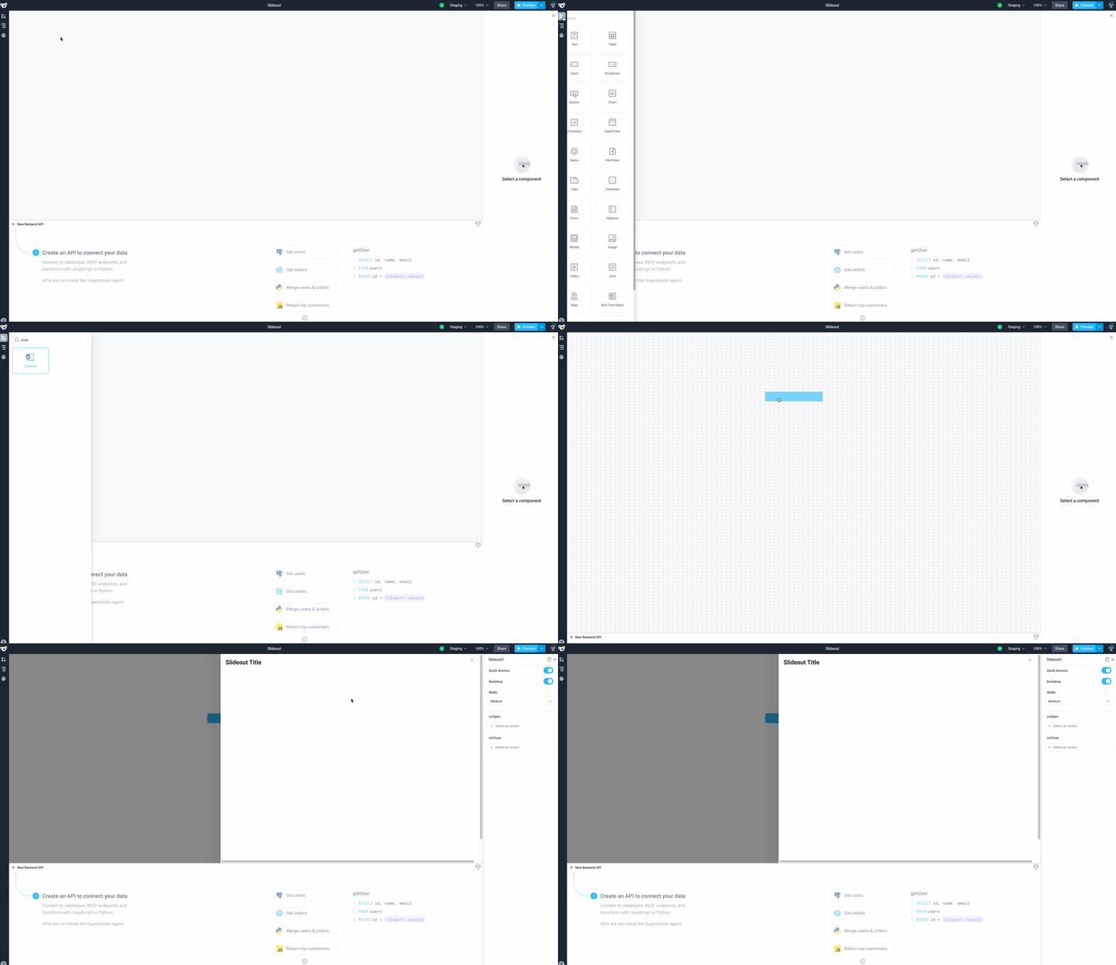
Create a Slideout by dragging a Slideout from the Components panel onto the canvas. When doing so, a Button component will be added to the canvas with an event handler configured onClick to open the Slideout. This can be removed, but note that the Slideout will be hidden until another event triggers it to open. See below for examples for how to open a slideout from a component and from JavaScript.

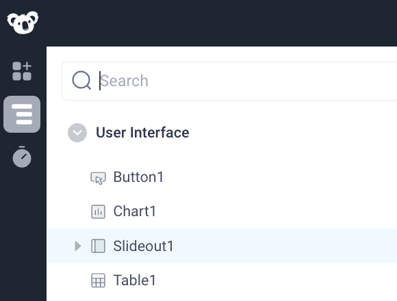
Slideout Navigation: The Slideout component is hidden from the canvas because it only opens when an event is triggered. One way to open and edit event-based components like the Slideout component is to click on Navigation > Slideout1.

Open a Slideout from a Component
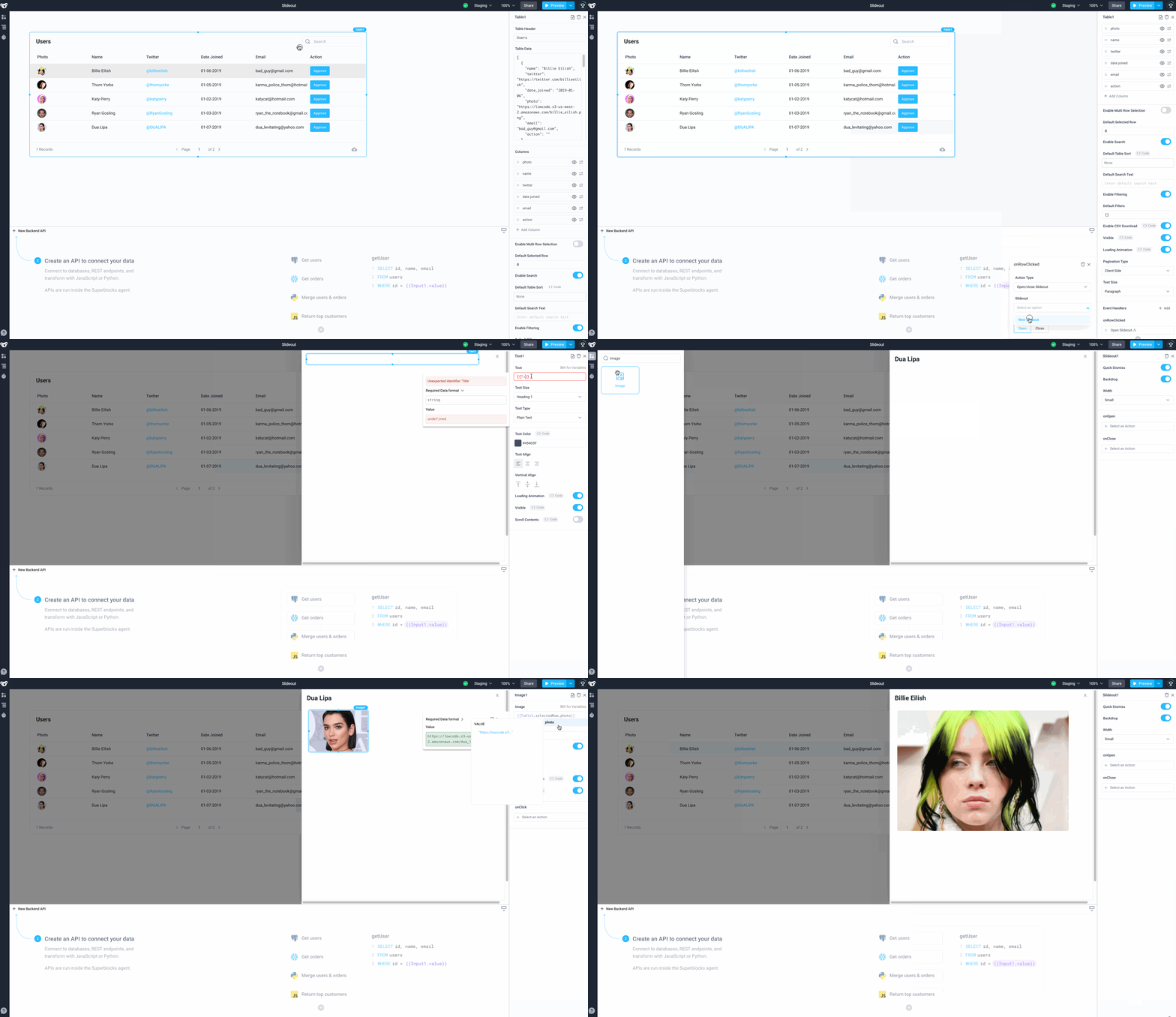
Slideouts can also be created and opened from event handlers within components. Start by dragging a Table component from the Components panel. In the Properties panel, add a trigger under onRowClicked and select the Action Type to be "Open/close Slideout". For Slideout, select "New Slideout".
Populate the Slideout with other components such as the Image component. By default, the Slideout is pre-populated with a Text component that acts as a title, this may be edited or removed as required.

Call a Slideout from JavaScript
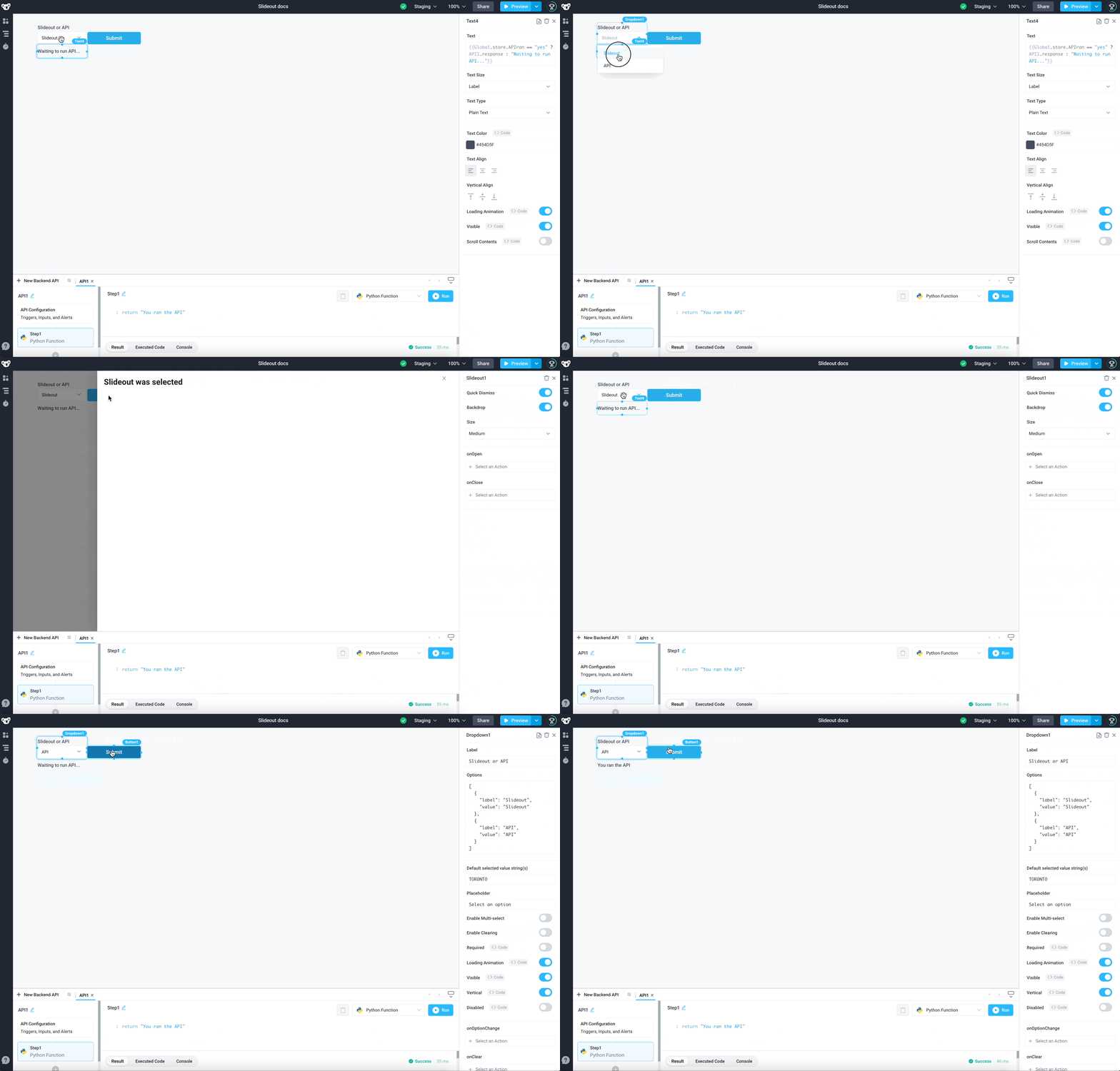
In addition to calling slideouts from the form-based triggers in components, you can leverage Frontend JavaScript to interact with them. These can be called using Slideout1.open() and Slideout1.close() to open open or close the slideout programmatically. See below for an example of using logic based on the state of the application to conditionally open a slideout or run an API.
Full code snippet for the Run JS code within the Button component
if (Dropdown1.selectedOptionValue == "Slideout"){
	Slideout1.open();
	storeValue("APIran", "no");
}
else {
	API1.run()
	storeValue("APIran", "yes");
}
Full code snippet for the Text component
{{Global.store.APIran == "yes" ? API1.response : "Waiting to run API..."}}

Slideout Properties
Component Properties
| Property | Description |
|---|---|
| Quick Dismiss | Allows dismissing the Slideout when a user presses the escape key or clicks the backdrop |
| Backdrop | Enables a backdrop behind the Slideout |
| Width | The Slideout width when open, options are: "Extra Small", "Small", "Medium", "Large" and "Fullscreen" |
Reference Properties
Properties can be access by adding the name of the Slideout component, and dot referencing the property. For a Slideout named Slideout1:
| Property | Description |
|---|---|
Slideout1.isOpen | Returns a boolean of the state of the Slideout (True, if it is open) |
Slideout1.isVisible | Returns the boolean value of the component's visibility (True, if it is visible) |
Slideout1.size | Returns a string of the Slideout's width (EXTRA_SMALL, SMALL, MEDIUM, LARGE, FULLSCREEN) |
Events
The following events are triggered by user interactions with Slideout components. Use event handlers to trigger actions in response to user events.
| Property | Description |
|---|---|
| onOpen | Triggers an action when the Slideout is opened |
| onClose | Triggers an action when the Slideout is closed |