Input
Capture a users inputs like search queries, numbers, emails.
Input components are useful for:
- Capturing user input for Search
- Capturing user data for a Form Submission

Set Input label and placeholder text
Input labels and placeholders are used to describe the purpose of the input and the expected input data type to users.
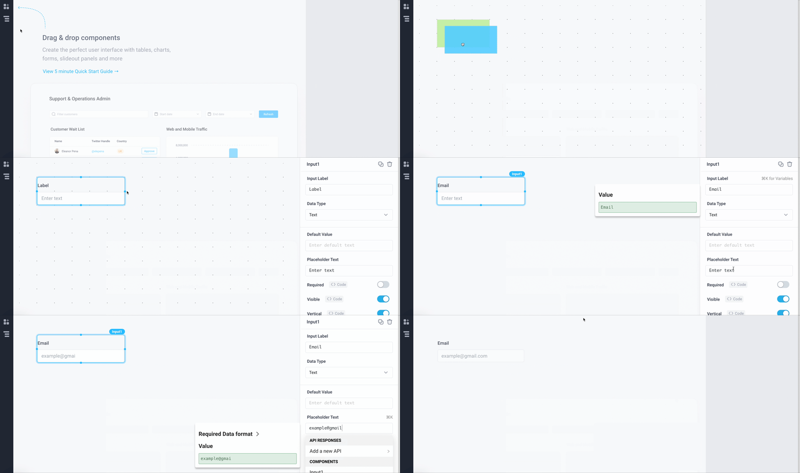
- Drag an Input component from the Components panel
- In the Properties panel, change the Input Label to Email and change the Placeholder Text to 'example@gmail.com'
Input data types and validation
You can specify the expected data type from the Input component. By selecting the expected Data Type, the Input component comes with automatic input validation. For example, if you select the Number Data Type, the Input component restricts the user entry to only numbers. The following data types are supported:
| Data Type | Description | Type Specific Properties | Example |
|---|---|---|---|
| Text (Default) | Accepts all characters and stores them as a string type |
|  |
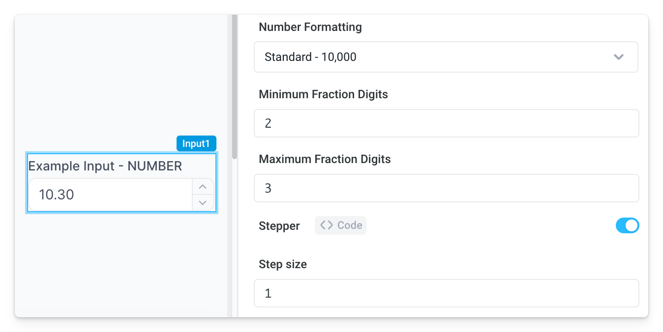
| Number | Only accepts digits and stores them as a float type |
|  |
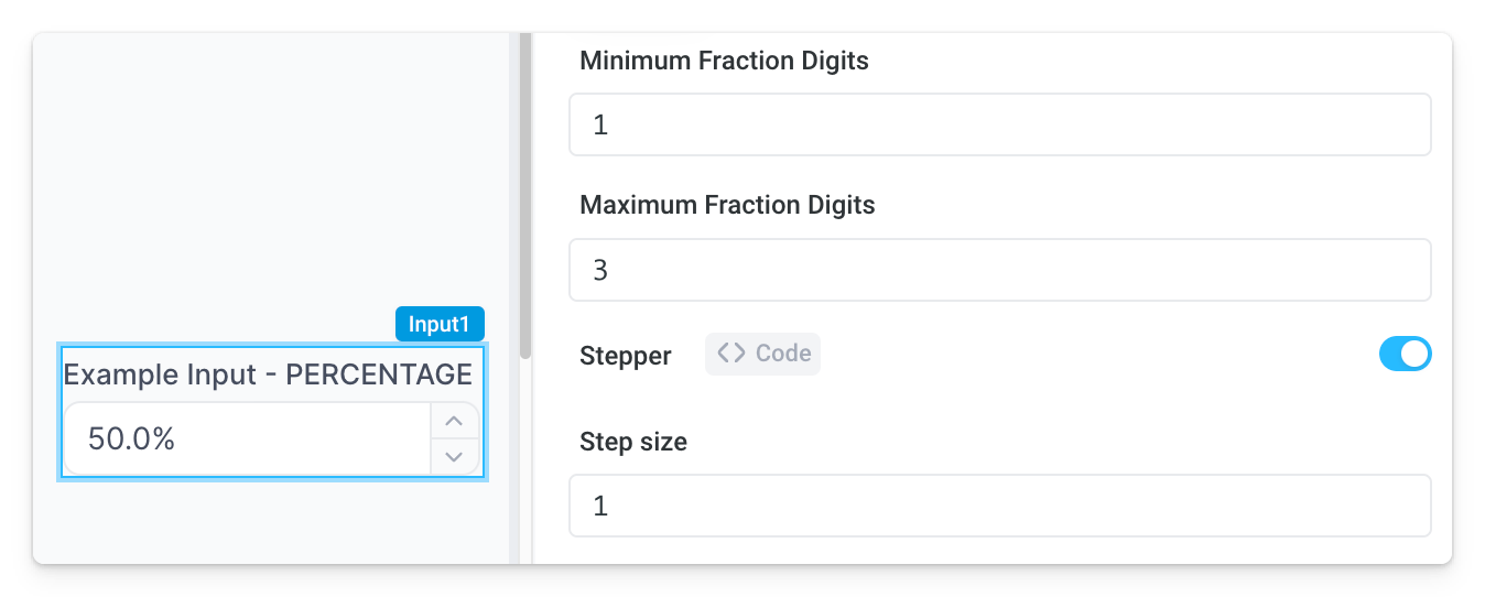
| Percentage | Only accepts digits and automatically adds a % sign |
|  |
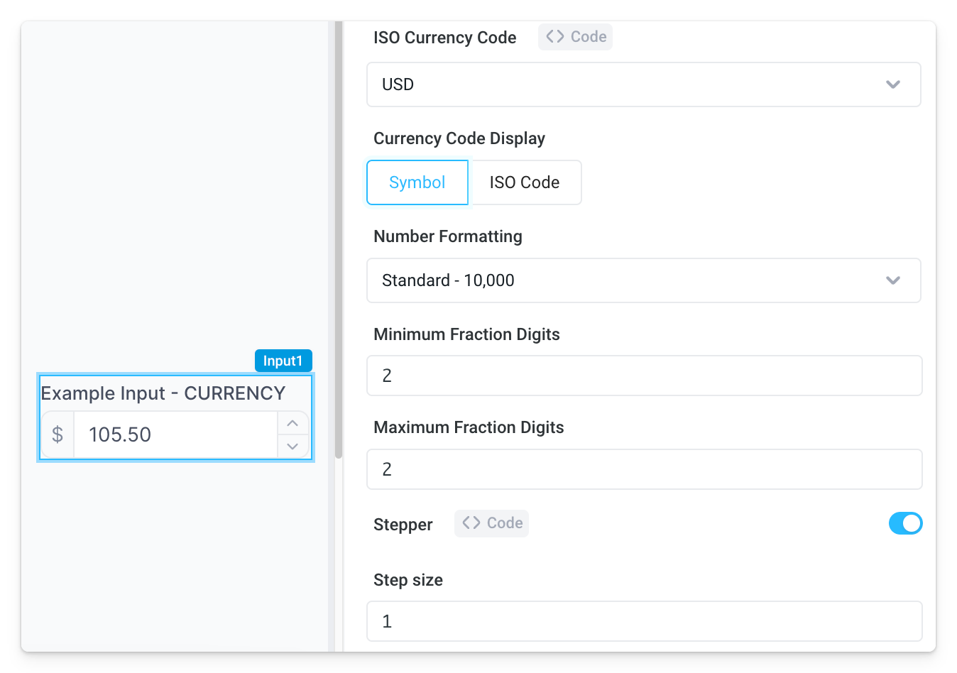
| Currency | Only accepts digits and automatically displays configurable currency code / symbol |
|  |
| Password | Hides input characters and evaluates input as a string type |
|  |
| Validates input is an email and evaluates as a string type |
|  | |
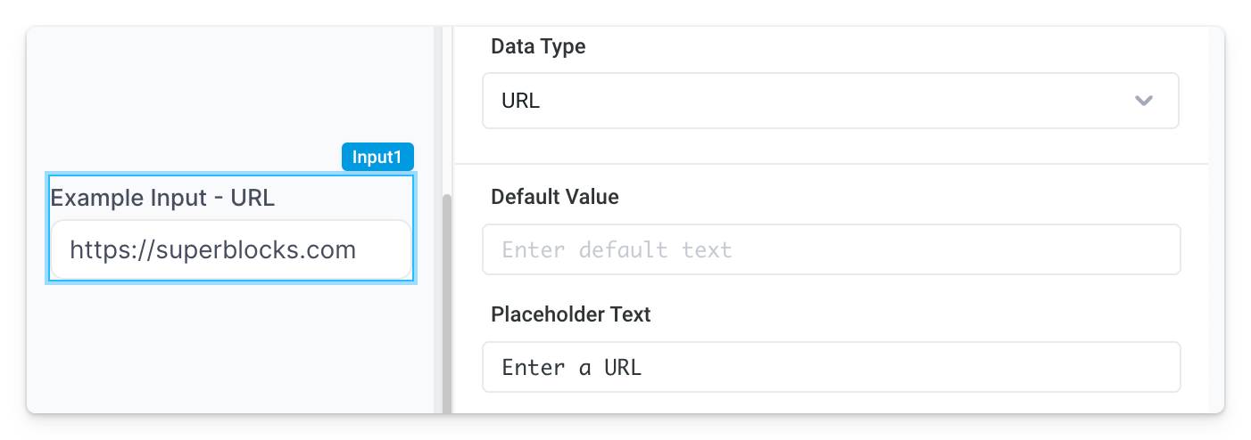
| URL | Validates input is a URL and evaluates as a string type |
|  |
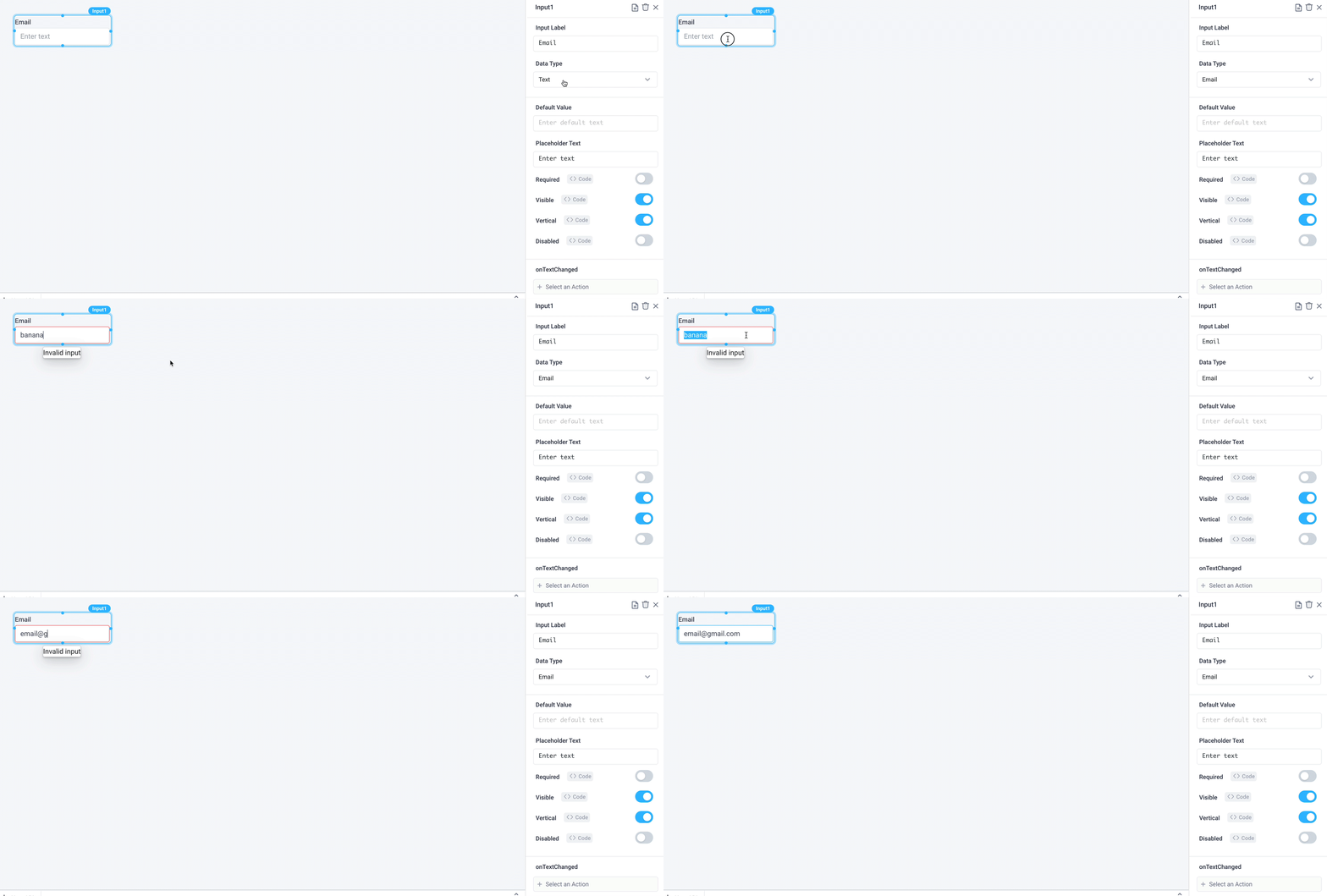
For this guide, set the Data Type to be Email in the Properties panel.
Use Inputs to Filter a table
You can reference the Input data from an API with JavaScript code surrounded by double brackets (e.g. {{ Input1.value }}).
Let’s populate a Table with orders placed from an email specified in the Input field.
- Drag a
Tablefrom the Components panel and rename Table Header to 'Orders' - Remove the example JSON from Table Data and click on Add a new API >
[Demo] OrdersPostgres DB in the autocomplete - Write a SQL query to fetch all the orders where the email is similar to the Input data.
SELECT *
FROM orders
WHERE user_email LIKE {{'%' + Input1.value + '%'}}
Hint: You can also reference the Input value from any UI components with JavaScript code surrounded by double brackets (e.g. {{ Table1.selectedRow.value }})
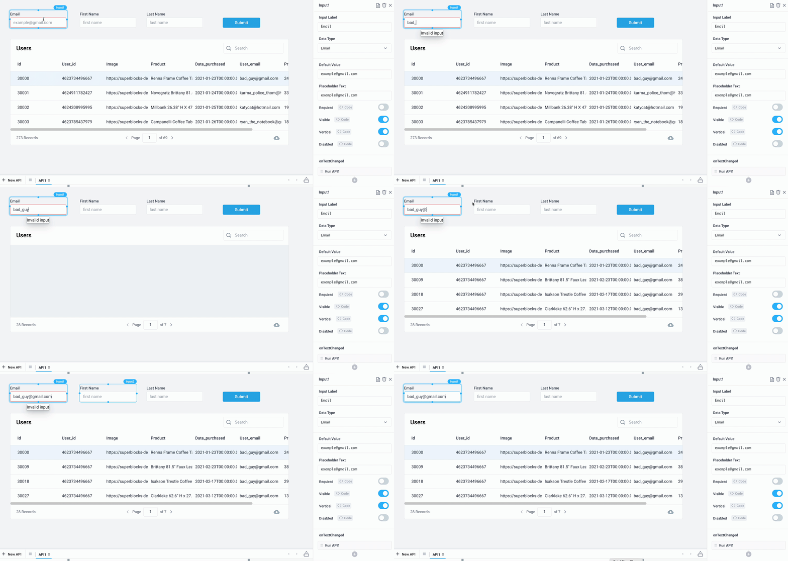
Next, you can trigger APIs as you are entering new data into the Input field using the onTextChanged event.
Let’s dynamically update the Orders table as users are entering data into the Input field.
- Click on the Input component to bring up the Properties Panel
- Choose Run API as the Action Type for the
onTextChangedtrigger and selectAPI1to run
The table should now dynamically fetch orders as you are entering the user email.
Try it out: You can use bad_guy@gmail.com as a test email.
Submit forms when users click a button
You can also use the values from input fields to add new entries to your database. Let’s update this application to allow the submission of new users.
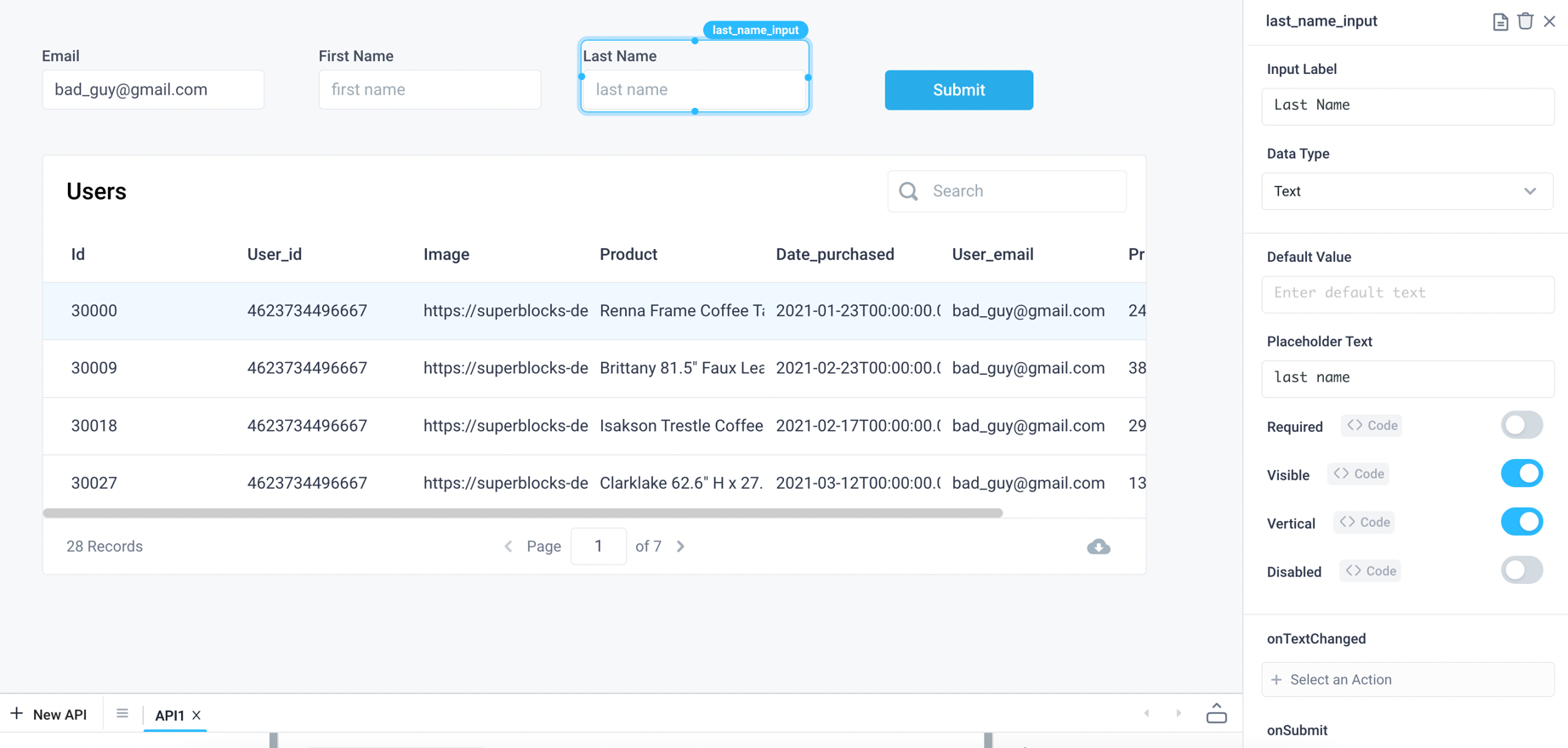
- Rename the existing Input component for the user’s email as 'email_input'
- Add a new Input component for the user’s first name. Update the label to be 'First Name' and rename the component as 'first_name_input'
- Add a new Input component for the user’s last name. Update the label to be 'Last Name' and rename the component as 'last_name_input'
- Add a new Button component with the label as 'Submit'
Next we will need to add an API, called addUser to submit the information into a database table. Write a SQL query to insert a row into the user table using the values from the three Input components. Note: the demo Postgres datastore is read only, you can connect to your own datastore to execute write queries
INSERT INTO users (first_name, last_name, email)
VALUES ({{first_name_input.value}}, {{last_name_input.value}}, {{email_input.value}});
Update the Submit button to run the addUser API when clicked.

Now you can update the users table with a new user directly from this application. Add a table component that shows the current list of users by using an API to pull the information from the users table.
- Add a new API called
getUsersto grab all users from the user table with the following SQL query:
SELECT * FROM users;
- Remove the example JSON from Table Data and set
getUsers.responseas the source of data for the table - Update the submit Button component to run the
getUsersAPI after runningaddUserAPI
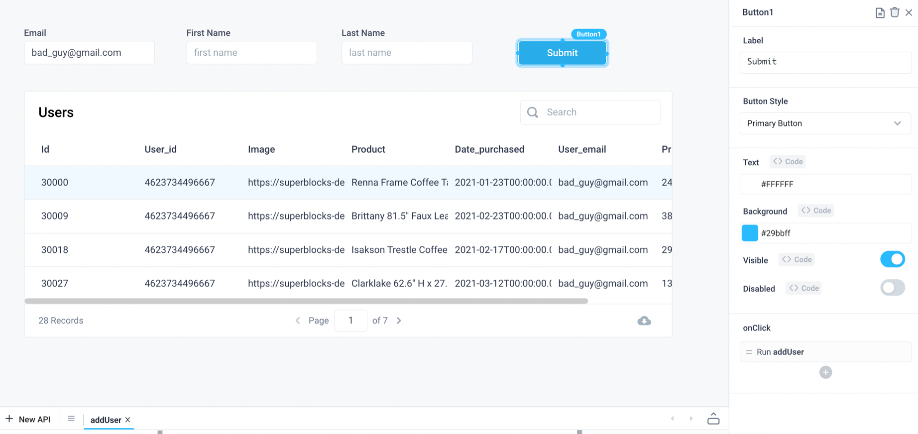
Now when new users are added to your database, the Table component will be updated to show the most current list of users.
Converting Input into a multi-line text area
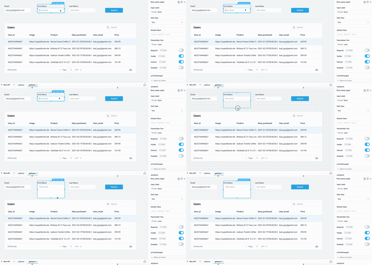
Multi-line text areas are helpful to allow users to input and edit large texts such as writing comments or reviews.
You can convert a single-line Input into a multi-line text area by simply enlarging the input field with your cursor. Use shift+enter in order to insert a new line into the Input component.
Use custom validation rules
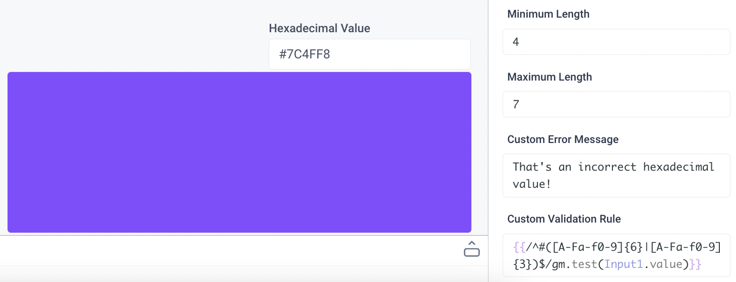
Use the .test() method to evaluate an expression to detect the validity of a user's input. For example, for an Input component called Input1, the following regex pattern will validate proper hexadecimal values and throw an error message when invalid:
{
  {
    /^#([A-Fa-f0-9]{6}|[A-Fa-f0-9]{3})$/gm.test(Input1.value);
  }
}
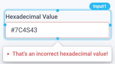
When the user inputs an invalid value, the Custom Error Message will appear alerting the user.
Input Properties
Component Properties
| Property | Description |
|---|---|
| Label | Set the text to be displayed above the input field |
| Data Type | Set the data type for automatic validation, options are Text, Number, Password, Email |
| Default Value | Set the default text for the component |
| Placeholder Text | Set a placeholder text for the input |
| Icon | Select an icon |
| Icon Position | Sets the alignment of the icon |
| Label Text Style | Changes the style (font, size, etc.) of the input's label text. Configure styles in the Typography settings |
| Label Color | Changes the color of the input's label text |
| Input Text Style | Changes the style (font, size, etc.) of the input's text. Configure styles in the Typography settings |
| Input Text Color | Changes the color of the input's text |
| Loading Animation | Controls the loading state of the component, values are a boolean |
| Visible | Controls the visibility of the component, values are a boolean |
| Vertical | Toggle the location of the label text, values are a boolean |
| Disabled | Disables user interaction with this component, values are a boolean |
| Required | Makes filling out this component mandatory, values are a boolean |
| Minimum Length | Minimum allowable length for the user's input |
| Maximum Length | Maximum allowable length for the user's input |
| Custom Error Message | Custom error message to be shown if user's input is invalid |
| Custom Validation Rule | Custom rule that must evaluate to a boolean, will throw the Custom Error Message if false |
Settable Properties
| Property Via Form / Via RunJS | Type | Example Value |
|---|---|---|
Text / text | string | "value" |
Reference Properties
Properties can be accessed from other frontend components and backend APIs by adding the name of the Input component, and dot referencing the property. For an Input component named Input1:
| Property | Description |
|---|---|
Input1.value | Returns the current value of the component |
Input1.isVisible | Returns the boolean value of the component's visibility (True, if it is visible) |
Input1.isDisabled | Returns the boolean value of the component's disabled state (True, if it is disabled) |
Input1.isValid | Validates the input based on the Data Type and Validation Rule, returns a boolean |
Events
The following events are triggered by user interactions with Input components. Use event handlers to trigger actions in response to user events.
| Property | Description |
|---|---|
| onTextChanged | Triggers an action when the text is changed |
| onSubmit | Triggers an action when the user presses enter/return |
| onFocus | Triggers an action when the input gets focus |
| onFocusOut | Triggers an action when the input loses focus |