Key Value
The Key Value component provides an intuitive way for developers to visualize an object's key and value pairs in a clear and organized manner.
This component is designed to make it easier to display and manage data structures by showing each key alongside its corresponding value.
Key Value Properties
Component Properties
| Property | Description |
|---|---|
| Content | |
| Source data | The object to be displayed within the component |
| Key value pairs | Keys corresponding to the values within an object. |
| Appearance | |
| Key position | Position the keys above or to the side of the value. |
| Key style | Changes the style (font, size, color, etc.) of the keys. Configure styles in the Typography settings |
| Value style | Changes the style (font, size, color, etc.) of the values. Configure styles in the Typography settings |
| Wrap key | If enabled, the key text will wrap. |
| Wrap value | If enabled, the value text will wrap. |
| Background | Changes the color of the background. |
| Border | Controls the border of the component. |
| Border radius | Controls the border radius of the component. |
| Divider | Display dividers between key value pairs. |
| Layout | |
| Padding | Controls padding. |
| Spacing | Control spacing between each key-value pair. |
| Width | Controls the width of the component. |
| Height | Controls the height of the button. |
| Key width | Control the width of the key container. Can specify a fixed width in pixels or a fluid width as a percentage of the component's width |
| Value alignment | Position the value to the right or left |
| Visible | Controls whether the button is visible or not |
| Collapse when invisible | When enabled, other components shift up to occupy the space left by this component. If disabled, the component is hidden but leaves blank space. Has no effect when viewing in edit mode |
Reference Properties
Properties can be accessed from other frontend components and backend APIs by adding the name of the Key Value component, and dot referencing the property. For a Key Value component named KeyValue1:
| Property | Description |
|---|---|
KeyValue1.isVisible | Returns whether the component is visible |
KeyValue1.data | Returns the data structure that includes the original data and any custom Key Value pairs not present in the source data |
KeyValue1.sourceData | Returns the original data that populates the Key Value component. |
Example Usage:
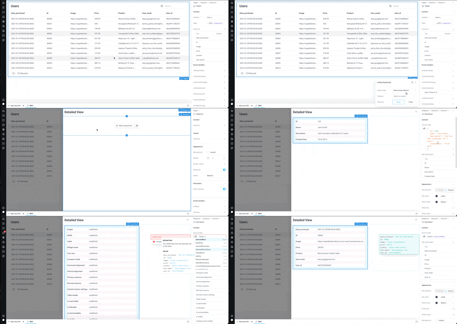
Display table row data within slide out
- Set your table component's
onRowSelectedevent handler to open/close a slideout. - Select an existing slideout or create a new one.
- Select a row on your table to open the slideout.
- Add the new Key-Value component anywhere you like on the slideout.
- Set the component's source data to
<TableName>.selectedRow.