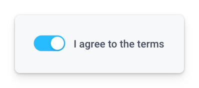
Switch
The Switch component is designed for capturing binary choices with clear visual indicators for 'On' and 'Off' states. It offers customization options for labels and is ideal for simple on/off decisions, with accessibility considerations for all users.

Switch Properties
Component Properties
| Property | Description |
|---|---|
| Label | The label to be displayed besides the switch |
| Label Text Style | Changes the style (font, size, etc.) of the switch's label text. Configure styles in the Typography settings |
| Label Text Color | Changes the color of the switch's label text |
| Label Position | The position of the label, options are "Left" or "Right" |
| Default State | Whether the switch is toggled on by default, values are a boolean |
| Required | Requires that the switch is toggled on for form submission, values are a boolean |
| Visible | Controls the visibility of the component, values are a boolean |
| Disabled | Disables user interaction with this component, values are a boolean |
Reference Properties
Properties can be accessed from other frontend components and backend APIs by adding the name of the Switch component, and dot referencing the property. For a Switch named Switch1:
| Property | Description |
|---|---|
Switch1.isDisabled | Returns the boolean value of the switch's disabled state (True, if it is disabled) |
Switch1.isRequired | Returns the boolean value of if the switch is require (True, if it is required) |
Switch1.isVisible | Returns the boolean value of the switch's visibility (True, if it is visible) |
Switch1.isToggledOn | Returns the switch's state (True, if it is toggled on) |
Switch1.label | Returns the switch's label as a string |
Switch1.labelPosition | Returns the switch's label position as a string |
Events
The following events are triggered by user interactions with Switch components. Use event handlers to trigger actions in response to user events.
| Table Reference Property | Description |
|---|---|
| onSwitchChange | Triggers an action when the switch state is changed |