Button
The Button component is an interactive element activated by a user’s mouse click. When clicked, it performs a predefined action, such as executing an api, submitting a form, navigating to a URL, and much more!

Button Properties
Component Properties
| Property | Description |
|---|---|
| Content | |
| Label | Sets the label of the button |
| Appearance | |
| Button style | Changes the style of the button, options are Primary, Secondary, or Tertiary |
| Icon | Selects an icon to be displayed in the dropdown input. If the selected option has its own icon, it will override this icon |
| Icon position | Sets the alignment of the icon |
| Label text style | Changes the style (font, size, etc.) of the button's text. Configure styles in the Typography settings |
| Label alignment | Set the horizontal alignment of the button label |
| Label color | Changes the color of the label |
| Background | Changes the color of the background |
| Border | Controls the Borders of the component |
| Border radius | Controls the border radius of the component |
| Loading animation | Display a loading animation if dependent data is loading |
| Visible | Controls the visibility of the component, values are a boolean |
| Layout | |
| Padding | Controls padding |
| Width | Controls the width of the button |
| Height | Controls the height of the button |
| Visible | Controls whether the button is visible or not |
| Collapse when invisible | When enabled, other components shift up to occupy the space left by this component. If disabled, the component is hidden but leaves blank space. Has no effect when viewing in edit mode |
| Interaction | |
| Disabled | Disables user interaction with this component, values are a boolean |
Reference Properties
Properties can be accessed from other frontend components and backend APIs by adding the name of the Button component, and dot referencing the property. For a Button named Button1:
| Property | Description |
|---|---|
Button1.isVisible | Returns the boolean value of the button's visibility (True, if it is visible) |
Button1.isDisabled | Returns the boolean value of the button's disabled state (True, if it is disabled) |
Button1.text | Returns the button's label as a string |
Events
The following events are triggered by user interactions with Button components. Use event handlers to trigger actions in response to user events.
| Table Reference Property | Description |
|---|---|
| onClick | Triggers an action when the button is clicked |
Example Usage:
Execute an API
- Create a backend api using the postgres [Demo] Orders integration found in every Superblocks account.
select * from orders - Set the
OnClickevent handler as shown below: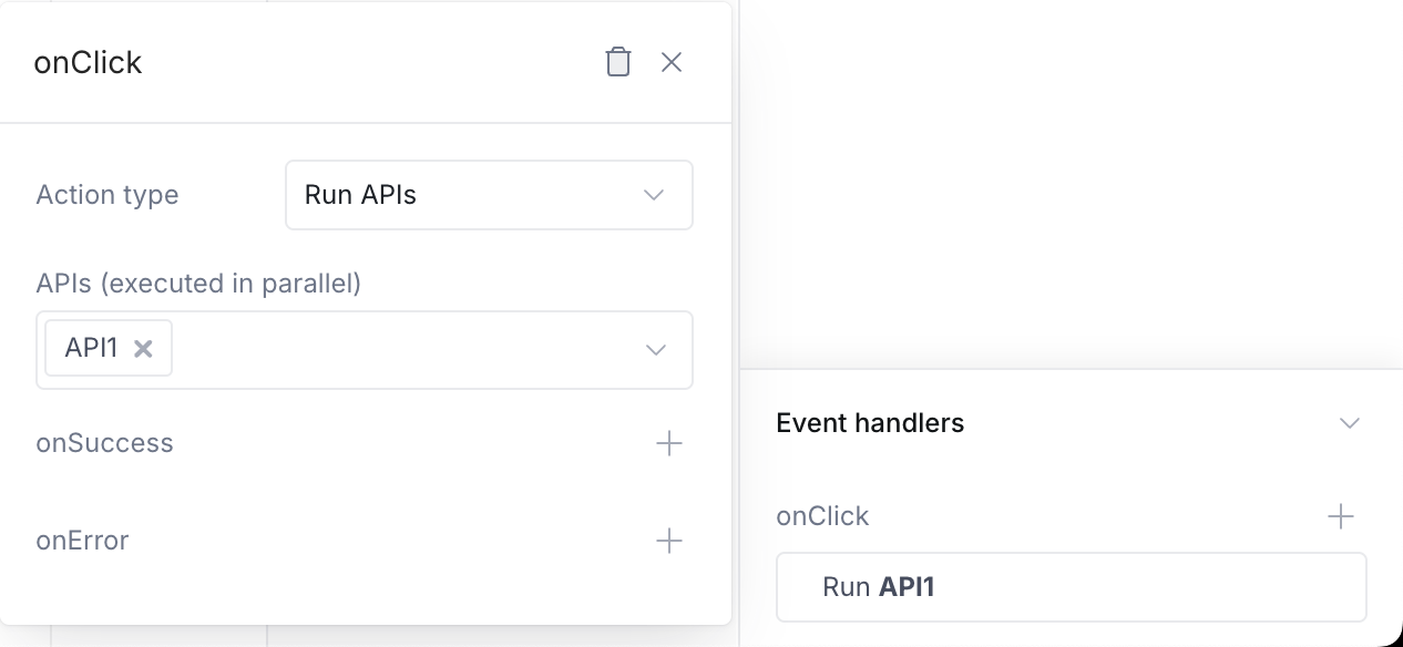
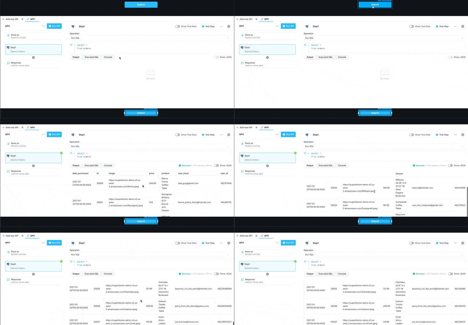
- You're done! Once the button is clicked it will execute the api as shown below:
Disable buttons based on other component's state
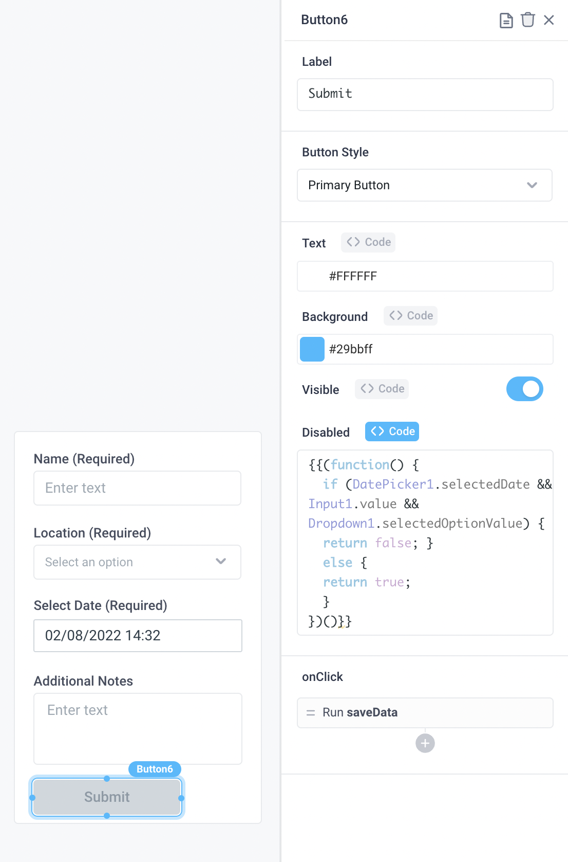
You can disable the button component based on the state of other component. This allows you to ensure the end user has properly filled out a form before being able to submit the data, for instance. Click on the "Code" button in the Properties Panel for a Button component to be able to use javascript within the component. The following code block is used in the below example:
{
  {
    (function () {
      if (
        DatePicker1.selectedDate &&
        Input1.value &&
        Dropdown1.selectedOptionValue
      ) {
        return false;
      } else {
        return true;
      }
    })();
  }
}
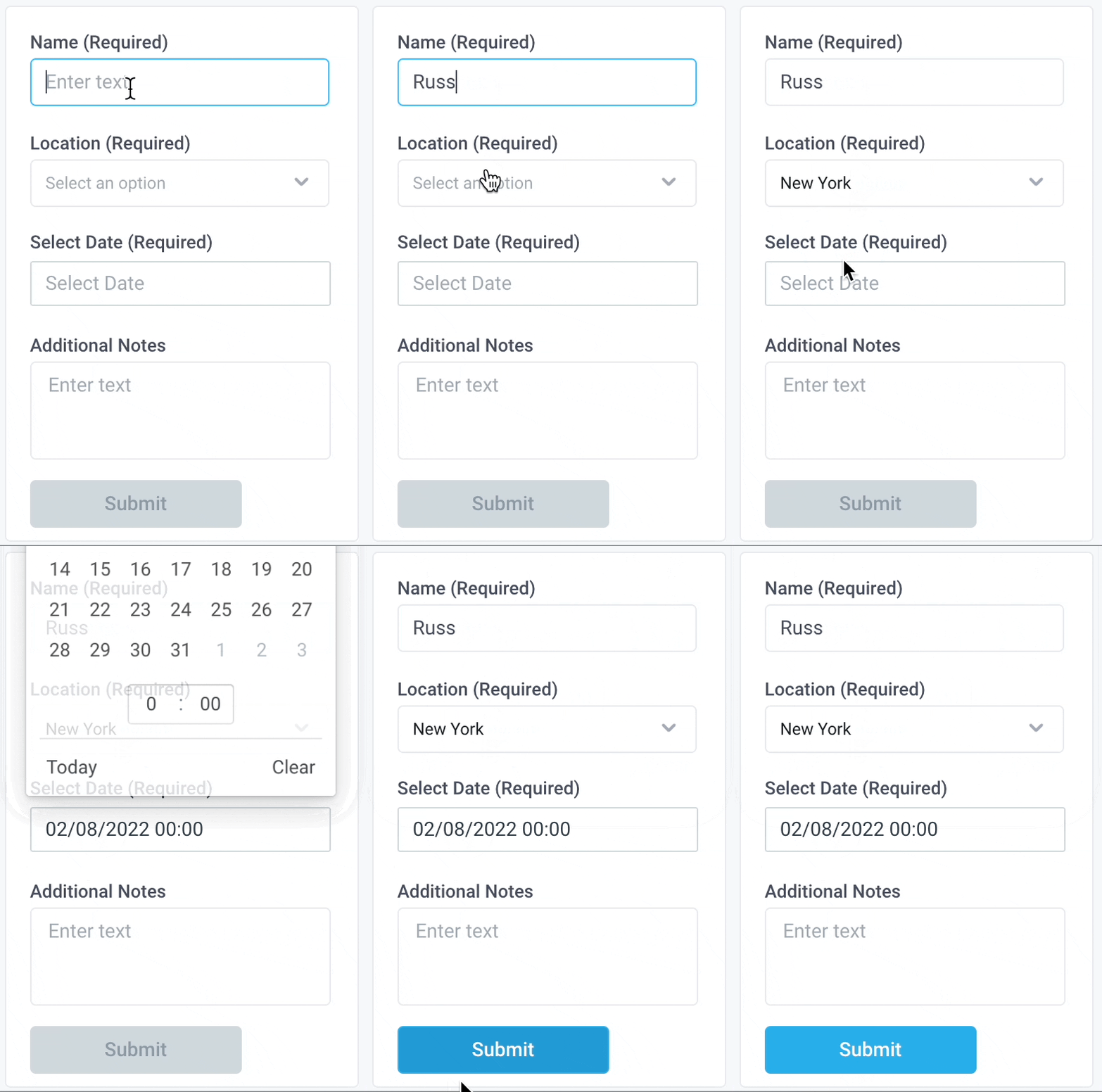
Create a dynamic query editor
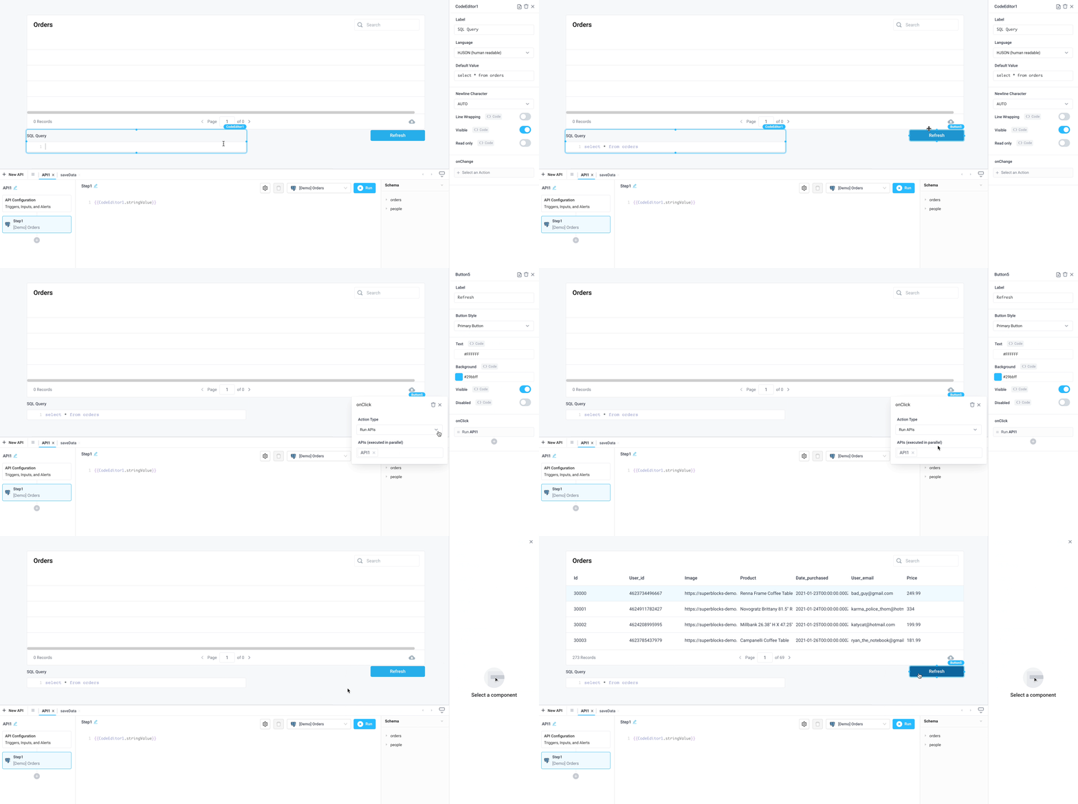
- Add a Code Editor component from the Components panel to the canvas
- In the Properties panel, change the Default Value to:
select * from orders
- Add a Table component from the Components panel to the canvas
- In the Properties panel, change the Table Data to a new API referencing the
[Demo] Orderspostgres database - In the API step, add the following SQL query:
{{CodeEditor1.stringValue}}
- Add a Button component from the Components panel to the canvas
- Update the Button label to "Refresh"
- In the onClick section choose Run APIs as Action Type and API1 for APIs (executed in parallel)
Now, when you change the SQL query in the Code Editor and click Refresh, the table will re-populate accordingly!
