Grid
Display a list or tile view for search results, recommendations, or pages using a repeating cell pattern. Click a cell to open a page or slideout panel.
Add data to a grid
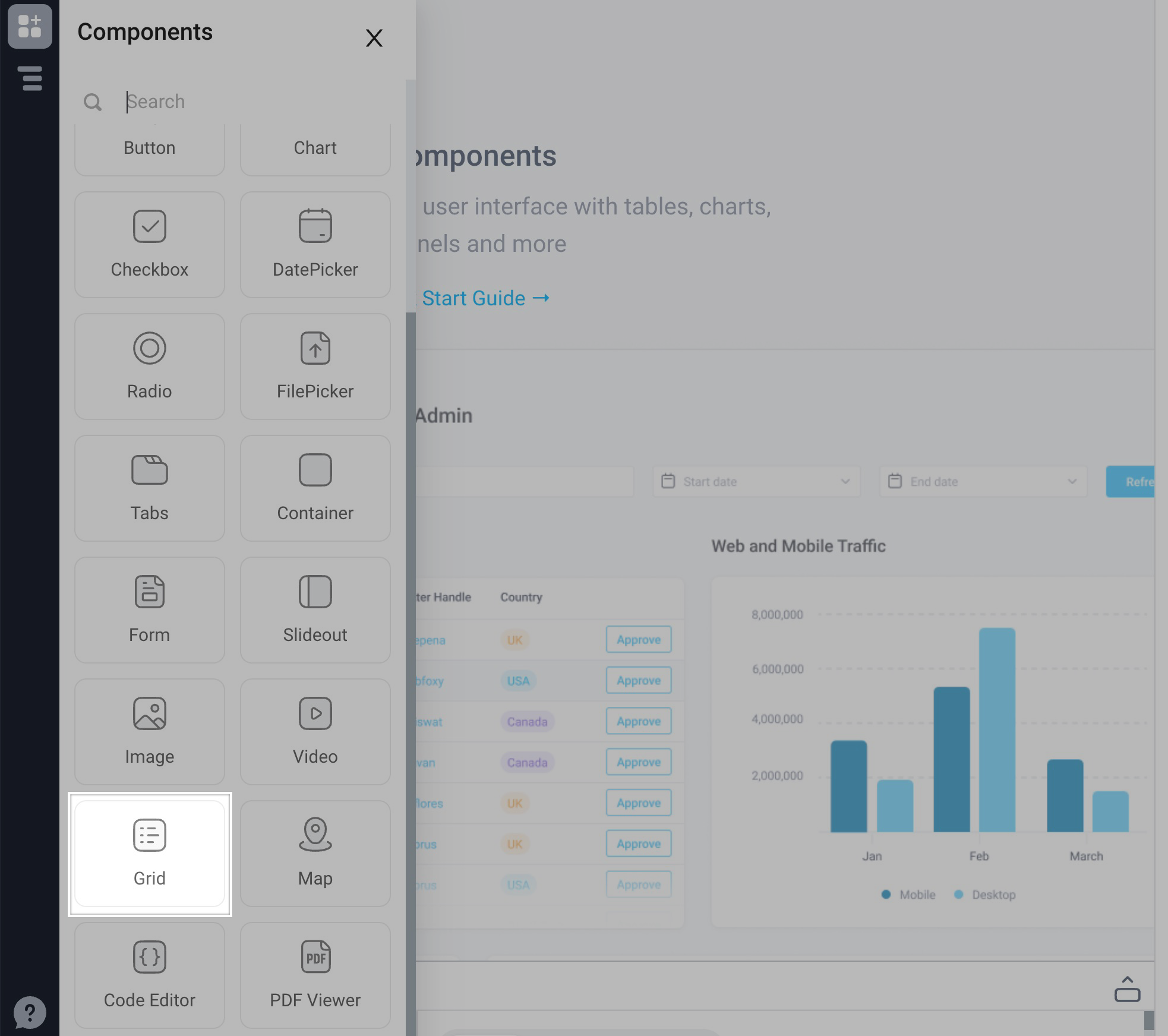
Start by dragging the Grid component from the Components panel to the empty canvas.
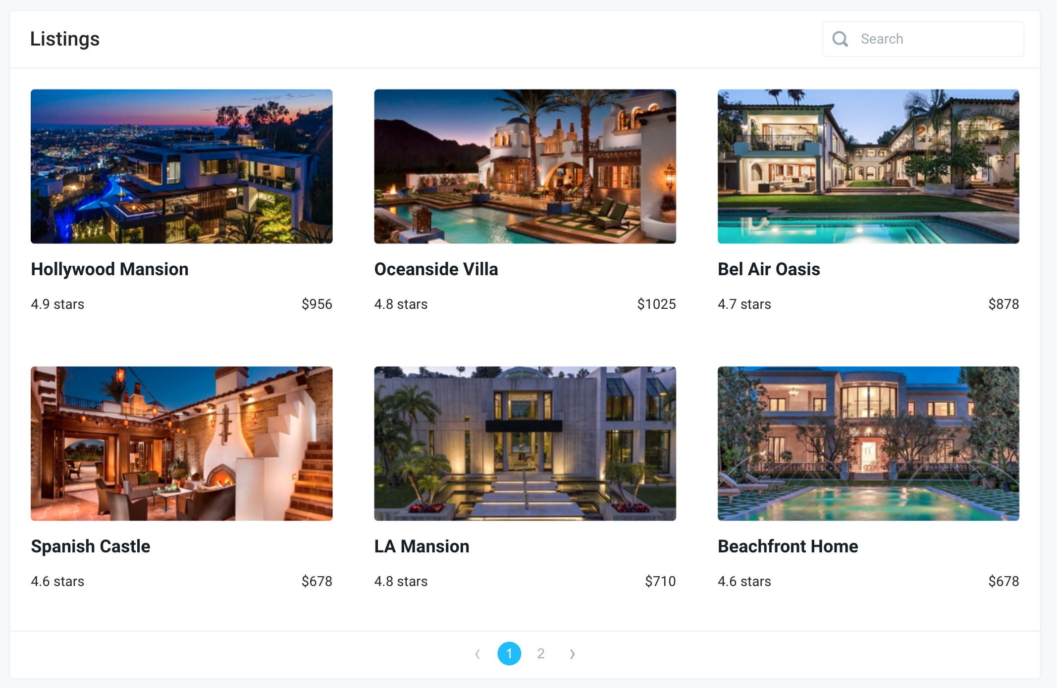
The grid will load with an example dataset.
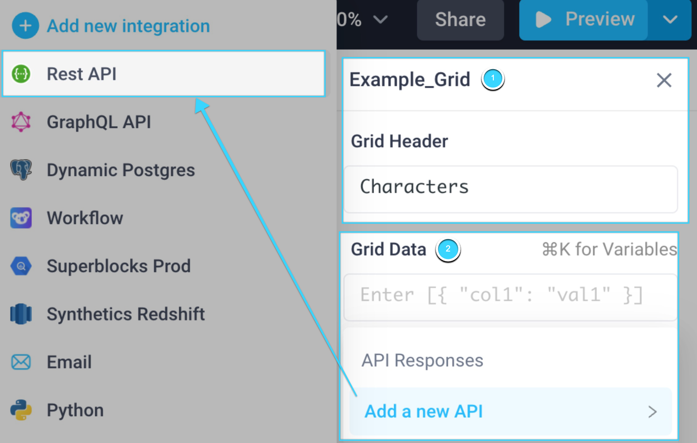
To edit the grid with your own data:
- Customize the name and header for the grid
- Remove the default grid data and select 'Add a new API. In this example, we'll use a REST API.
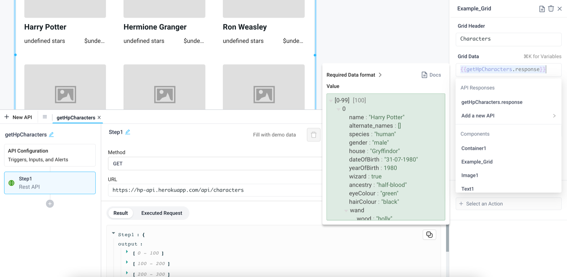
The REST API will use a simple JSON-based API for getting information on Harry Potter characters.
In the API panel, add the URL, https://hp-api.herokuapp.com/api/characters, and update the name of the API to getHpCharacters. Click "Run" to populate the grid with some of the resulting output.
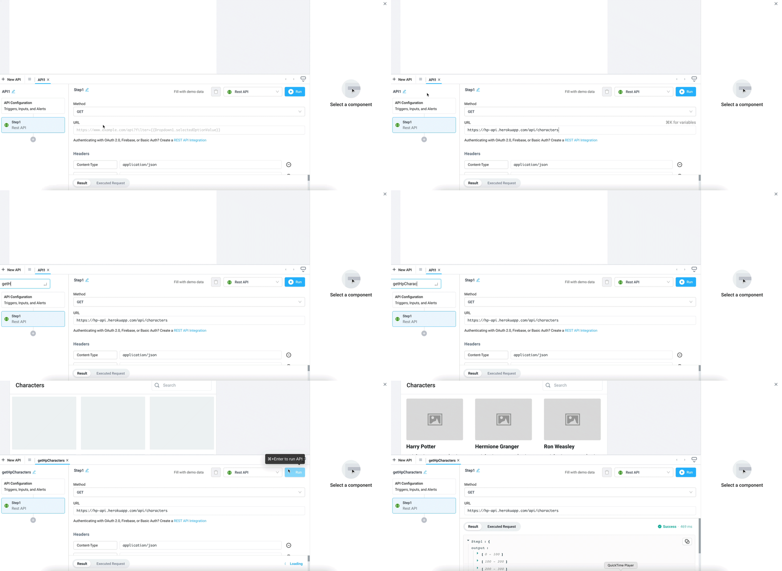
We can also see the API resonse in the API panel's "Result" section, as well as by hovering over the Grid Data value {{getHpCharacters.response}}. Any of these attributes can now be used in the grid.
Map data to grid cells
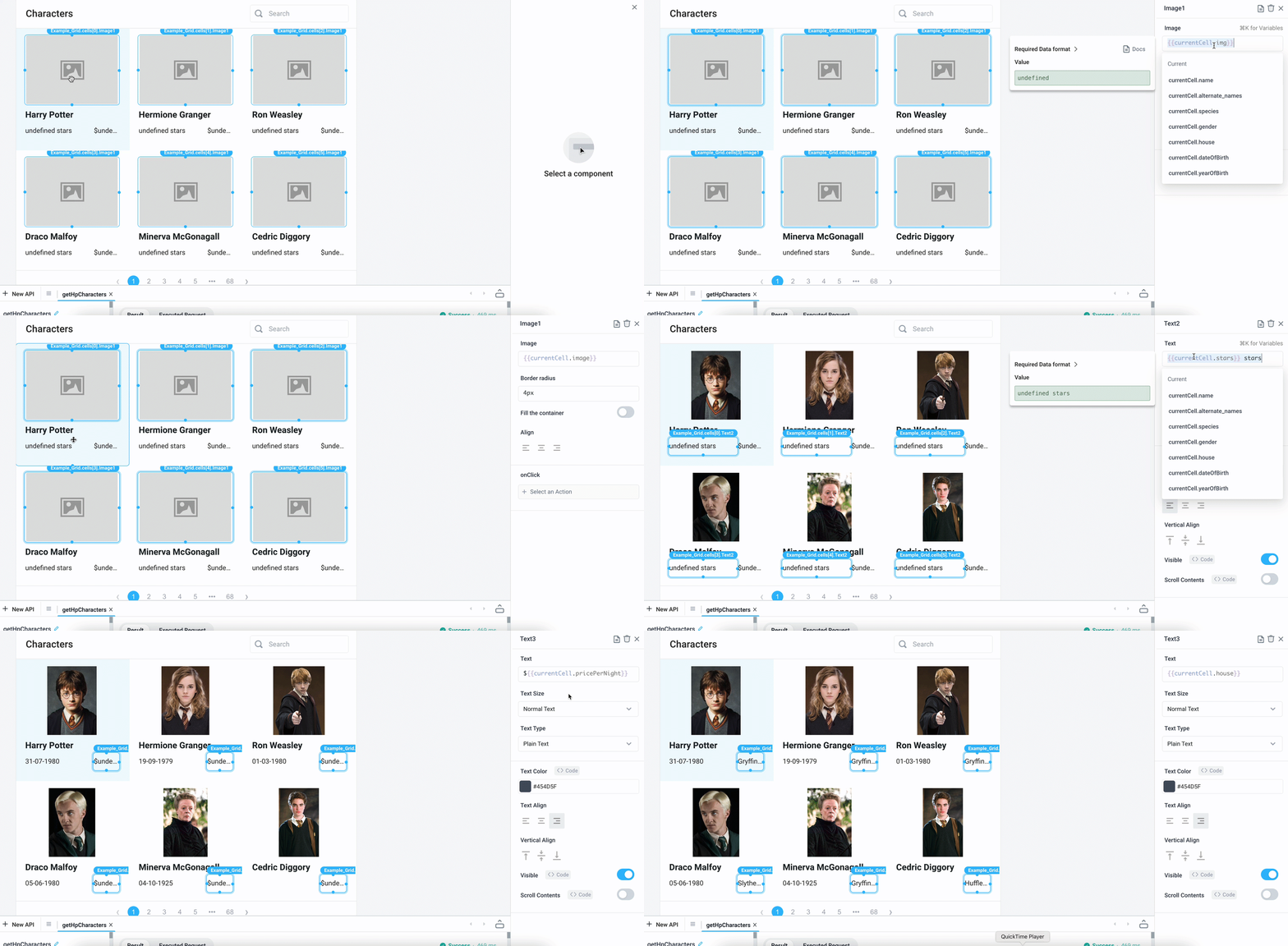
Next, we'll edit the grid so the cell elements pull from the previous API values. To configure each cell element, click the element and update its value to {{currentCell.<KEY>}} in the Properties panel. Here we'll change the image to {{currentCell.image}} and the text components to {{currentCell.dateOfBirth}} and{{currentCell.house}}
Customize grid
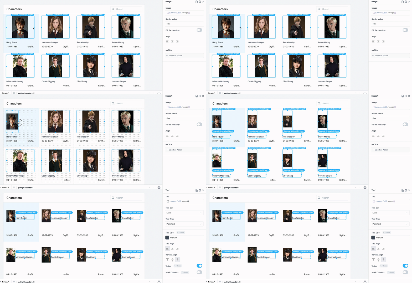
Adjust the grid display and image size by increasing the Column Count to 4, and disable Fill the container on the image.

We can also resize and organize elements within a grid cell.
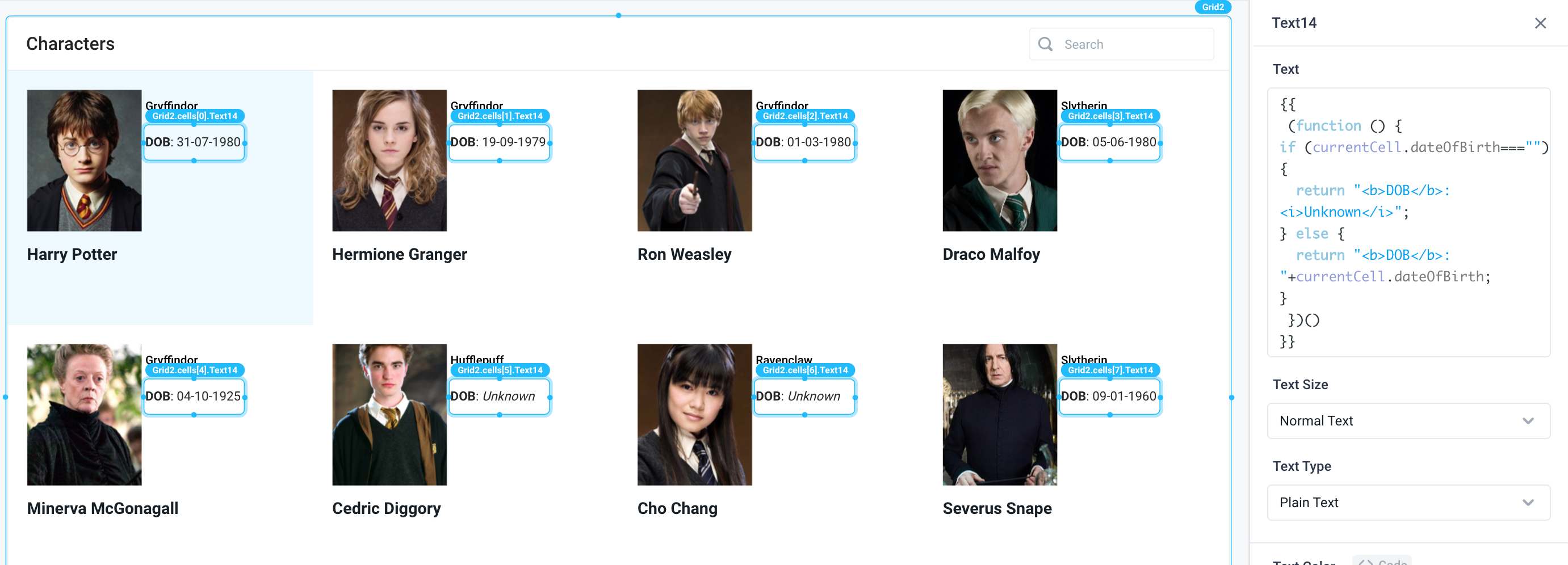
Lastly, we can use JavaScript for further customization of text cells, such as setting conditional logic to only display the date of birth for a character if its returned in the API response, or changing the text color depending on the house.

Trigger action on cell click
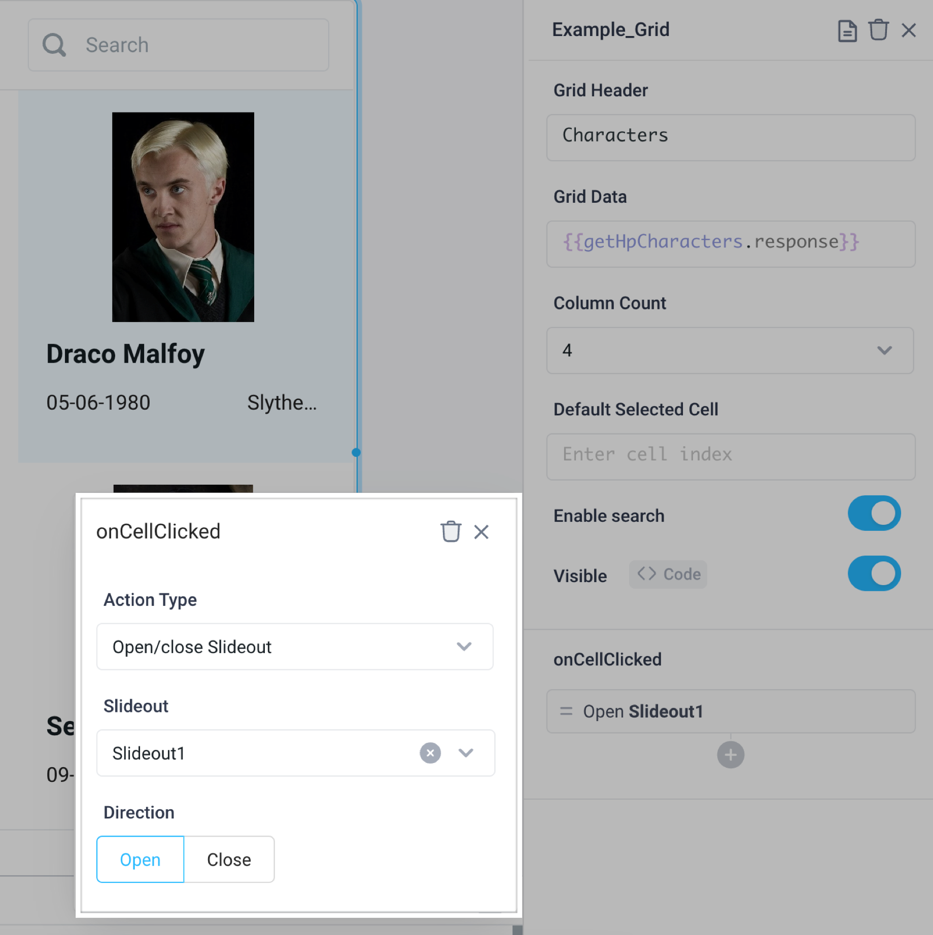
When a grid cell is clicked, let's add a Slideout panel for more details about each character.
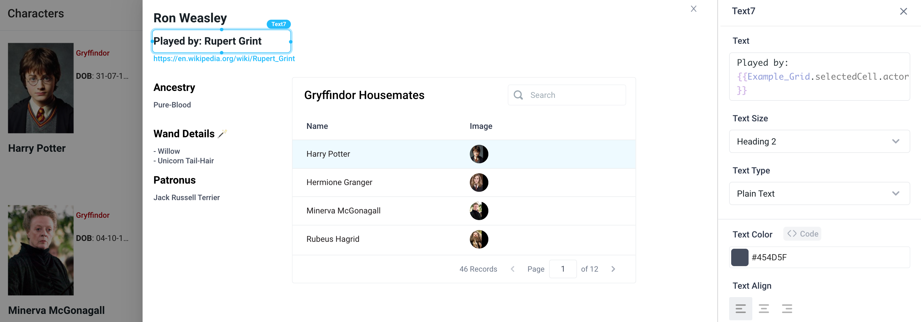
Customize the slideout with components that reference the selected cell by adding the name of the grid, and dot referencing the property grid cell. For example, {{Example_Grid.selectedCell.actor}}
Grid Properties
Component Properties
| Property | Description |
|---|---|
| Grid Header | Set the grid title |
| Header Text Style | Changes the style (font, size, etc.) of the grid's header text. Configure styles in the Typography settings |
| Header Text Color | Changes the color of the grid's header text |
| Grid Data | Takes in an array of objects and displays each as a cell in the grid |
| Column Count | Adjust number of columns to display |
| Default Selected Cell | Index of the cell to select and highlight by default (starts at 0) |
| Enable Search | Add a search box within the grid to filter results |
| Visible | Toggle the visibility of the component |
| Loading Animation | Controls the loading state of the component, values are a boolean |
Settable Properties
| Property Via Form / Via RunJS | Type | Example Value |
|---|---|---|
Selected Cell / selectedCellIndex | number | 0 |
Reference Properties
Properties can be accessed from other frontend components and backend APIs by adding the name of the Grid, and dot referencing the property. For a Grid named Grid1:
| Property | Description |
|---|---|
Grid1.selectedCell.<KEY> | Returns data from the selected cell, for example Grid1.selectedCell.name |
Grid1.selectedCellIndex | Returns the index of the selected cell, as a number, the first cell starts at 0 |
Grid1.cells | Returns an array of the data in the cells |
Grid1.title | Returns the title of the component |
Events
The following events are triggered by user interactions with Grid components. Use event handlers to trigger actions in response to user events.
| Property | Description |
|---|---|
| onCellClicked | Trigger an action when a grid item is clicked |