Menu
The Menu component enables developers to easily build dropdown menus of buttons and links.
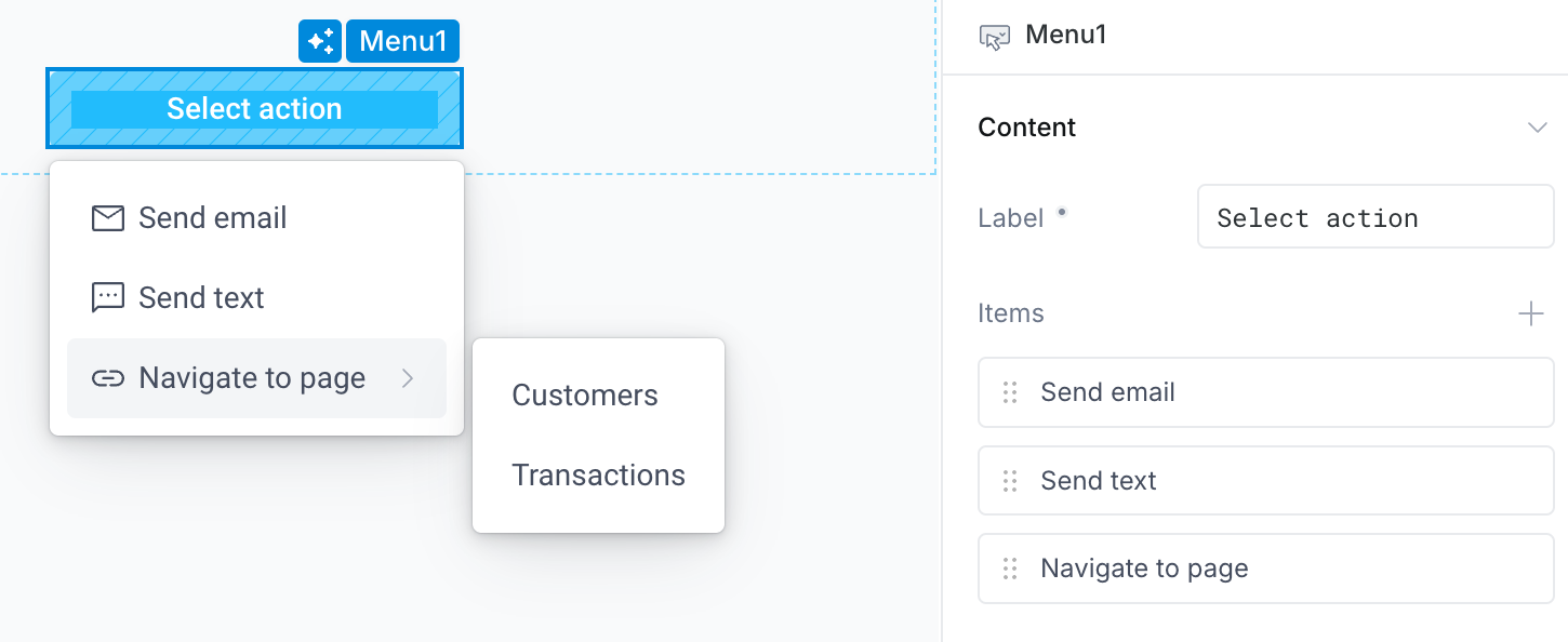
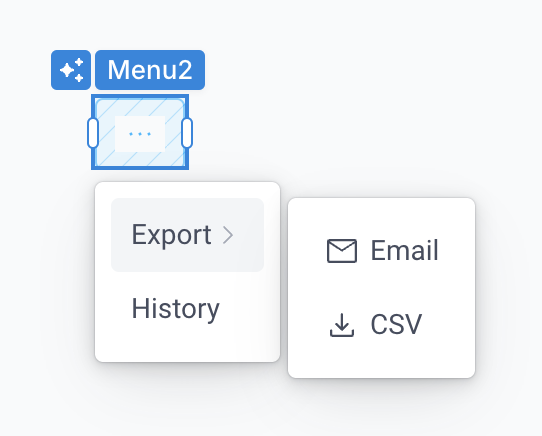
Examples of common menus include navigational menus with links to other pages and resources, menu buttons to trigger actions, deeply nested menus grouped categorically, and overflow (...) menus.
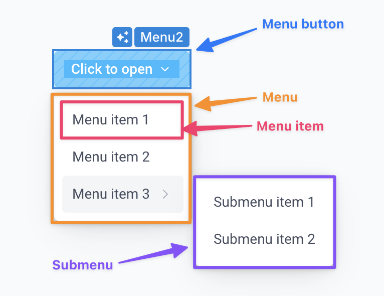
Anatomy of a menu
Each Menu component is composed of:
- Menu button: The button is the root element for a menu and is always visible. To open the menu and view the menu items, the user clicks the menu button.
- Menu: The Menu is opened when clicking the Menu button. The Menu contains Menu items
- Menu items: These are the items displayed in the menu. Each item can be a Link or a Button
- Link: A link is a menu item that navigates to a page, app, or external URL when clicked. A menu item that is a link behaves just like the Link component
- Button: A button is a menu item that triggers an onClick event handler when clicked. A menu item that is a link behaves just like the Button component
- Submenu items: Each menu item can also have children to create nested menus. There is no limit to the depth of a menu
When building with the Menu component:
- The first layer of the properties panel is used for configuring the menu button and for any configuration applied to the menu or all menu items
- You will drill into each menu item to configure the specific item
Styling menus
The Menu component offers a variety of styling options to customize how the menu is displayed.
Button style
Just like the standalone Button component, Superblocks provides out-of-the-box configurations to style the Menu button as as a Primary, Secondary, or Tertiary button. These presets simply apply the relevant styling properties to the Menu button in the properties panel.
Orientation
You can choose to orient a Menu component horizontally or vertically.
Vertically oriented menus open downward (below the menu button) when there is available space, and otherwise open upward
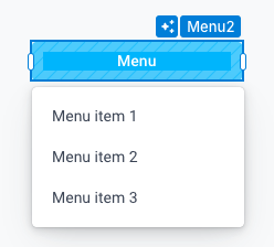
Horizontally oriented menus open to the right (beside the menu button) when there is available space, and otherwise open to the left. Horizontal menus are commonly used for sidebar navigations and other vertically oriented interfaces.
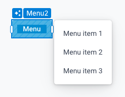
Menu width
The menu's width is controlled using the Width property within the Menu Layout section. The available width options vary slightly based on the orientation of the menu:
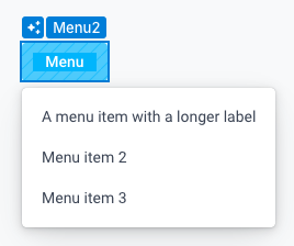
- Fit content: The menu's width will be dynamically calculated based on the longest menu item's label.
- Vertical menus utilizing this mode have minimum width set to the width of the Button so that the menu can never be narrower than the button that opens it
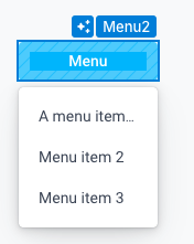
- Match parent (vertical menus only): The menu's width will be equal to the width of the menu button
- Pixels: The width is set explicitly in pixels and any overflow is ellipsized
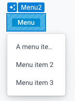
Keep in mind that the menu button's width is managed separately using the width property in the Button Layout section.
Alignment
You can also control how the menu is aligned relative to the button. The alignment options vary depending on the menu's orientation.
Vertically oriented menus can be aligned:
- Left: The left side of the menu is aligned with the left side of the button
- Center: The center of the menu is aligned with the center of the button
- Right: The right side of the menu is aligned with the right side of the button
Horizontally oriented menus can be aligned:
- Top: The top of the menu is aligned with the top of the button
- Center: The center of the menu is aligned with the center of the button
- Bottom: The bottom of the menu is aligned with the bottom of the button
Menu properties
Component properties
Menu
| Property | Description |
|---|---|
| Label | The label that will be displayed on the menu button |
| Items | A list of menu items that will each be configured individually by drilling into the respective item's properties (see Menu item below) |
| Button appearance | |
| Button style | Select a preset styling configuration for the Menu button from Primary, Secondary, and Tertiary options |
| Icon | Select an icon to be displayed beside the button label |
| Icon position | Specify whether the icon should be displayed left or right of the label |
| Label style | Set the typography of the label |
| Background | Set the background color of the button |
| Border | Set the border color and border width of the button |
| Border radius | Set the border radius of the button |
| Menu appearance | |
| Text style | Set the typography of all menu items |
| Orientation | Set the orientation of the menu relative to the menu button |
| Alignment | Set the alignment of the menu relative to the menu button |
| Button layout | |
| Padding | Controls the space between the button label and the border of the component |
| Width | Controls the width of the button |
| Height | Controls the height of the button |
| Margin | Controls the space around the button, outside of the component boundary |
| Visible | Controls whether the component is visible |
| Collapse when invisible | When enabled, other components shift to occupy the space left by the invisible component / area |
| Menu layout | |
| Width | Controls the width of the menu |
| Interaction | |
| Disabled | Controls whether the component is enabled or disabled |
| Open on | Controls whether the menu opens on hover or on click |
Menu item
There are a number of properties that are shared regardless of whether the menu item is a link or a button.
Shared properties
| Property | Description |
|---|---|
| Label | The label that will be displayed on the menu item |
| Type | Controls whether the item is a Link or a Button |
| Submenu items | A list of nested menu items that will each be configured individually by drilling into the respective item's properties |
| Icon | Select an icon to be displayed beside the item's label |
| Icon position | Specify whether the icon should be displayed left or right of the label |
| Visible | Controls whether the item is visible |
| Disabled | Controls whether the item is disabled |
Link properties
| Property | Description |
|---|---|
| Link to | Where you would like to link to. You can link to another Page in the App, another App, or any external URL |
| Page | Select the page to link to in this app. Only present when you've selected to link to a page. |
| URL | Provide the URL to link to. Only present when you've selected to link to a URL. |
| Deployed app | Select another deployed app in your organization to link to. Only present when you've selected to link to a deployed app. |
| Route parameters | Specify values for any route parameters required by the page you are linking to. Only relevant when linking to a page that has a dynamic route. |
| Query parameters | Specify any query parameters to be included in the URL. Only relevant when linking to a page or app (when linking to a URL, simply supply query parameters directly in the URL) |
| Keep existing query parameters | When enabled, new query params are merged with any existing query params. When disabled, existing query params will be discarded |
| Open in new tab | Opens the link in a new tab. When disabled, users will still be able to open in new tab using Command/Ctrl + Click or the browser-provided right-click context menu |
Button properties
Menu items that are Buttons have no additional properties but do have an onClick event handler.
Reference Properties
Properties can be accessed from other frontend components and backend APIs by adding the name of the Menu component, and dot referencing the property. For a Menu named Menu1:
| Property | Description |
|---|---|
Menu1.isVisible | Returns whether the Menu is visible |
Event handlers
Menu items that are Buttons each have their own onClick event handler.
Menu vs Dropdown
The Menu and Dropdown components both display a list of items when clicked. These components typically serve different purposes:
- Menus are typically used to provide a list of actions, navigation options, or commands. The items are often actionable and trigger immediate effects
- Dropdowns are designed for selecting one or more options from a predefined list of values. Drodpdowns are focused on making a selection rather than triggering an action immediately