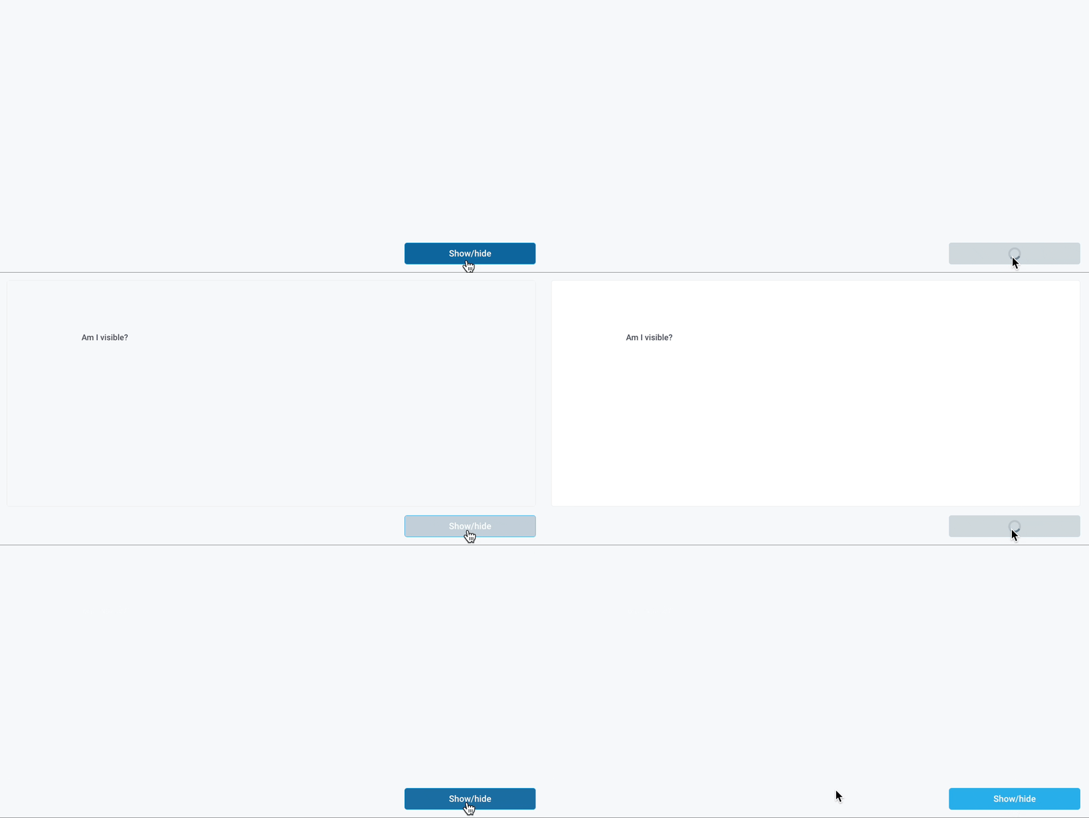
Component Property Examples
Toggle the visibility of a component
The following example shows how to use a Button to hide or show a certain component in an application.
- Drag a Container component on to the canvas
- Drag a Text component into the container and give it a default text (this will be used to show if the container is visible)
- Create a Button component and for the
onClicktrigger, create a new API:API1 - For API1, create a python step that references the visibility state of the container and returns the negation:
return not Container1.isVisible - Go back to the Container component and click the
<> Codebutton next to Visible and update it to be the response of the API:{{API1.response}}
Now when you click the button, it toggles the visibility state of the container.

Hide components until first user interaction
The following shows an example of how you can set up an application to hide certain components until after a user first interacts with the app.
- Drag a Form component on to the canvas
- Populate the Form to take in data
- Click on the Submit button and update the
OnClicktrigger to create a new API with a JavaScript step - Rename the API
submitFormand use the following code snippet:return Form1.data - Drag a CodeEditor component on to the canvas and label it "Form Results"
- Update the Default Value:
{{submitForm.response || "<Your_placeholder_text>"}} - Create a new API called
returnTruethat uses a JavaScript step and the following code snippet:return true; - In the API configuration for
returnTrue, set the API trigger toNever run on load - Drag a Text component on to the canvas and set the Text field to the value you'd like to appear after the user interacts
- Click on the
<> Codebutton for the Visible property and update it to be:{{returnTrue.response || false}}infoThis logic hides components until the first interaction and then they will be visible until the page is reloaded. If you'd like the visibility to toggle with each user interaction, see this example.
- You can follow Steps 8 and 9 for any other components you'd like to appear on click
- Update the Form's Submit Button to run the
returnTrueAPI OnClick

Disable a child component in a form until user interaction
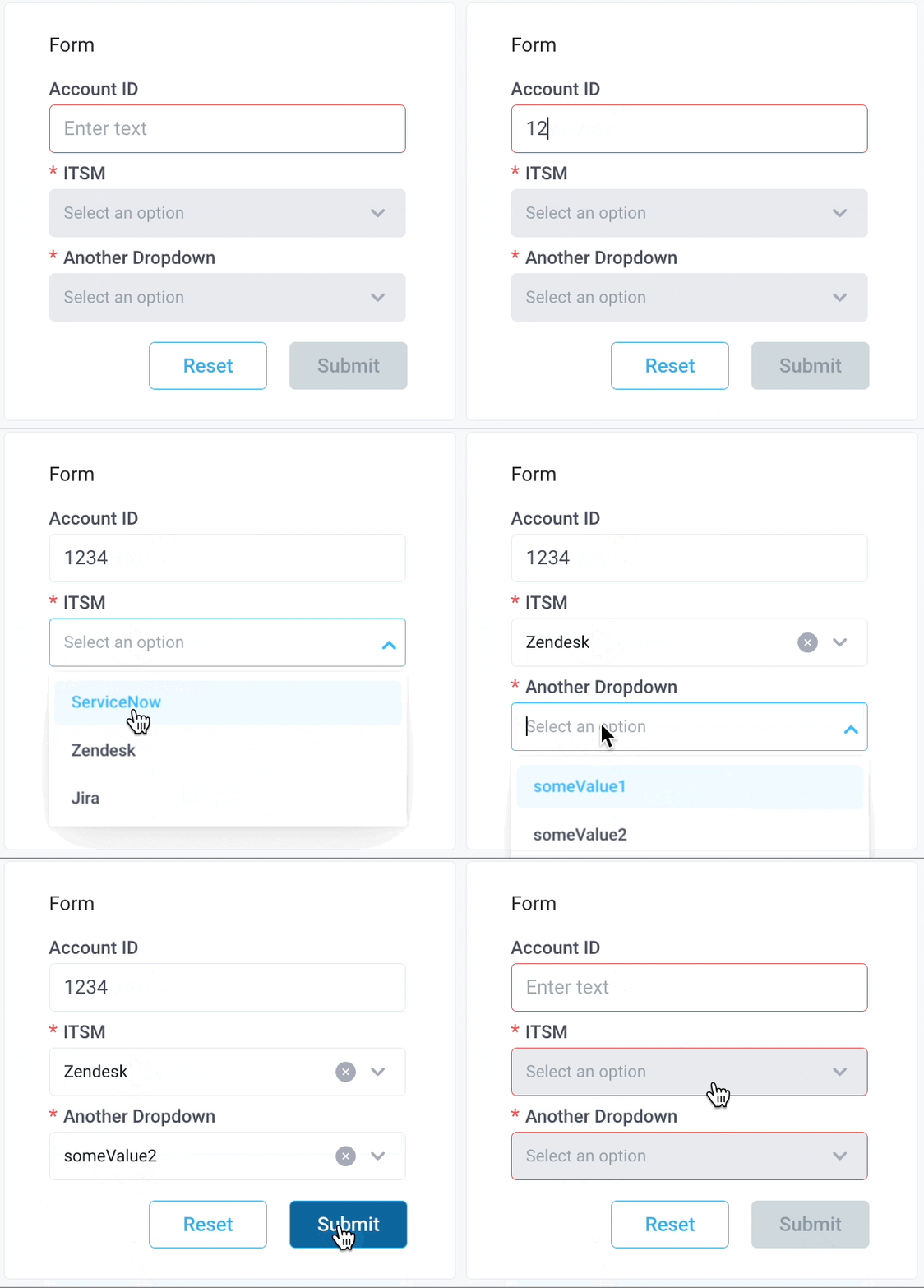
This example walks through using the Disabled property to create a dynamic form that disallows users from moving forward to the next component until a valid selection has been made at the current step.
-
Drag a Form component on to the canvas
-
Drag components onto the Form, in this case an Input component and 2 Dropdown components
-
Rename the Input component to "accountID"
- Update the label to "Account ID"
- Set the minimum length to 4
- Set the maximum length to 10
- [Optional] Add custom validation rules
-
Rename the first Dropdown to "itsmDropdown"
- Set the label to "ITSM"
- Set the options to:
[
{
    "label": "ServiceNow",
    "value": "ServiceNow"
},
{
    "label": "Zendesk",
    "value": "Zendesk"
},
{
    "label": "Jira",
    "value": "Jira"
}
]- Delete the
Default selected value string(s) - Toggle on
Enable Clearing - Toggle on
Required - Click
<> Codenext to Disabled and set it to:
{{!accountID.isValid}} -
Rename the second dropdown to "anotherDropdown"
- Set the label to "Another Dropdown"
- Set the options to:
[
{
    "label": "someValue1",
    "value": "someValue1"
},
    {
    "label": "someValue2",
    "value": "someValue2"
},
{
    "label": "someValue3",
    "value": "someValue3"
}
]- Delete the
Default selected value string(s) - Toggle on
Enable Clearing - Toggle on
Required - Click the
<> Codenext to Disabled and set it to:
{{!accountID.isValid || itsmDropdown.selectedOptionValue == null}}
