DatePicker
This component is useful for capturing user input for dates, with or without a time element.
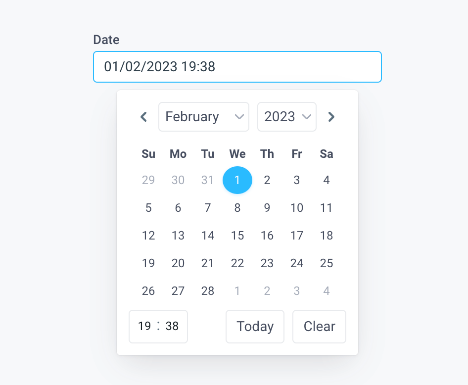
Use the selected date and time to create dynamic dashboards with Charts, or build Forms that submit to a database.
DatePicker Properties
Component Properties
| Property | Description |
|---|---|
| Content | |
| Label | Set the text to be displayed above the DatePicker |
| Default date | The default date set for the DatePicker |
| Value format | Sets the format of the selected date |
| Display format | Sets the format of the date displayed in the UI |
| Manage timezone | Allows you to toggle on or off to manage the timezone for the Datepicker's output value and display |
| Value timezone | Timezone of the DatePicker's output value - local is dynamic to the user's location |
| Display timezone | Timezone of the date displayed in the UI - local is dynamic to the user's location |
| 24-hr time | 12 or 24 hour time format |
| Appearance | |
| Label style | Changes the style (font, size, color etc.) of the DatePicker's label text. Configure styles in the Typography settings |
| Input text style | Changes the style (font, size, color etc.) of the DatePicker's input text. Configure styles in the Typography settings |
| Input background | Changes the color of the input background |
| Input border | Changes the color of the input border |
| Input border radius | Changes the input border radius |
| Show icon | Show calendar icon inside the DatePicker field |
| Loading Animation | Controls the loading state of the component, values are a boolean |
| Layout | |
| Width | Controls the width of the component |
| Height | Controls the height of the component |
| Label position | Position the label above or to the side of the input |
| Visible | Set true to show and false to hide. Set dynamically using JavaScript with {{}} |
| Collapse when invisible | Controls what happens when the component is invisible. When true, other components shift to fill its space; when false, it leaves a blank space. This has no effect in edit mode. |
| Interaction | |
| Required | Makes selecting a date mandatory, values are a boolean |
| Minimum Date | Minimum allowed date to be set |
| Maximum Date | Maximum allowed date to be set |
| Disabled | Disables user interaction with this component |
| Error display | Choose whether to display errors in a Tooltip or Inline |
| Validation | Sets a custom validation rule |
Settable Properties
| Property Via Form / Via RunJS | Type | Example Value |
|---|---|---|
Selected Date / selectedDate | string | "07/04/2022" |
Reference Properties
Properties can be accessed from other frontend components and backend APIs by adding the name of the DatePicker, and dot referencing the property. For a DatePicker named DatePicker1:
| Property | Description |
|---|---|
DatePicker1.selectedDate | Returns the selected date as a string |
DatePicker1.isVisible | Returns the boolean value of the component's visibility (True, if it is visible) |
DatePicker1.isDisabled | Returns the boolean value of the component's disabled state (True, if it is disabled) |
DatePicker1.isValid | Returns the boolean value of the component's validity (True, if it is valid) |
DatePicker1.dateFormat | Returns the Date Format property as a string |
DatePicker1.outputDateLocal | Returns the selected date as a string in the user's local timezone |
DatePicker1.outputDateUtc | Returns the selected date as a string in UTC |
Events
The following events are triggered by user interactions with DatePicker components. Use event handlers to trigger actions in response to user events.
| Table Reference Property | Description |
|---|---|
| onDateSelected | Run an API every time a date is selected |
Example Usage:
Use DatePickers with APIs
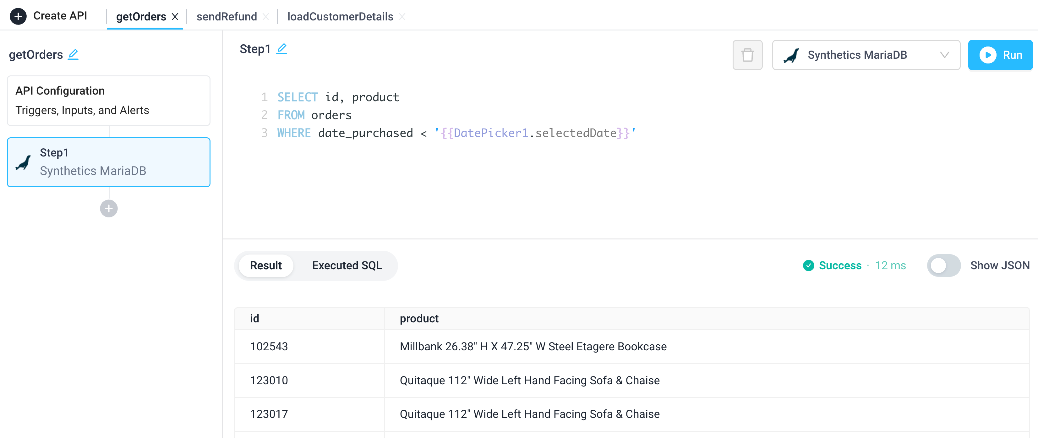
Create an API that references the DatePicker via <DATEPICKER_NAME>.selectedDate.
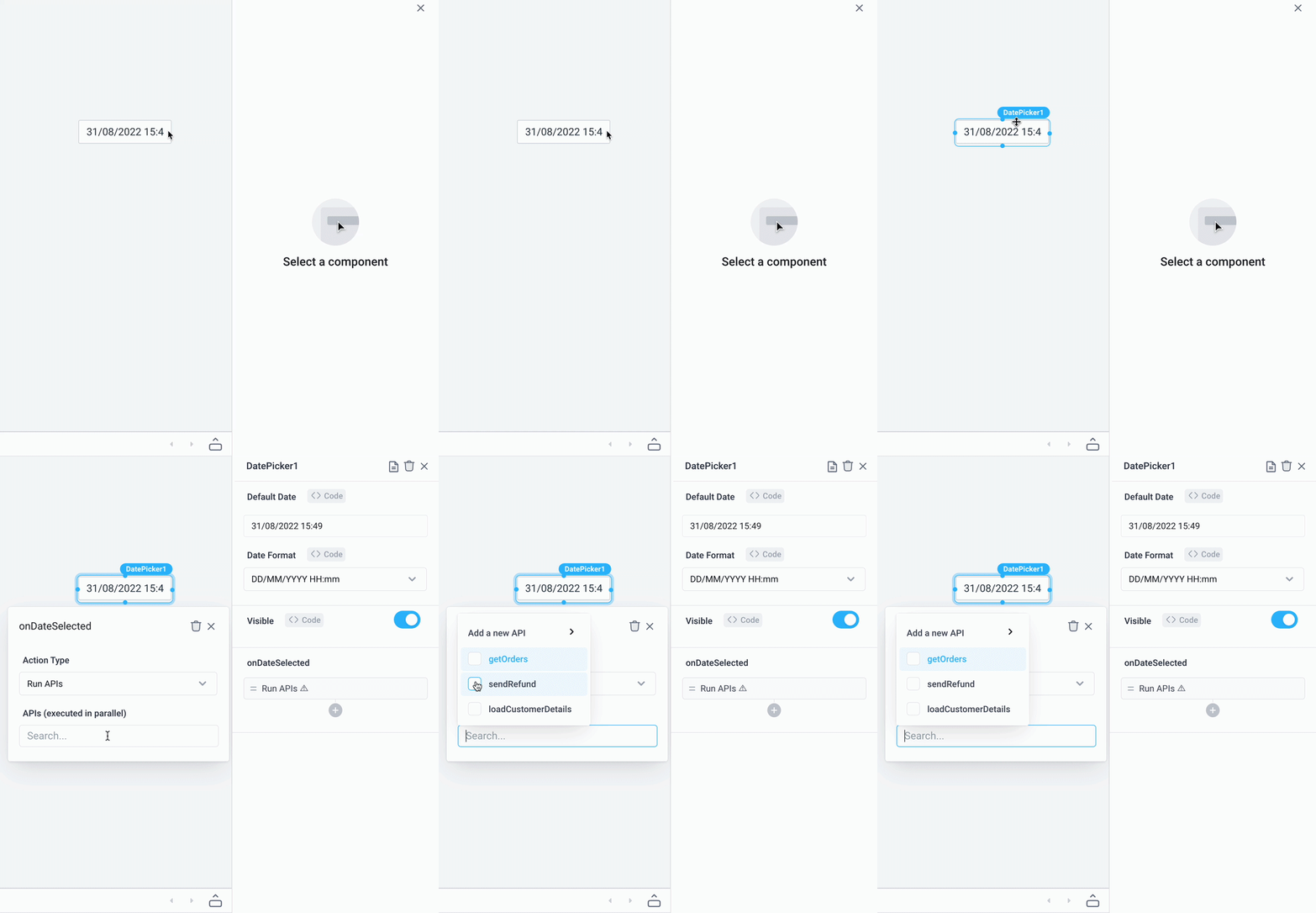
Trigger APIs to run when the DatePicker is changed via onDateSelected.
Set default date and date format
- Drag a DatePicker component from the Components panel
- In the Properties panel, set the Default Date if required and select the appropriate Date Format.
- If required, set a Display Date Format.

Use the JavaScript Moment library to set dynamic default dates. For example, for a one month date range, create a start date DatePicker with a default date from one month ago.
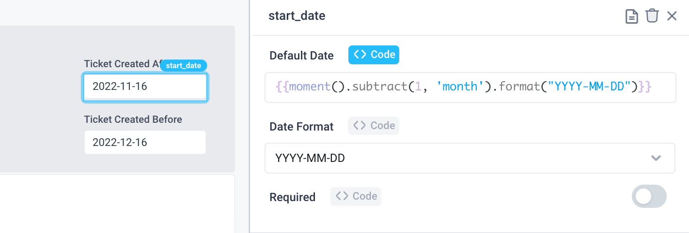
{{moment().subtract(1, 'month').format("YYYY-MM-DD")}}
Configure the end date to always show today's date.
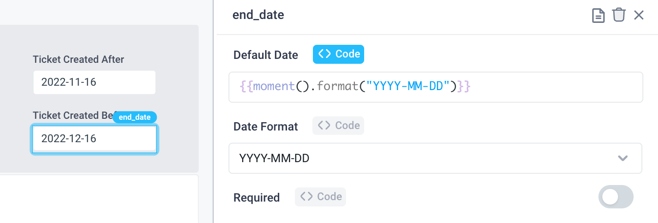
{{moment().format("YYYY-MM-DD")}}
Note, the Date Format dropdown uses the same Moment formatting tokens.
Managing Timezones
Create a DatePicker that stores the time in UTC but displays in the user's timezone.
- Enable
Manage Timezone. - Set the
Value Timezone. This is the output value of the DatePicker,UTCis most commonly stored in databases.localis dynamic based on the end user's location. - Set the
Display Timezone. This is the timezone of the date displayed in the UI,localmay be most appropriate.
