Modal
Use a modal component to build a modal box
Create a Modal
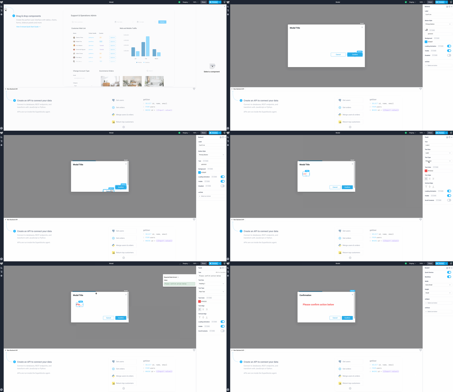
Start by dragging a Modal component from the Components panel.
Populate the modal with other components such as the Text component. By default the modal is pre-populated with two Button components, these may be edited or removed as required.

Modal Navigation: The Modal component is hidden from the canvas because it only opens when an event is triggered. One way to open and edit event-based components like the modal component is to click on Navigation > Modal1.
Modal Properties
Component Properties
| Property | Description |
|---|---|
| Quick Dismiss | Allow the modal to closed by clicking outside of the modal |
| Backdrop | Add overlay outside of modal box |
| Width | Width of modal box, options are: Extra Small, Small, Medium, Large and Fullscreen |
| Height | Height of modal box, options are: Extra Small, Small, Medium, Large and Fullscreen |
Reference Properties
Properties can be accessed from other frontend components and backend APIs by adding the name of the Modal component, and dot referencing the property. For a Modal named Modal1:
| Property | Description |
|---|---|
Modal1.isOpen | Returns a boolean of the state of the Modal (True, if it is open) |
Modal1.isVisible | Returns the boolean value of the component's visibility (True, if it is visible) |
Modal1.widthPreset | Preset width of modal box (EXTRA_SMALL, SMALL, MEDIUM, LARGE, FULLSCREEN) |
Modal1.heightPreset | Preset Height of modal box (EXTRA_SMALL, SMALL, MEDIUM, LARGE, FULLSCREEN) |
Events
The following events are triggered by user interactions with Modal components. Use event handlers to trigger actions in response to user events.
| Property | Description |
|---|---|
| onOpen | Triggers an action when the modal is opened |
| onClose | Triggers an action when the modal is closed |