Chart
Charts are used to build various internal tools such as Admin Panels, Pipeline Dashboards, Custom CRM, and more. Superblocks makes it easy to extract, transform, and convert data into meaningful charts for internal tools.
Superblocks has two ways of charting data:
- UI Charts - effortlessly convert query results directly to charts
- Plotly Charts - advanced charting for Machine Learning (ML) and statistical analysis using Python
Chart Properties
Component Properties
| Chart Property | Description |
|---|---|
| Content | |
| Chart header | Text displaying on top of the chart |
| Chart definition | Definition of how the chart is constructed. Currently, UI and Plotly chart types are supported |
| Appearance | |
| Header style | Changes the style (font, size, color, etc.) of the chart's header text. Configure styles in the Typography settings |
| Background | Change the background color |
| Border | Set the border of the component |
| Border radius | Set the border radius of the component |
| Load animation | Toggle whether or not to have a loading animation |
| Layout | |
| Width | Controls the width of the component |
| Height | Controls the height of the component |
| Visible | Controls the visibility of the component, values are a boolean |
| Collapse when invisible | Controls what happens when the component is invisible. When true, other components shift to fill its space; when false, it leaves a blank space. This has no effect in edit mode. |
UI Chart Properties
| Chart Property | Description |
|---|---|
| Content | |
| Chart data | Expects an array of objects in row-based format, the natural output of any SQL query. You can also call {{API1.response}} |
| Visualization | Changes the visualization of the chart data |
| X-axis values | Automatically populated and defaulted once Chart Data is added, select any key from the object to plot on the X-axis |
| Y-axis values | Automatically populated once Chart Data is added, select any key from the object to plot on the Y axis. Add multiple series if required |
| Y-aggregation | Enable Sum or Count on the chosen x-axis variable |
| Group by | Select any key from the object to group by different colors on the chart |
| Appearance | |
| X-axis label | Set the label of the x-axis |
| X-axis type | Auto, Time, Categorical, Continuous |
| Y-axis title | Title of the Y-axis |
| Min decimals | The minimum number of digits after the decimal separator |
| Max decimals | The maximum number of digits after the decimal separator |
Plotly Chart Properties
| Chart Property | Description |
|---|---|
| Content | |
| Plotly chart JSON | Plotly Description of the Chart. It consists of data field and layout field. Usually, this is imported from a Plotly Python Figure |
| Layout JSON | Plotly Chart Layout JSON. You can configure chart size, margin, color, axes, legends and other layout related parts here. If you already have layout defined in Plotly Chart JSON, it will merge with this layout object. See Plotly Layout Docs |
Reference Properties
Properties can be accessed from other frontend components and backend APIs by adding the name of the Chart, and dot referencing the property. For a Chart named Chart1:
| Table Reference Property | Description |
|---|---|
Chart1.selectedData | Access the selected data as an array of objects (only supported in UI charts) |
Chart1.isVisible | Returns the boolean value of the component's visibility (True, if it is visible) |
Events
The following events are triggered by user interactions with Chart components. Use event handlers to trigger actions in response to user events.
| Chart Event Handler | Description |
|---|---|
| onSelectedData | Trigger an action when data is selected (only supported in UI charts) |
Example Usage:
Convert SQL queries to charts
Start by dragging the Chart component from the Components panel to the empty canvas.
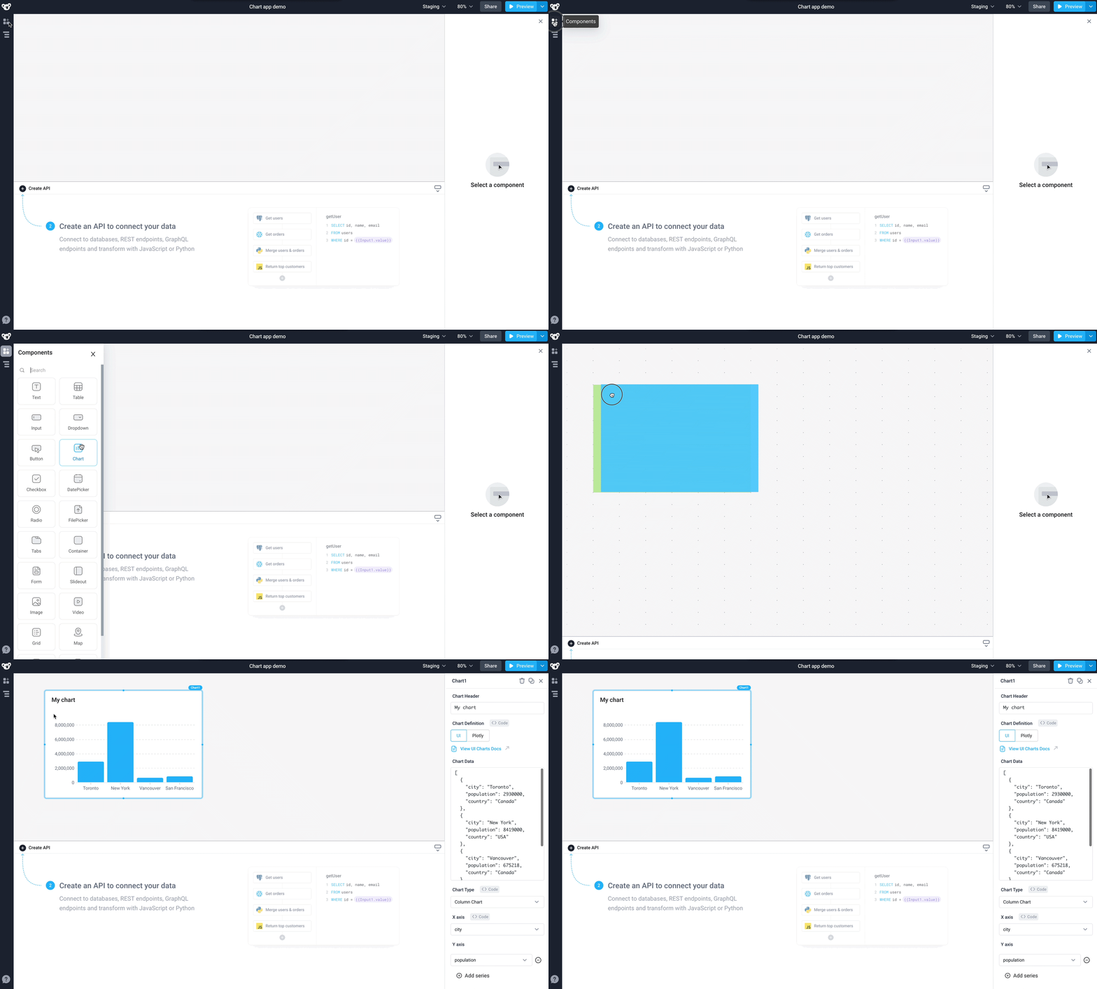
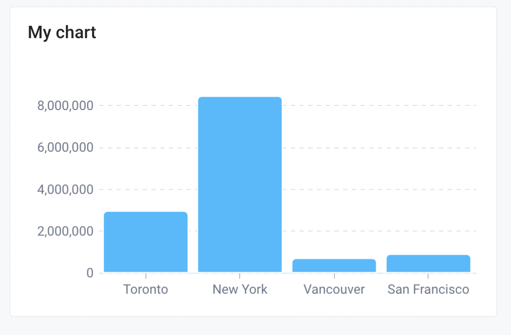
The chart will load with an example dataset.
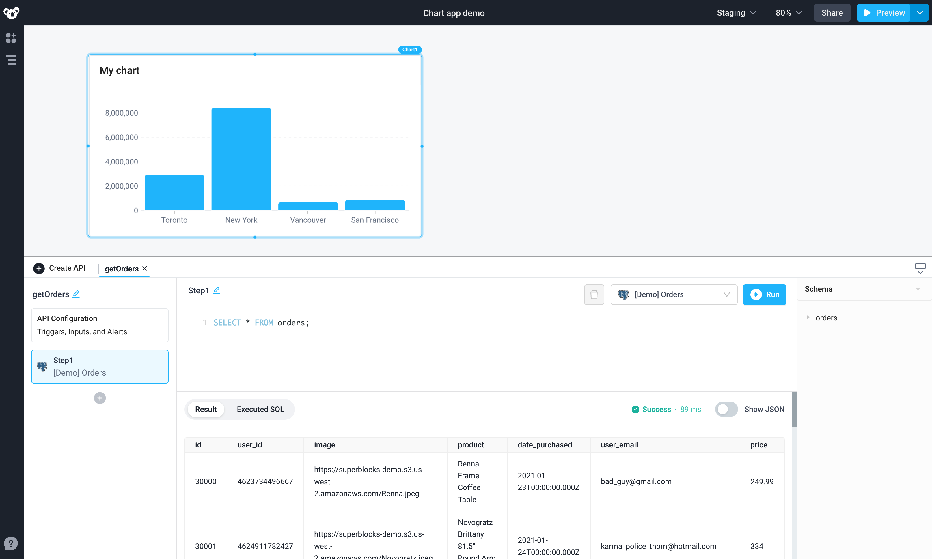
To populate the chart from a database, we can use the Superblocks API builder.
- Click Create API in the bottom panel and select the
[Demo] OrdersPostgres Database - Rename API1 to
getOrders - Input the following SQL query in the
getOrdersAPI to fetch all orders from the Orders table in the Postgres demo database
SELECT * FROM orders;
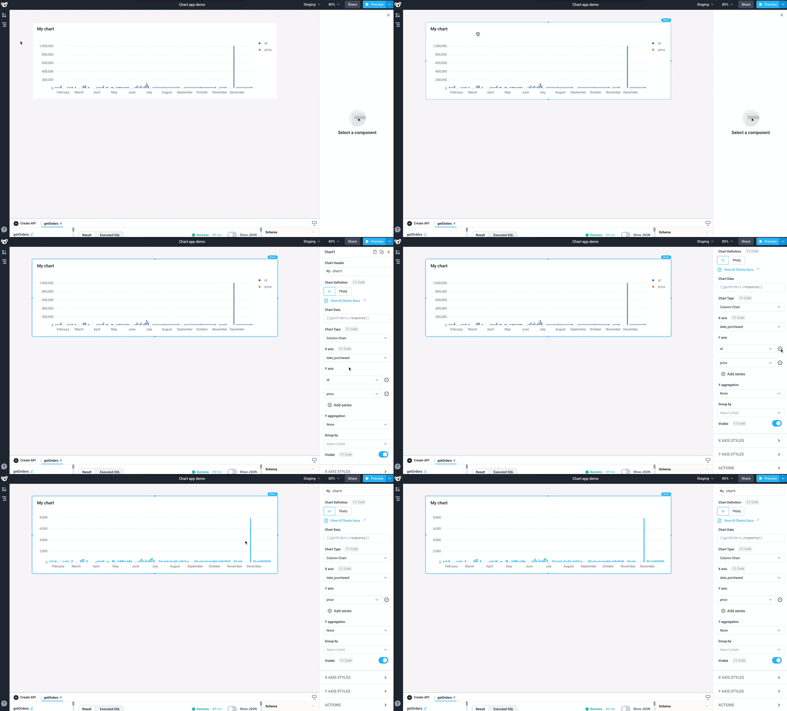
In the application User Interface, click on the chart to open the Properties panel. To connect the results from getOrders API to the chart, replace the example JSON with {{getOrders.response}} in the Chart Data field. The Chart Type will default to Column Chart.
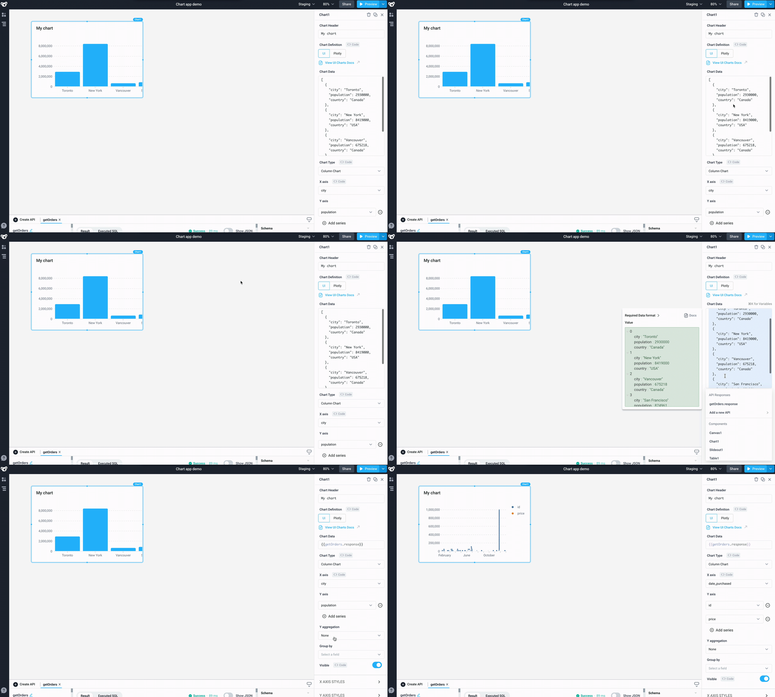
Let’s say we want to graph all orders from the orders table.
By default, the X-axis is set to date_purchased, and the id series needs to be removed from the Y-axis. Open the Properties panel, navigate to the Y axis section and click on the '-' sign next to id to remove it. Now we have a chart showing our orders placed by date.
Aggregate data and change time granularity
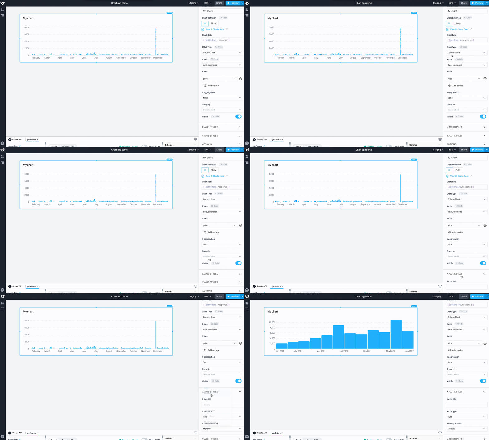
Now let's update the chart to show monthly revenue trends. We need to sum the prices of all the orders placed in a month, effectively reducing the series to a single datapoint per month representing the total monthly revenue.
- Open the Properties panel and change the Y aggregation to
Sum - Expand the X AXIS STYLES section and change the X time granularity to
Monthly
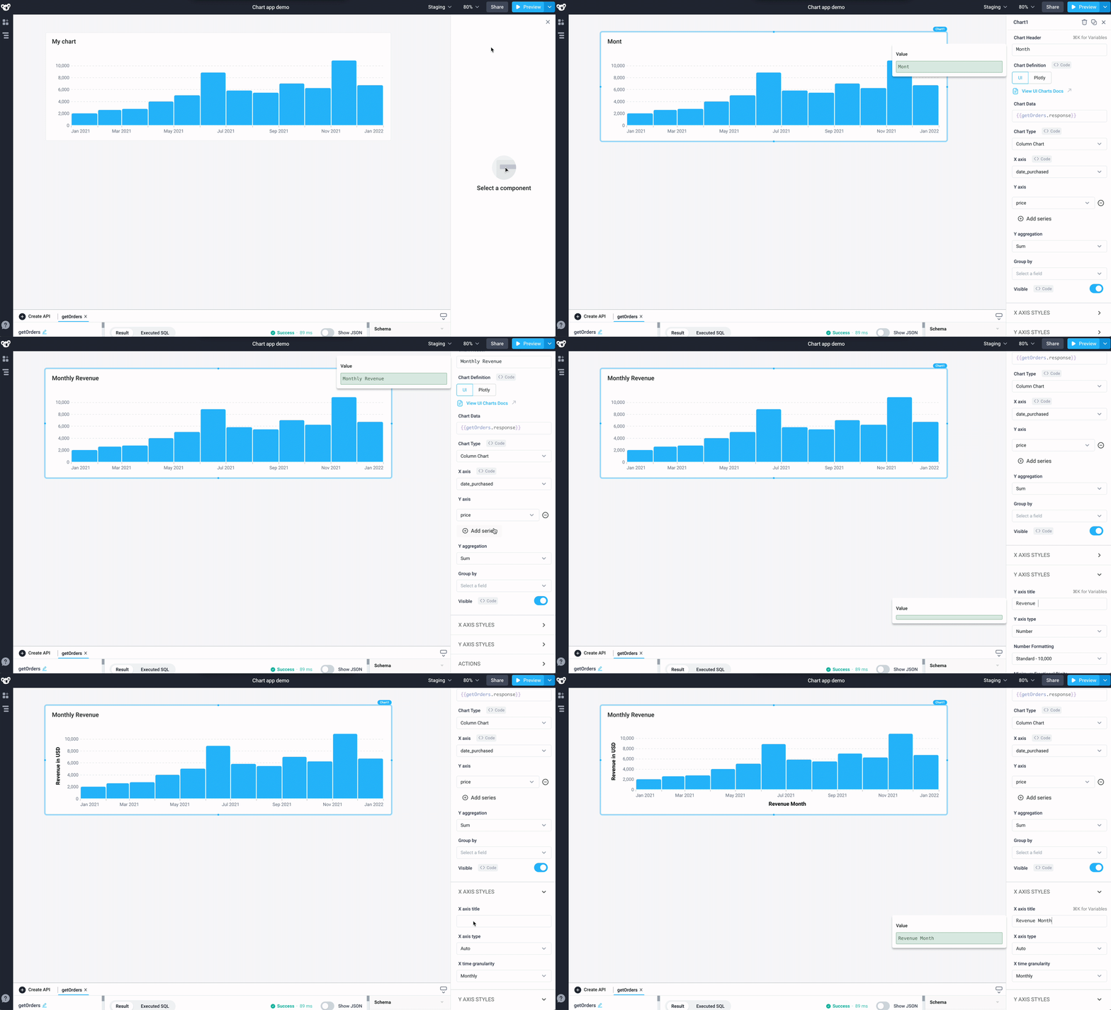
Now that we have a chart showing total monthly revenue over time, let's update the names of the charts and axes. Use the Properties panel to rename the title of the chart to 'Monthly Revenue', the X-axis to 'Revenue Month', and Y-axis to 'Revenue in USD'.
Create line charts
In the above chart, we can see that while our monthly revenue has steadily increased year over year, there are two significant revenue spikes in the months of June and November. The sudden increase in November is likely due to Black Friday sales, but we need to confirm. Let's see how these revenue spikes correlate to the number of orders made from our website. We can confirm whether the June and November spikes were due to a sudden influx of orders.
Let's update our chart to show the count of orders by month.
- Open the Properties panel and change the Chart Type to
Line Chart - Change the Y aggregation to
Count - Under Y AXIS STYLES, change the Y axis title to 'Number of orders'
Now we can see that the number of orders also spiked in June and November, confirming our assumption that the jump in revenue was tied to an increase in orders.
Trigger events when selecting data points
While we can tie the increased orders in November to our Black Friday sales, we're still not sure what caused the spike in June. To investigate, let's create a new chart that groups our sales by another attribute, like user, to see if we can find a correlation.
- Drag a new Chart component to the canvas and replace the JSON in Chart Data with
{{getOrders.response}} - Rename the Chart Header to 'Monthly order volume' and rename the component as 'MonthlyOrderVolume'
- Under the Y axis section, click on the '-' sign next to
idto remove the id field - Change the Y aggregation to
Sum - In the Group by dropdown, choose
user_email - Change the Y axis title to 'Monthly Revenue' and change the X axis title to 'Monthly Revenue'
- Change the X time granularity to
Monthly
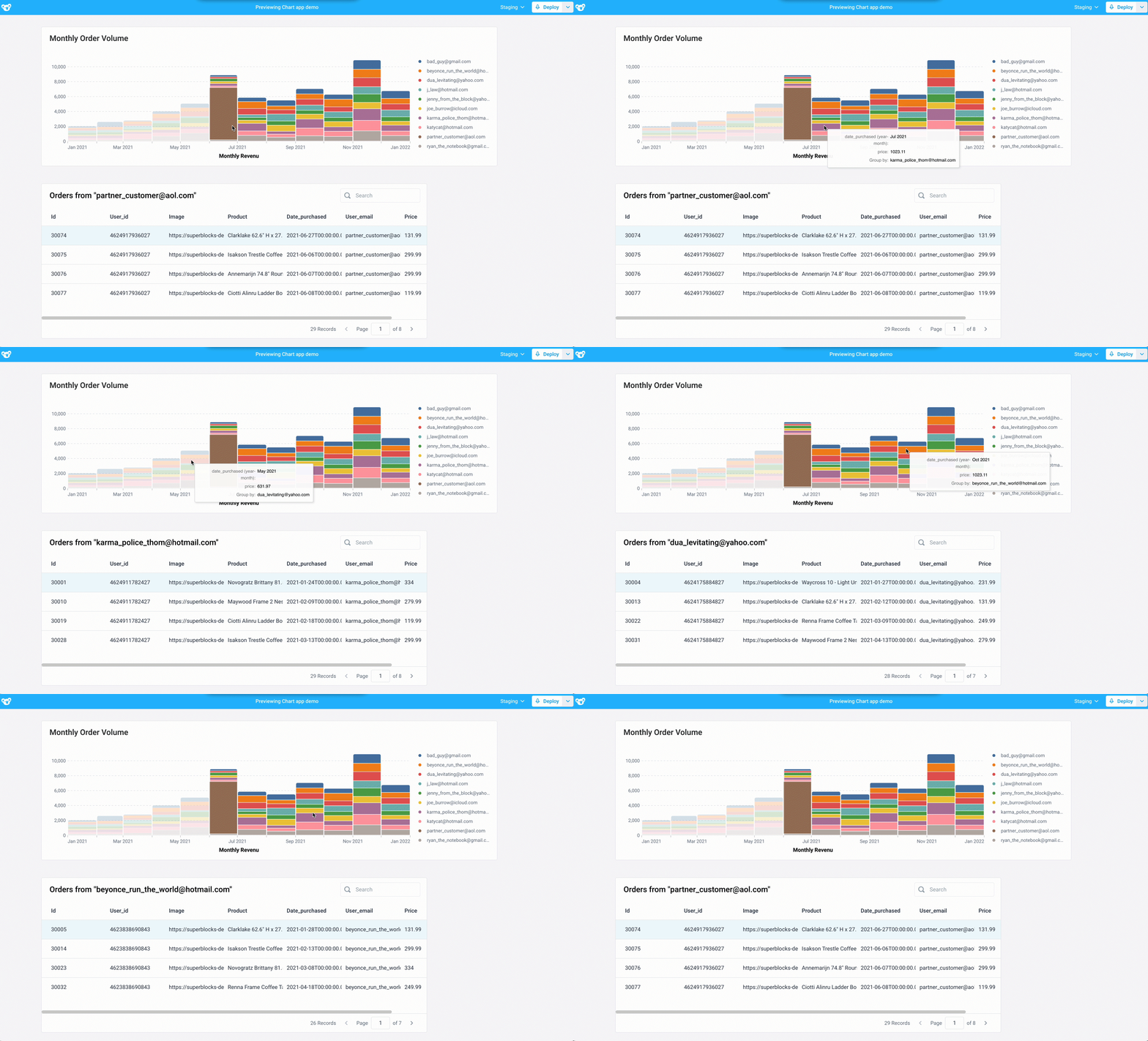
Now that we are grouping sales by user, we can see that a significant portion of June's sales were from a single user. Let's investigate this further by viewing all purchases tied to a user when we click on that user in the chart.
First, we'll need to create a new API to query for orders tied to a specific user.
- Create a new API using the
[Demo] Ordersintegration. Rename the APIgetUserOrders - Add the following SQL query that filters the results to the 'user_email' selected on the 'MonthlyOrderVolume' chart
SELECT * FROM orders WHERE user_email = '{{MonthlyOrderVolume.selectedData[0].user_email}}';
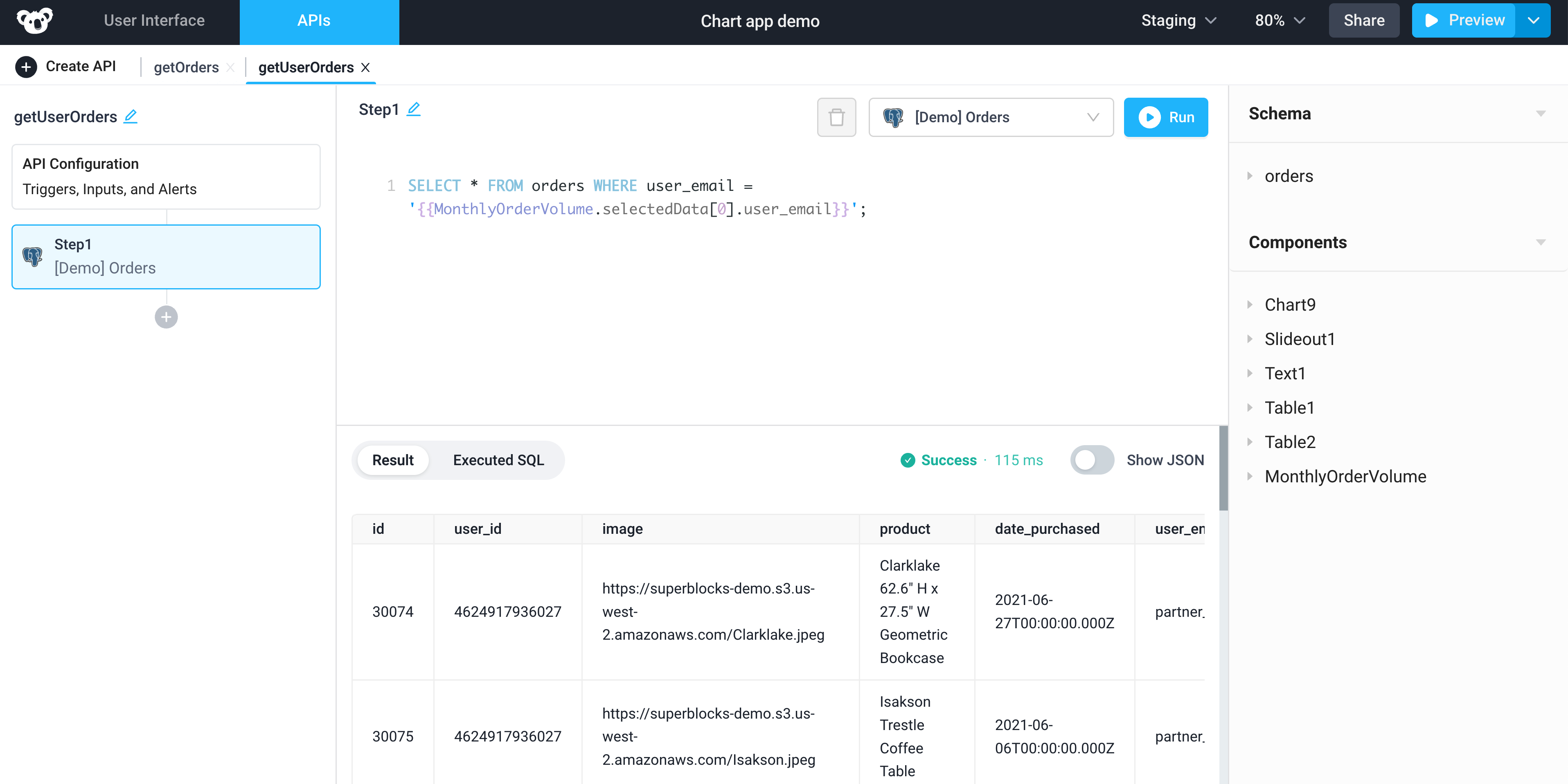
Now that we have an API to query for a user's purchases, let's add a Table component to display those results.
- Drag a new Table component to the canvas and replace the JSON in Chart Data with
{{getUserOrders.response}} - Replace the Table Header with
Orders from "{{MonthlyOrderVolume.selectedData[0].user_email}}"to display the selected user's email - In the 'MonthlyOrderVolume' chart, add
{{getUserOrders.run()}}under the onSelectData to trigger the API to run with a datapoint is clicked
Now when you click on a specific user in the chart, their orders will be displayed in the table below.
Advanced charting using Python, Pandas, and Plotly
Superblocks supports Plotly Charts using the Plotly Python library, which allows advanced charting beyond UI Charts.
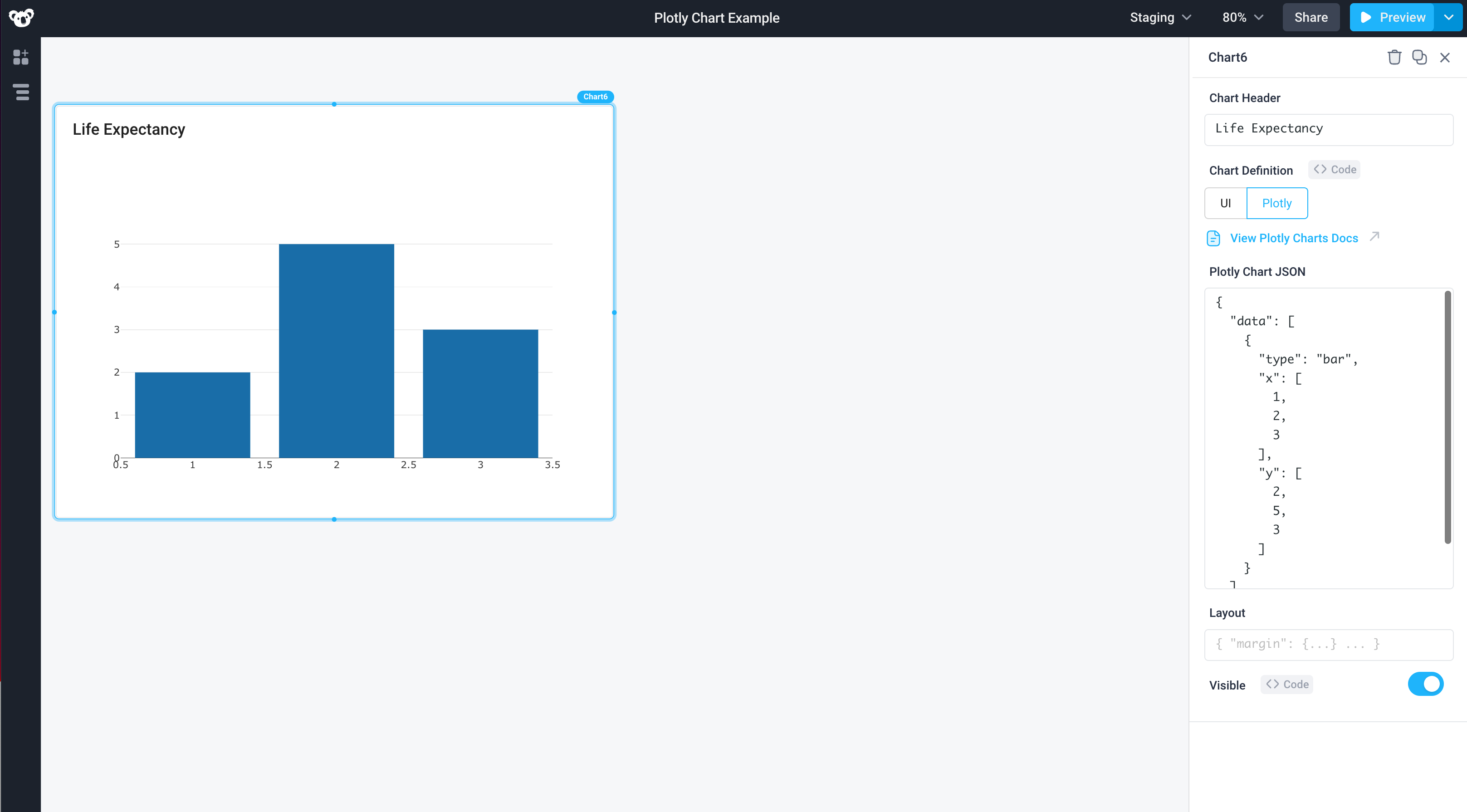
Using Plotly, we can any create any type of visualization inside Superblocks with our data. For example, let's take an example chart from Plotly, such as this sunburst plot that shows life expectancy across the world, and render it in Superblocks.
Drag another chart from the Components table into the canvas and title it 'Life Expectancy'. In the Properties Panel, select Plotly Chart under Chart Definition.
- Create an API using Python and name it
getLifeExpectancyData - Copy the Python code from the example in Plotly and paste it in the first API step
- Replace the final line
fig.show()withreturn fig(Plotly charts expect afigobject, the data structure used by Plotly to render graphs in order to render) - After running the API, replace the example data in Plotly Chart JSON
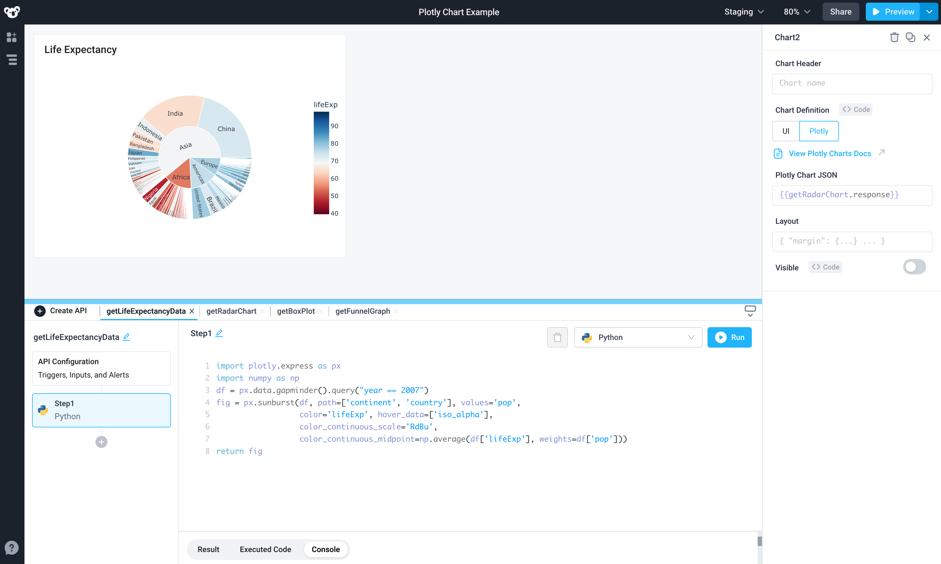
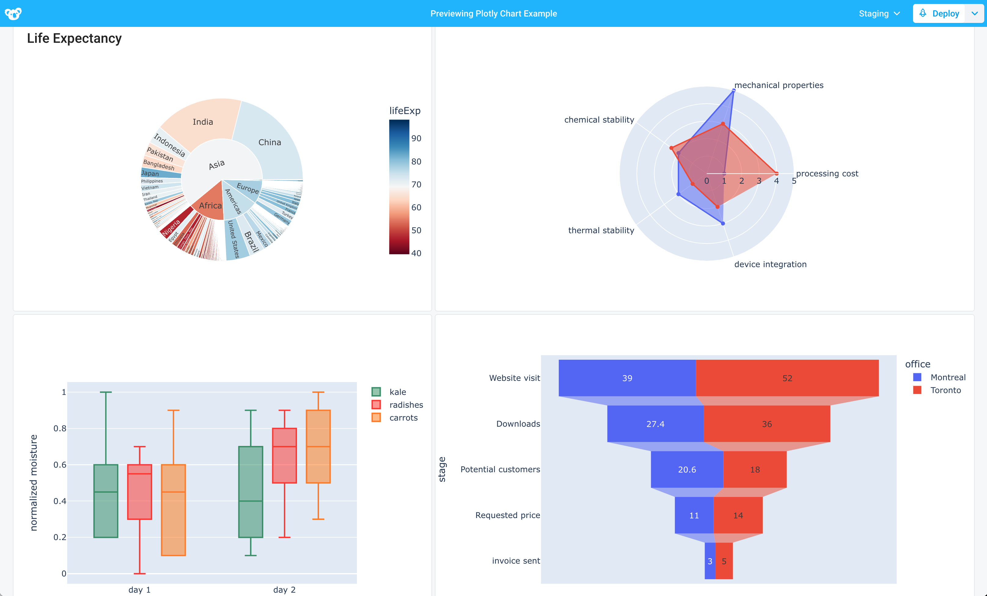
As long as a fig object is returned, Plotly charts are flexible enough to create a wide variety of complex visualizations, such as radar charts, box plots, and funnel charts.
For more on using Python in Superblocks, check out the docs here.