Custom Component Files
Each Custom Component is comprised of the three following files:
config.ts- the source of truth for the component configuration, including properties & eventscomponent.tsx- the React code for the component, which exports the component as its default exporttypes.ts- the TypeScript types for your component, auto-generated based on yourconfig.ts
config.ts
The config.ts file is the source of truth from which Superblocks fetches information about your component.
This file includes the following properties:
| Property | Description |
|---|---|
| id | The unique identifier for your custom component. You should not modify this property as it is auto-generated when the component is registered |
| name | The machine readable name for your component, used as the default identifier when you create an instance of the component |
| displayName | The human readable name for your component. This name will be displayed in your Component List in the Application UI |
| componentPath | The filepath where this component is found |
| gridDimensions | Optional. The initial dimensions of the component when it is dragged onto the app canvas |
| properties | The list of properties which the component supports. See the schema of properties below |
| events | The list of events which the component supports. See the schema of events below |
The config.ts file is automatically generated based on your inputs when running the superblocks components create command.
You can then modify this file as you wish (except the id property) to update your Custom Component configuration - for example, to add additional properties or modify the name(s) of your event(s).
The following is an example config.ts file for a To-Do List component
import { type ComponentConfig } from "@superblocksteam/cli";

export default {
  // DO NOT CHANGE THE ID ONCE THE COMPONENT HAS BEEN REGISTERED!
  id: "14d52bcd-b64b-452c-b6eb-6ffd6e0732af",
  name: "ToDoList",
  displayName: "To Do List (Example)",
  componentPath: "components/ToDoList/component.tsx",
  properties: [
    {
      path: "tasks",
      dataType: "any",
      description: "The list of tasks",
      propertiesPanelDisplay: {
        label: "Default Tasks",
        controlType: "js-expr",
        placeholder:
          "{ taskId: { taskName: 'Task Name', taskStatus: 'complete' | 'todo' } }",
      },
    },
    {
      path: "deletedTasks",
      dataType: "any",
      description: "The list of deleted tasks",
      isExternallySettable: false,
      isExternallyReadable: true
    }
  ],
  events: [
    {
      label: "On Task Added",
      path: "onTaskAdded",
    },
    {
      label: "On Task Status Changed",
      path: "onTaskStatusChanged",
    },
    {
      label: "On Task Deleted",
      path: "onTaskDeleted",
    }
  ],
} satisfies ComponentConfig;
Properties schema
Each property is defined in your config.ts file as an object with the following properties:
| Property | Description |
|---|---|
| path* | The path used to reference the property throughout Superblocks and in your React code. Note that the property path must not be reserved |
| dataType* | The type of data the property expects. One of "string", "number", "boolean", "any" |
| description | Optional. The description of the property - used in the tooltip and in autocomplete |
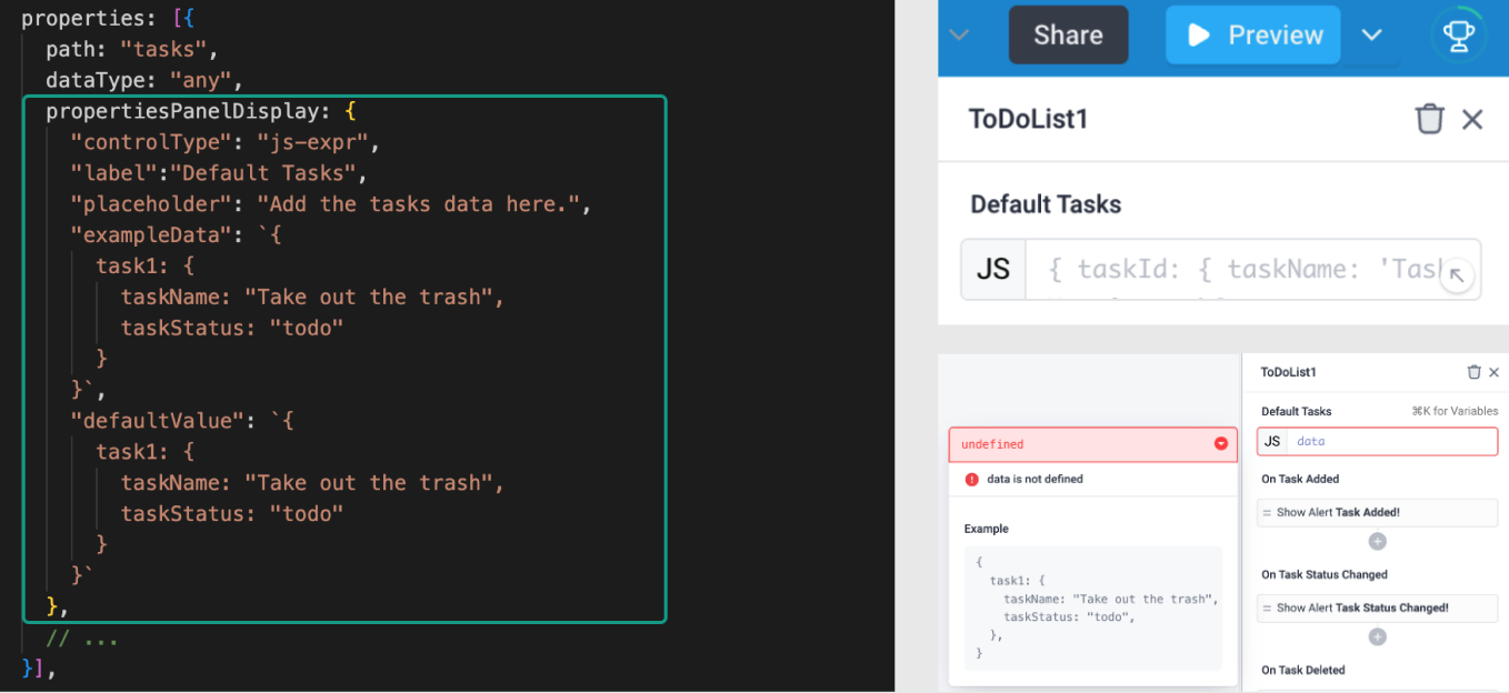
| propertiesPanelDisplay | Optional. The configuration for how the property will be displayed in the properties panel. Excluded if a property should not be surfaced in the properties panel. The propertiesPanelDisplay schema is included below |
| isExternallySettable | Optional. Defaults to true. Whether or not the property can be set or reset by other parts of the application |
| isExternallyReadable | Optional. Defaults to true. Whether or not the property can be read by other parts of the application |
PropertiesPanelDisplay schema
| Property | Description |
|---|---|
| controlType* | How the property control will be represented. One of "text", "js-expr", "switch" |
| label* | The label of the property |
| placeholder | Optional. The placeholder data which will appear in the properties panel. Only relevant for controlTypes with user inputs |
| exampleData | Optional. Helper data displayed to the user when entering a value |
| defaultValue | The default value for the property that is set in the properties panel and is passed to each new instance of a component when it is dragged onto the canvas. The provided value must match the dataType of the property |

Events schema
Each event is defined in your config.ts file as an object with the following properties:
| Property | Description |
|---|---|
| label* | The displayed label for the event within the properties panel |
| path* | The name of the function to use in your React code to trigger the event |
component.tsx
The component.tsx file is where you write the React code for your component. This file is initially generated based on your inputs in the superblocks components create wizard. You should modify this file directly in order to develop your Custom Component.
In your code, you will use the Custom Components React API to integrate with the Superblocks Application.
This file must contain a default export which contains a single React component.
types.ts
The types.ts file contains the TypeScript types to use in your component.tsx file. These types are automatically generated based on your config.ts when you initially create the component via superblocks components create, and regenerated each time you modify the config.ts file while running superblocks components watch.
You should not modify the types.ts file manually