Styling Custom Components
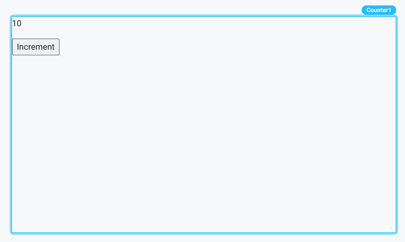
There are a number of approaches to styling your Custom Components. To illustrate these approaches, let's walk through an example. Imagine we are trying to style our simple counter component.
Because Custom Components are rendered alongside the rest of the Superblocks App Builder, your CSS classes can override parts of the Superblocks App. As such, we strongly recommend that you namespace your styles using one of the approaches below.

import { Props } from "./types";
import { useSuperblocksContext } from "@superblocksteam/custom-components";
import { type Props, type EventTriggers } from "./types";

export default function Component({
  count,
}: Props) {
  const {updateProperties, events: {onCountChange}} = useSuperblocksContext<Props, EventTriggers>();

  const handleIncrementClick = () => {
    updateProperties({ count: count + 1 });
    onCountChange();
  };

  return (
    <div>
      <div>
        <p>{count}</p>
        <button onClick={handleIncrementClick}>Increment</button>
      </div>
    </div>
  );
}
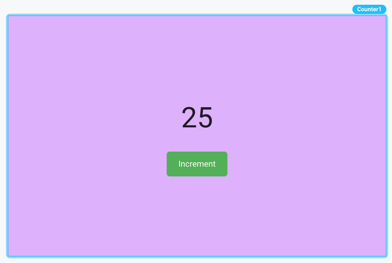
We want to style the component so it looks like the following:

CSS Modules
You can leverage CSS Modules to style your components. CSS Modules are scoped locally by default, which helps avoid naming collisions.
In order to leverage CSS Modules, you'll first want to create a file for your CSS with the .module.css extension - for example, counter.module.css. You'll then populate this file with your CSS.
counter.module.css
.counter-container {
  background-color: #e0b0ff;
  display: flex;
  align-items: center;
  justify-content: center;
  flex-direction: column;
  height: 100%;
  width: 100%;
}

.counter-count {
  font-size: 3rem;
  margin-bottom: 20px;
}

.counter-button {
  background-color: #4caf50;
  color: white;
  padding: 10px 20px;
  border: none;
  border-radius: 5px;
  cursor: pointer;
  display: flex;
  align-items: center;
  justify-content: center;
  transition: background-color 0.3s ease;
}

.counter-button:hover {
  background-color: #45a049;
}

.counter-button i {
  margin-right: 5px;
}
Then you'll need to import from this file, and update your classNames in your React code.
Class names are automatically transformed to camel case. You can use the class name directly as in the example below, or use the transformed camel cased version (ex: styles.counterContainer)
import { useSuperblocksContext } from "@superblocksteam/custom-components";
import { type Props, type EventTriggers } from "./types";
import styles from "./counter.module.css";

export default function Component({
  count,
}: Props) {
  const {updateProperties, events: {onCountChange}} = useSuperblocksContext<Props, EventTriggers>();

  const handleIncrementClick = () => {
    updateProperties({ count: count + 1 });
    onCountChange();
  };

  return (
    <div className={styles["counter-container"]}>
      <p className={styles["counter-count"]}>{count}</p>
      <button
        className={styles["counter-button"]}
        onClick={handleIncrementClick}>
        Increment
      </button>
    </div>
  );
}
You may notice a TypeScript error in your styles import. You can fix this by providing TypeScript with type definitions for CSS Modules.
First, create a new declaration file in your project. You can put it at the root level or inside a types folder. The filename could be something like styles.d.ts.
declare module "*.module.css" {
  const classes: { [key: string]: string };
  export default classes;
}
This tells TypeScript that for any imported module with an extension of .module.css, it should treat the imported value (styles in your component file) as an object where keys are strings (the class names) and values are also strings (the transformed class names).
Next, you may need to ensure that TypeScript recognizes the declaration file by updating your tsconfig.json file. TypeScript should automatically pick up any .d.ts files in your project. However, if you're placing your declaration files inside a specific folder (e.g., types), you might want to explicitly include it in your tsconfig.json:
{
  "include": ["src/**/*", "types/**/*"]
}
Global CSS
You can import any .css file, but it will affect all styles within the App Builder. We recommend that you namespace any CSS you write, as we do in the example below.
When using third-party libraries which ship separate CSS files (for example, BlueprintJS), it is important to look out for potential conflicts with the Superblocks App styling. For example, some libraries may include reset stylesheets, which might inadvertently reset the Superblocks App styles. As such, it is important to test and look out for visual changes from what you're expecting due to potential naming conflicts.
global.css
.counter-container {
  background-color: #e0b0ff;
  display: flex;
  align-items: center;
  justify-content: center;
  flex-direction: column;
  height: 100%;
  width: 100%;
}

.counter-count {
  font-size: 3rem;
  margin-bottom: 20px;
}

.counter-button {
  background-color: #4caf50;
  color: white;
  padding: 10px 20px;
  border: none;
  border-radius: 5px;
  cursor: pointer;
  display: flex;
  align-items: center;
  justify-content: center;
  transition: background-color 0.3s ease;
}

.counter-button:hover {
  background-color: #45a049;
}

.counter-button i {
  margin-right: 5px;
}
component.tsx
import { useSuperblocksContext } from "@superblocksteam/custom-components";
import { type Props, type EventTriggers } from "./types";
import "./global.css";

export default function Component({
  count,
}: Props) {
  const {updateProperties, events: {onCountChange}} = useSuperblocksContext<Props, EventTriggers>();

  const handleIncrementClick = () => {
    updateProperties({ count: count + 1 });
    onCountChange();
  };

  return (
    <div className="counter-container">
      <p className="counter-count">{count}</p>
      <button className="counter-button" onClick={handleIncrementClick}>
        Increment
      </button>
    </div>
  );
}
CSS-in-JS
You can leverage CSS-in-JS libraries to style Custom Components in Superblocks. Most CSS-in-JS libraries should be supported without requiring additional configuration.
Example - Emotion Styled
For example, let's walk through using the popular Emotion Styled CSS-in-JS library to style our component.
First, we'll need to install the @emotion/styled package into our application directory.
npm i @emotion/styled @emotion/react
Then, we'll update our component.tsx file to leverage the Emotion Styled approach for styling our component.
import { useSuperblocksContext } from "@superblocksteam/custom-components";
import { type Props, type EventTriggers } from "./types";
import styled from "@emotion/styled";

// Emotion Styled Components
const Container = styled.div`
  background-color: #e0b0ff;
  display: flex;
  align-items: center;
  justify-content: center;
  flex-direction: column;
  height: 100%;
  width: 100%;
`;

const Button = styled.button`
  background-color: #4caf50;
  color: white;
  padding: 10px 20px;
  border: none;
  border-radius: 5px;
  cursor: pointer;
  display: flex;
  align-items: center;
  justify-content: center;
  transition: background-color 0.3s ease;
  &:hover {
    background-color: #45a049;
  }

  i {
    margin-right: 5px;
  }
`;

const Counter = styled.p`
  font-size: 3rem;
  margin-bottom: 20px;
`;

export default function Component({
  count,
}: Props) {
  const {updateProperties, events: {onCountChange}} = useSuperblocksContext<Props, EventTriggers>();

  const handleIncrementClick = () => {
    updateProperties({ count: count + 1 });
    onCountChange();
  };

  return (
    <Container>
      <Counter>{count}</Counter>
      <Button onClick={handleIncrementClick}>Increment</Button>
    </Container>
  );
}
Tailwind CSS
You can use Tailwind CSS to style your components as well, with a slightly modified installationa and configuration.
Installation
You can view the instructions for installing Tailwind using PostCSS here.
When you reach Step 2, you'll need to create a new postcss.config.js file at the root of your Application Directory (the same level as your package.json file). You should use Tailwind's provided configuration.
When you configure your template paths in your tailwind.config.js file, be sure to include all relevant files in your components directory. The following configuration should be sufficient:
/** @type {import('tailwindcss').Config} */
module.exports = {
  content: ["./components/**/*.{ts,tsx,js,jsx}"],
  theme: {
    extend: {},
  },
  plugins: [],
};
Be sure to import the CSS file where you've added your Tailwind directives into your component.tsx file.
Finally, you may need to restart your local development server by running superblocks components watch.
Example Usage
Once we've configured Tailwind CSS, we can style our Counter component as follows:
import { useSuperblocksContext } from "@superblocksteam/custom-components";
import { type Props, type EventTriggers } from "./types";
import "./styles.css";

export default function Component({
  count,
}: Props) {
  const {updateProperties, events: {onCountChange}} = useSuperblocksContext<Props, EventTriggers>();

  const handleIncrementClick = () => {
    updateProperties({ count: count + 1 });
    onCountChange();
  };

  return (
    <div className="bg-purple-200 flex flex-col items-center justify-center p-8 rounded-md h-full w-full">
      <p className="text-4xl mb-4 underline">{count}</p>
      <button
        className="bg-green-500 hover:bg-green-600 text-white px-4 py-2 rounded-md flex items-center"
        onClick={handleIncrementClick}
      >
        Increment
      </button>
    </div>
  );
}
Note that styles.css is the name of the file where we've added our Tailwind directives.
Other Styling Libraries
Most styling libraries should be supported for Custom Components without much additional configuration.
Under the hood, Custom Components relies on Vite throughout. As such, it is generally reasonable to look to Vite's documentation to determine how a specific concept is handled. For example, Custom Components supports TailwindCSS installation using PostCSS, as PostCSS is automatic in Vite.
If you have trouble using a particular styling library, please reach out to Superblocks support.