Custom Components Quickstart
Welcome to Custom Components! In this quickstart guide, you'll build a To-Do List Custom Component in the following steps:
- Install the Superblocks CLI & initialize your Superblocks repo
- Create your component locally
- Start your local development server and connect it to Superblocks
- Interact with the component
- Upload your component to Superblocks
- Commit your application
- Build a new feature to delete a task from the list
Steps 1-6 should take ~5 minutes total. By going through these steps, you'll complete the full Custom Components development lifecycle.
In the final step, you will write some new code to add a feature to the provided component. In this step, you'll learn the Custom Components React API and put the fundamental concepts into practice. We highly recommend completing this step, as doing so will teach you all you need to easily build custom components going forward!
Please be sure to commit your application before you begin developing Custom Components.
1. Install the Superblocks CLI & initialize your Superblocks repo
Developing Custom Components in Superblocks requires using the Superblocks CLI.
Install the CLI
To install the CLI, run:
npm install -g @superblocksteam/cli@latest
- Please use
npmto install the CLI.yarnis not currently supported. - Please ensure you are running a supported version of node.
Log into your account
Once the CLI is installed, you will need to log into your Superblocks account by running:
superblocks login
The Superblocks CLI uses the app.superblocks.com domain by default. If you wish to use a different domain, run superblocks config set domain {domain}.
Initialize your Superblocks repo locally
Next, you will create a new local directory for your Superblocks resources & navigate into that directory.
mkdir [MY_SUPERBLOCKS_DIRECTORY]
cd [MY_SUPERBLOCKS_DIRECTORY]
Learn more about the Superblocks directory.
Finally, you need to initialize the local directory for the Superblocks Application for which the Custom Component will be scoped.
Grab the URL from your Superblocks Application and run:
superblocks init [MY_APPLICATION_URL] -m latest-edits
For example:
superblocks init https://app.superblocks.com/applications/c9d060f6-66a3-4859-9008-f2d069c91cf9/pages/3318ed66-e1e8-4187-8c51-93ef3b2a1d6d/edit -m latest-edits
You will now have a directory configured for your application, and can begin developing your Custom Component!
Learn more about the Application directory.
2. Create your component locally
Next, you need to configure your component. Let's use the Superblocks CLI to create the component locally.
First, we'll navigate into the application directory that we initialized above.
cd apps/[MY_APPLICATION_DIRECTORY]
Then, we'll run the create command to initialize our component locally.
superblocks components create --example
The example component is a To-Do List which implements various features, including integration with the Custom Components React API, custom styling, property validation, and more.
If you don't intend to follow along closely with this guide and want to create your own component from scratch, simply run superblocks components create and follow the wizard
Creating the example component will initialize a /components directory, which contains the following files:
| File | Description |
|---|---|
config.ts | The source of truth from which Superblocks fetches information about your component. Learn more about the config.ts file here. |
component.tsx | The file which contains the React code for your component (as a default export). Learn more about the component.tsx file here. |
types.ts | The TypeScript types to use in your React code. This file is autogenerated based on your config.ts file. Learn more about the types.ts file here. |
main.scss | The stylesheet for the component. This stylesheet is written using sass. Stylesheets are optional and will not be included by default when creating components from scratch. Learn more about styling Custom Components. |
validation.tsx | Custom validation written specifically for this component. This file is completely optional and is imported into the component.tsx file. |
Feel free to open this directory in your code editor. We will go into greater depth with each file later in this guide.
Learn more about the component files
Running the create command registers your custom component in Superblocks. Open your components list, and click the refresh icon beside the Custom Components section. You should see the To-Do List (Example) component listed in the components list.
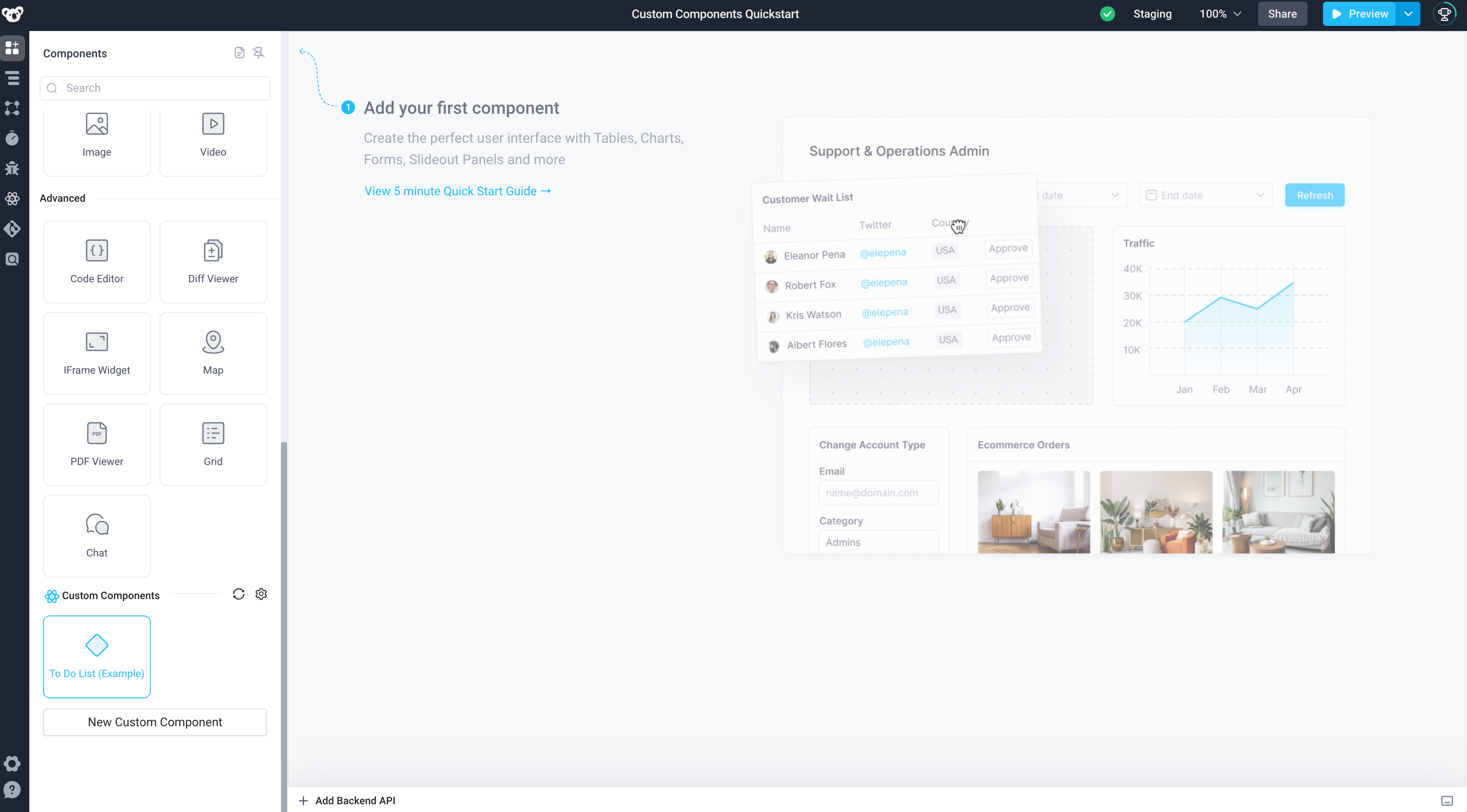
If you drag the component onto your canvas at this point, you will see an error which indicates that the component has not yet been uploaded to Superblocks. Don't worry about this error - move onto the next steps to develop your component and eventually upload the completed component to Superblocks!
3. Start your local development server and connect it to Superblocks
In order to develop your component, you will use Superblocks Local Development Mode. This mode allows you to serve the component from your local machine and interact with it in the Superblocks UI.
Learn more about Local Development Mode
Run the watch command to start your local dev server
First, let's run the watch command to run the local development server.
superblocks components watch
Enable Local Dev Mode in the Superblocks Application UI
Click the link returned by this command to open your Application with Local Dev Mode enabled. You can also control Local Dev Mode via the Custom Components panel by clicking the React icon in the sidebar.
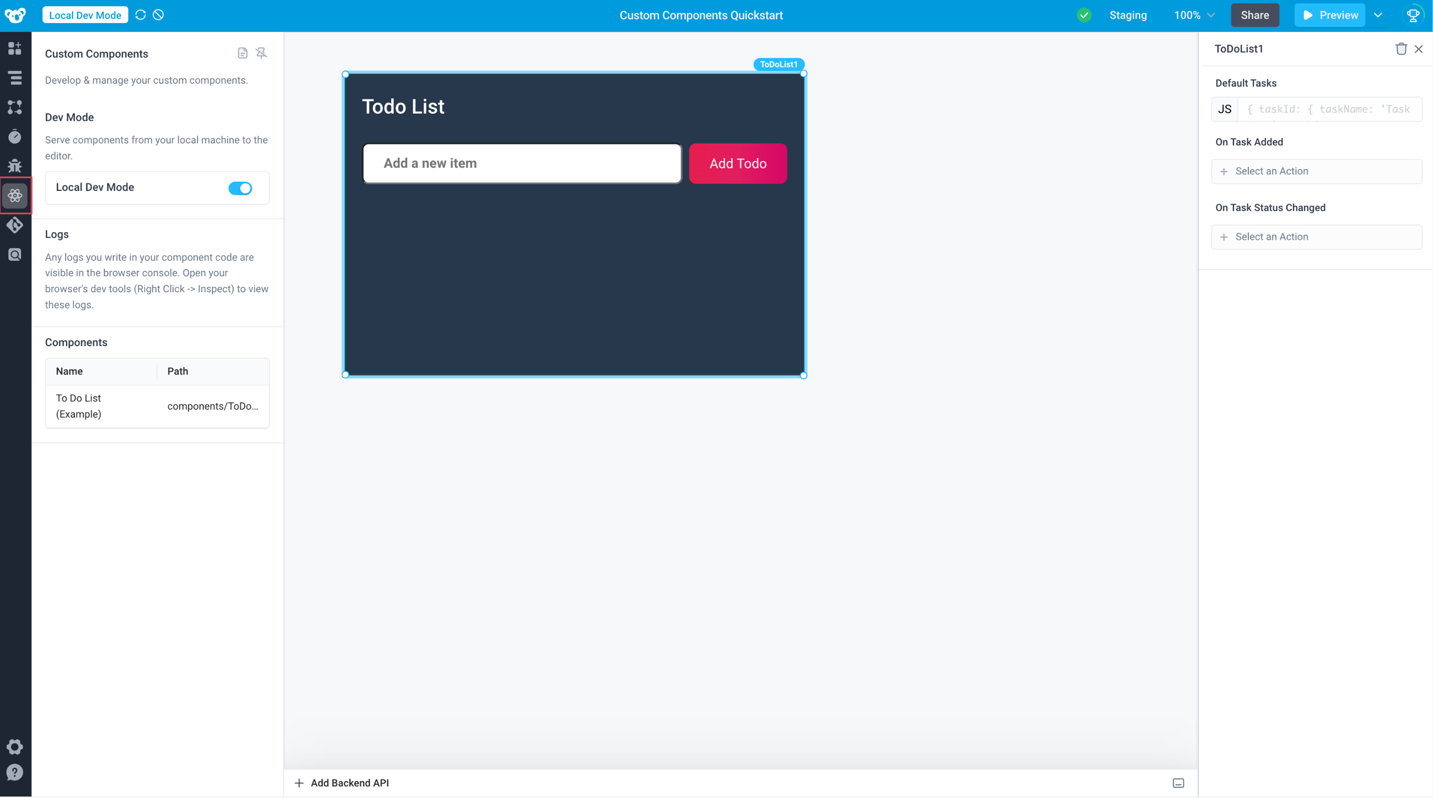
When Local Dev Mode is enabled, the Application fetches the component from your development server running on your local machine.
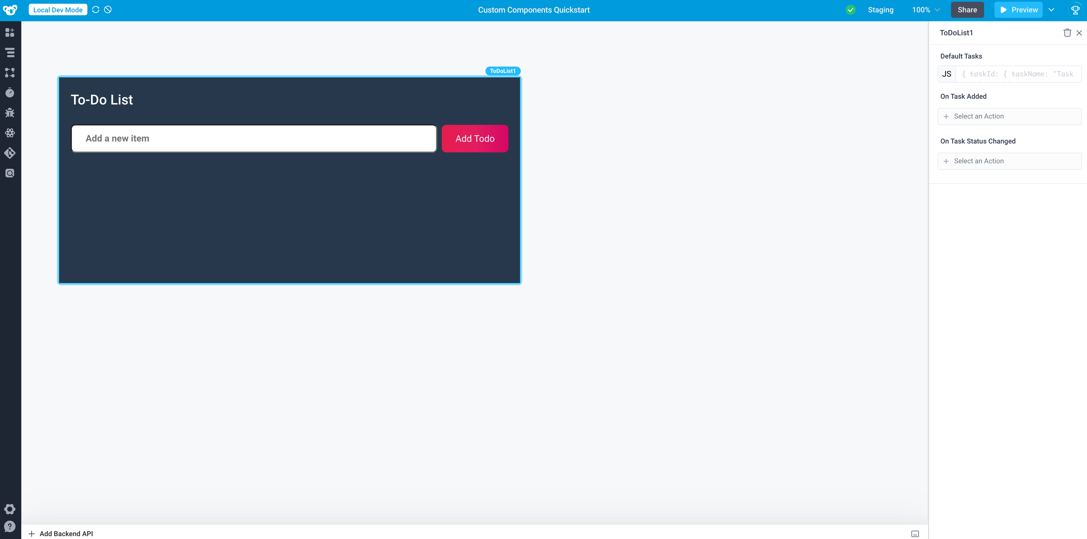
Local Dev Mode provides hot-reloading, so that when you make an edit to your component locally, the change is immediately reflected in Superblocks. Open your component.tsx file and update the header of the component from "Todo List" to "To-Do List", and view the updated component in your App.
{/* ... */}
<h2>To-Do List</h2>
{/* ... */}
4. Interact with the component
If we were starting from scratch, now would be the time to build out our component. However, because we chose to leverage the example component, the directory we initialized contains a fully functioning To-Do List Custom Component.
In Step 7 we will add a new feature to the component. Stay tuned!
Play around with the To-Do List component to understand its functionality. Specifically, note that the component:
- Displays a list of tasks
- Allows users to add a task to the list via an input and a button
- Allows users to check off a task in the list
- Allows developers in Superblocks to set the default list of tasks via the properties panel
- Allows developers in Superblocks to wire up event handlers to an On Task Added event
- Allows developers in Superblocks to wire up event handlers to an On Task Status Changed event
Anatomy of our To-Do List Component
Let's do a bit of investigation to understand how this component works. Remember, properties & events are defined in the config.ts file, and then leveraged in our React code within the component.tsx file. Open up these files to follow along.
Properties
This component has one property, tasks, which
- Stores an object containing the set of tasks, which are displayed in the component
- Is exposed in the properties panel in Superblocks, with the name "Default Tasks", allowing developers to provide the default set of tasks
This property is then updated as a user interacts with the task list:
- When a user adds a task, the task is added to the
tasksobject (see theonTodoAddedmethod in the React code) - When a user modifies the status of a task, the task's
taskStatusis modified (see theonTaskStatusChangemethod in the React code)
Events
This component triggers two types of events in Superblocks:
- On Task Added - this event is triggered when a task is added - see the
onTaskAdded()invocation in theonTodoAddedmethod - On Task Status Changed - this event is triggered when a task's status changes - see the
onTaskStatusChanged()invocation in theonTaskStatusChangemethod
5. Upload your component to Superblocks
Let's upload the To-Do List Custom Component so that we can use it in our application.
Remember that in Local Development Mode, the component is served from your local machine. In order to access the component outside of Local Dev Mode, the component must be uploaded to Superblocks, so that it can be served from Superblocks.
Run the upload command
Run the upload command from the CLI:
superblocks components upload
Learn more about uploading your component to Superblocks
Test your component outside of Local Dev Mode
In order to test out the uploaded version of your component, disable Local Dev Mode by clicking the icon in the header, and ensure that your component functions as expected.
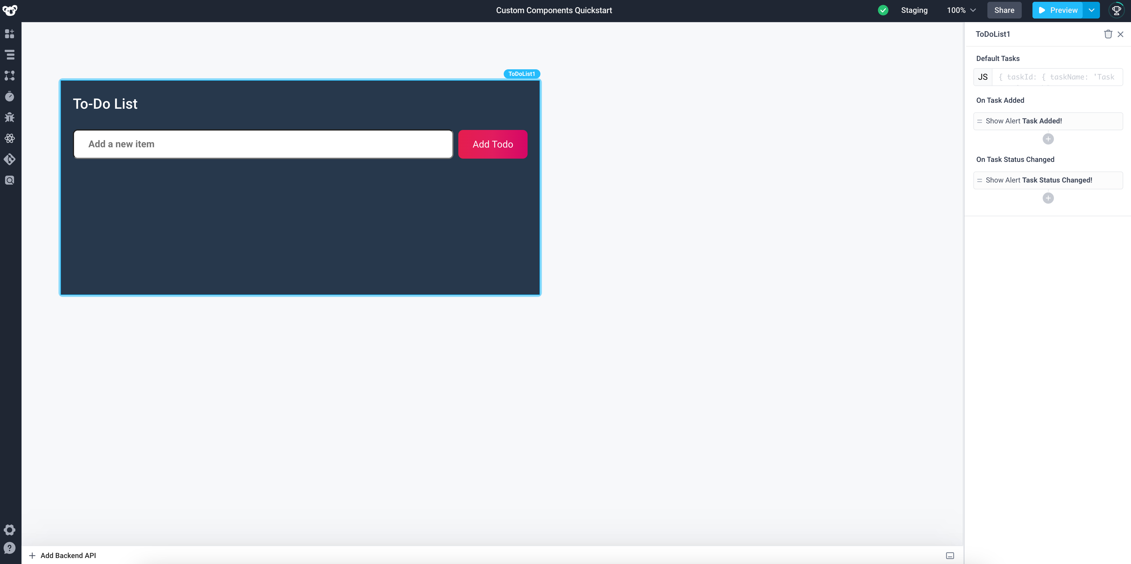
This component is now ready for use in your Superblocks App!
6. Commit your application
Next, let's commit the application.
Learn more about commits in Superblocks.
Each time you create a commit, the version of the Custom Component which was uploaded at the time of the commit is pinned to that commit. This versioning ensures that the custom component is versioned alongside your commits.
Learn more about Custom Component Versioning
After completing the next step, you can test this versioning behavior, by examining the preview for the commit we just created. You will see that any changes you make to the component do not affect the committed version of the app.
7. Add support to delete a task
Now comes the fun part - let's implement a new feature to delete a task from our component list.
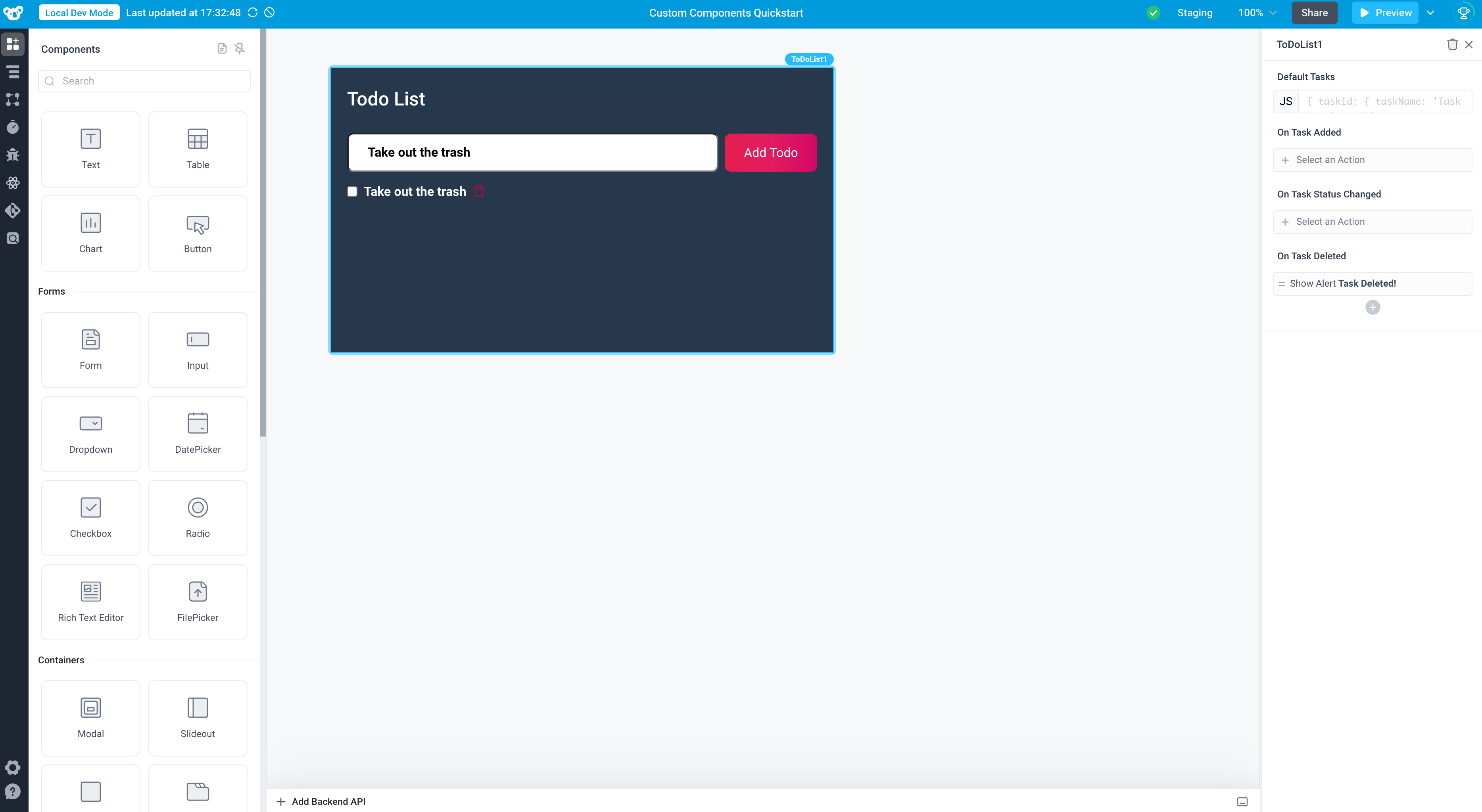
Adding the icon to our component
We will use the Ant Design Icon Library library for our delete icon. Let's install that library by running:
npm install @ant-design/icons
Be sure to install the dependencies into your application directory
Now, we'll modify the React code to build out our custom component!
Let's use the DeleteOutlined icon. First, we need to import the icon into our component.tsx file with the following import statement:
import { DeleteOutlined } from "@ant-design/icons";
Next, we want to display the icon alongside each task. Let's update the div with className="checkboxes" to add the icon alongside the each task.
{/* ... */}
<div className="checkboxes">
  {Object.entries(validatedTasks).map(
    ([id, task]: [string, Task], idx) => (
      <div key={idx} className="horizontal-layout">
        <input
          type="checkbox"
          checked={task.taskStatus === "complete"}
          onChange={(e) => onTaskStatusChange(id, e.target.checked)}
        />
        <p>
          <span
            className={
              task.taskStatus === "complete" ? "is-complete" : ""
            }>
            {task.taskName}
          </span>
        </p>
        {/* new code for icon */}
        <div>
          <DeleteOutlined className="delete-button" />
        </div>
      </div>
    )
  )}
</div>
{/* ... */}
Now we should see a trash can icon displayed alongside each task in the list.

Wiring up the delete functionality
Next, let's wire up the functionality so that clicking the icon removes the task from the list.
We know that the list of tasks is managed via Superblocks state, specifically via the tasks property. Thus, in order to build this functionality, we will need to update that tasks property to remove the task when a user clicks the delete icon.
We'll write a new function onTaskDelete in our React code to handle this deletion. This function will receive an id of a task, and use the provided updateProperties() function to update that tasks piece of Superblocks state to a new object which excludes the task with that id, deleting the task from the set.
Learn more about updating properties using the React API
const onTaskDelete = useCallback(
  (id: string) => {
    // create a copy of the validated tasks which we will manipulate
    const newTasks = { ...validatedTasks };
    // delete the task
    delete newTasks[id];
    // use updateProperties to set the new value of the tasks property
    updateProperties({
      tasks: newTasks,
    });
  },
  [updateProperties, validatedTasks, tasks, onTaskStatusChanged, deletedTasks]
);
Next, we'll need to ensure that clicking the icon calls our function. We'll add an onClick handler to the <div/> wrapping our icon.
<div onClick={() => onTaskDelete(id)}>
  <DeleteOutlined className="delete-button" />
</div>
Navigate back to your application and click the trash can icon to see the task removed from the list!
Adding the On Task Deleted event in Superblocks
At this point, we have built out functionality to delete an item from the list. However, there is no mechanism for the rest of the Superblocks Application to listen for these deletions. In order to allow the rest of our application to hook into this event, we want to add a new event to our component called On Task Deleted.
First, we need to update our config.ts file to add this event. We can add a new event to the list with the following code:
{
  // ...r
  events: [
    // other events
    {
      label: "On Task Deleted",
      path: "onTaskDeleted",
    },
  ]
}
Save this change, then take a look at your types.ts file. You'll notice that the new event was automatically added to your EventTriggers type.
Next, we need to trigger this event in our component code. Event Triggers are accessed by calling the useSuperblocksContext hook. You should add onTaskDeleted to the list of event triggers being destructured from this hook.
const {
  updateProperties,
  events: { onTaskAdded, onTaskStatusChanged, onTaskDeleted },
} = useSuperblocksContext<Props, EventTriggers>();
Finally, we want to trigger this event in Superblocks when the user deletes an event. Let's update our onTaskDelete function we wrote above to call the onTaskDeleted() event trigger.
Learn more about triggering events using the React API
const onTaskDelete = useCallback(
  (id: string) => {
    const newTasks = { ...validatedTasks };
    delete newTasks[id];
    updateProperties({
      tasks: newTasks,
    });
    // trigger the On Task Deleted event in Superblocks
    onTaskDeleted();
  },
  [updateProperties, validatedTasks, tasks, onTaskStatusChanged, deletedTasks]
);
To test this out, add an event handler to your On Task Deleted event in Superblocks to show an alert. Then, delete a task from the list, and you should see the alert!
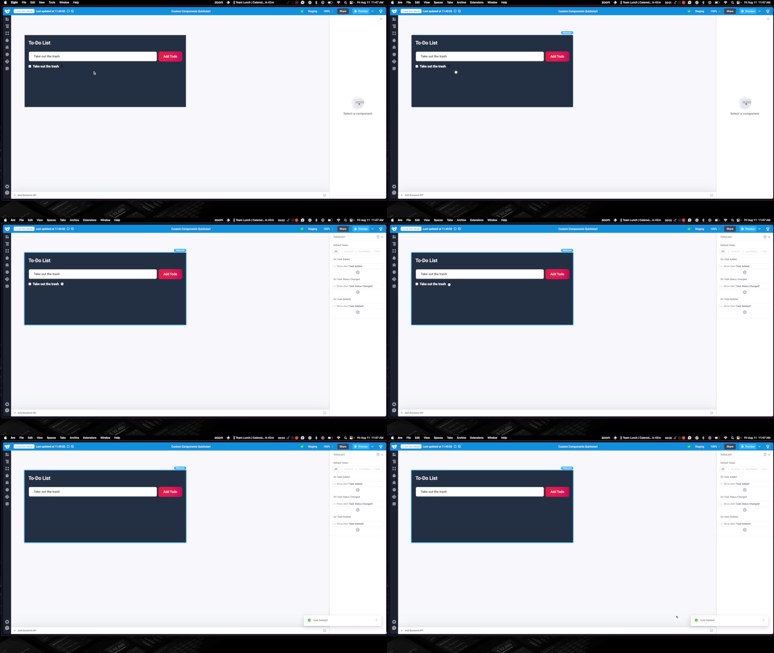
Keeping track of deleted tasks
We have now implemented functionality to delete a task from the list and fire a corresponding Superblocks event. In our current implementation, once a task is deleted, that task is permanently gone, as it is removed from the tasks piece of state.
Imagine we actually want to preserve the list of deleted tasks. Perhaps we intend to display the list of deleted tasks in another Superblocks component and allow a user to restore a deleted task with a single click. Let's walk through how we would accomplish that goal.
Since we know that we want to expose this list of deleted tasks to the rest of our Superblocks Application, this indicates that we should manage this piece of state in Superblocks. As such, we should create a new property. Navigate to the config.ts file to add a new property.
{
  path: "deletedTasks",
  dataType: "any",
  description: "The list of deleted tasks"
}
We do not want to expose this property in the Properties Panel, as it would not make sense to allow a developer in Superblocks to provide this list explicitly. As such, we will simply exclude the propertiesPanelDisplay object from our property configuration.
Save the configuration - we should now see that:
- The
types.tsfile has been automatically updated to include to thedeletedTasksprop - In our Superblocks Application, the
deletedTasksproperty is a part of our component state, and this property is not displayed in the properties panel.
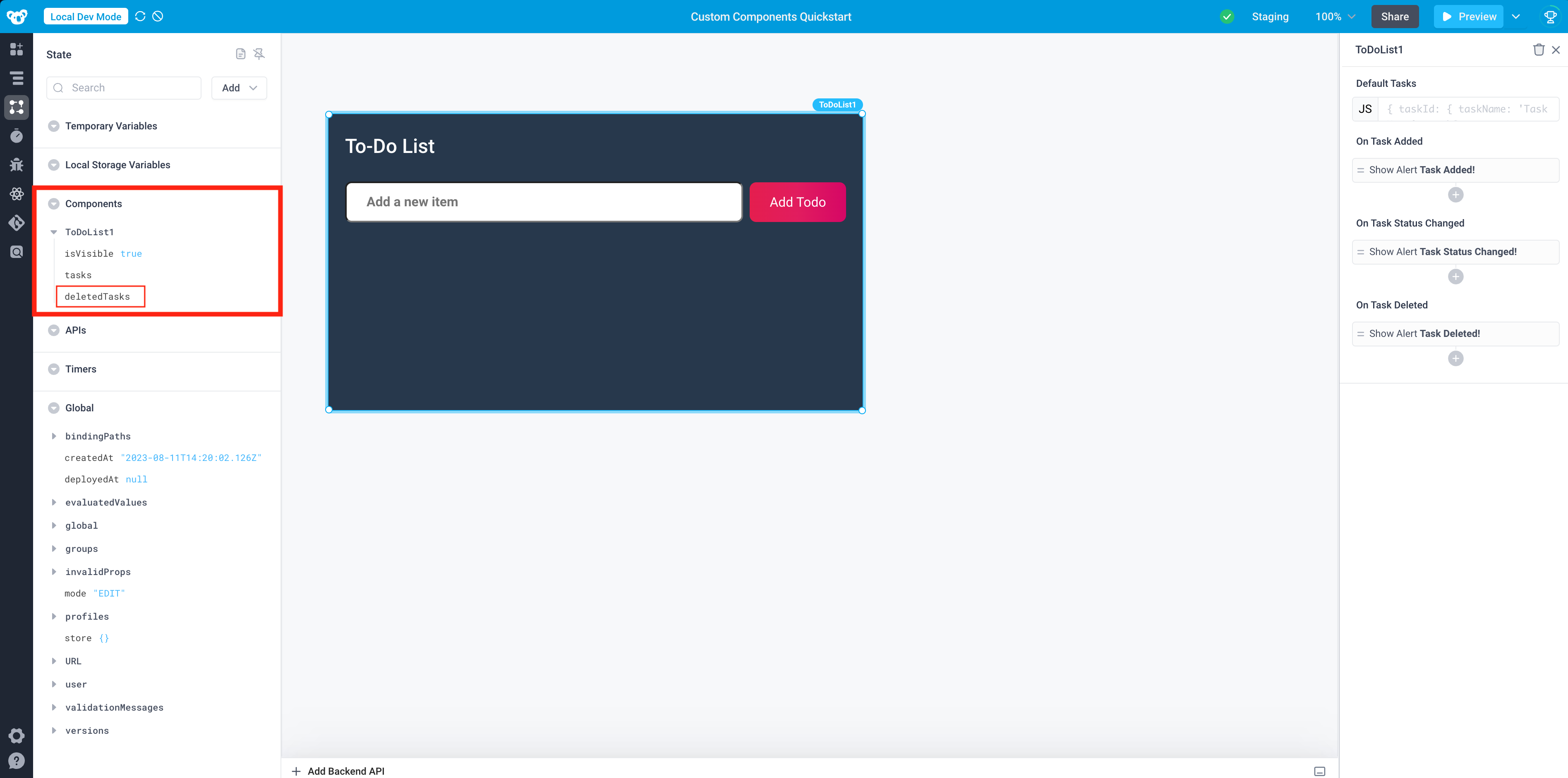
Now, we need to update our component.tsx code to track & update the deletedTasks property we just defined.
First, we'll update our component to destructure out the deletedTasks prop from the props the component receives.
export default function Component({ tasks, deletedTasks }: Props)
Next, we'll update our onTaskDelete function to write each deleted task to the deletedTasks property.
const onTaskDelete = useCallback(
  (id: string) => {
    // create a copy of the validated tasks which we will manipulate
    const newTasks = { ...validatedTasks };
    // get the task we are about to delete
    const taskToDelete = validatedTasks[id];
    // delete the task
    delete newTasks[id];
    // using the provided updateProperties method
    updateProperties({
      // set the new value of the tasks property
      tasks: newTasks,
      // add the task to the deletedTasks property
      deletedTasks: {
        ...deletedTasks,
        [id]: taskToDelete,
      },
    });
    // trigger the On Task Deleted event in Superblocks
    onTaskDeleted();
  },
  [updateProperties, validatedTasks, tasks, onTaskStatusChanged, deletedTasks]
);
To verify this behavior works as expected:
- Delete a task from the list
- Inspect the
deletedTasksproperty of the component state - you should see the task you just deleted!
Now, if you wanted to display this list of tasks elsewhere in Superblocks, you could simply reference {{ToDoList1.deletedTasks}}.
Styling our icon
Finally, you may notice that the trash can icon is a bit difficult to see with the current color scheme. Additionally, the cursor is not well distinguished when hovering over the icon. Let's add some styles to address these issues.
When we created the <div/> wrapping our component, we set the className="delete-button". We now need to style this class in our stylesheet. Navigate to the main.scss file and add the following styles.
.delete-button {
  color: rgb(188, 8, 68);
  cursor: pointer;
}
The icon is now styled, and your component is complete!
Learn more about styling Custom Components

Congratulations - you've added a brand new feature to delete tasks from the to-do list!
Finishing up
Now that we've successfully added the deletion feature to our To-Do List component, we probably want to re-upload this component and commit the latest version of our app. If you don't remember how to take these steps, refer to Steps 5 & 6 above!
If you wish to remove the To-Do List component from your Application at any point, simply delete the local directory and re-run any superblocks components command.