Dropdown
Capture user input from a list of choices.
Dropdown components are useful for capturing user input for a single choice or multiple choices of various options.
Dropdown options
Start by dragging a Dropdown component from the Components panel.
To set the options a user can select in the dropdown, you pass the list of options into the Options property in the properties panel.
Under the hood, each option has a label and value.
- The label is the text shown in the dropdown option
- The value is the output resulting from selecting that item in the dropdown. This value can be referenced in components and APIs using
{{<DROPDOWN_NAME>.selectedOptionValue}}for a single-select or{{<DROPDOWN_NAME>.selectedOptionValues}}for a multi-select dropdown.
Options data format
There are a few ways you can structure your options:
Pass a list of objects where each object has a
labelandvalueproperty. For example:[
{
label: "Option 1",
value: 1
},
{
label: "Option 2",
value: 2
}
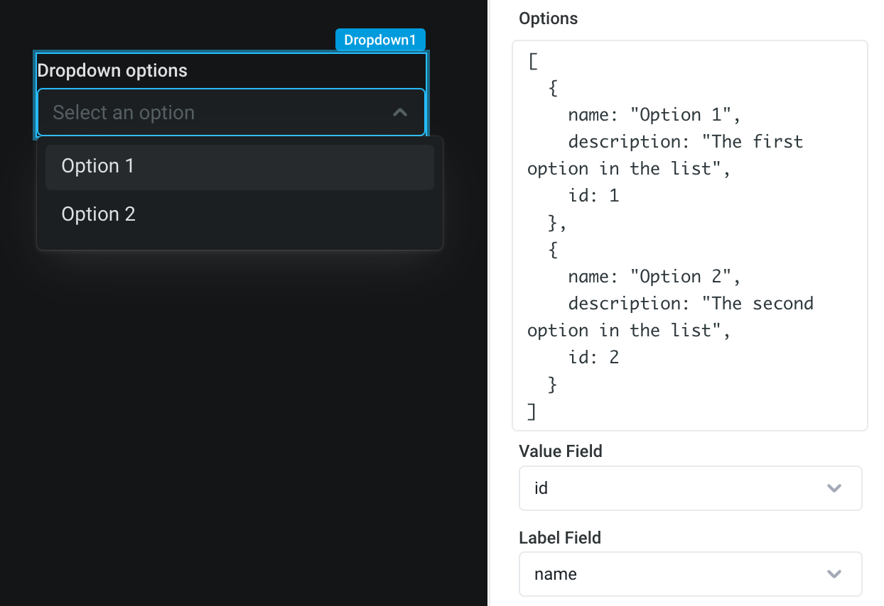
]Pass an arbitrary list of objects. You can then map the
labelandvaluefields to properties in your object in the properties panel. This pattern is useful so you don't need to transform your options objects into a specific format in code. For example:[
{
name: "Option 1",
description: "The first option in the list",
id: 1
},
{
name: "Option 2",
description: "The second option in the list",
id: 2
}
]
If you want to access the entire selected object, rather than some identifier of the selected item, this is also supported. This pattern is useful if you want to use information present in the source object elsewhere in your app.
To do so, you can select
None (entire object)as the Value field"**. This will allow you to reference each key in the object. For example, you can use{{Dropdown1.selectedOptionValue.description}}to access the corresponding description.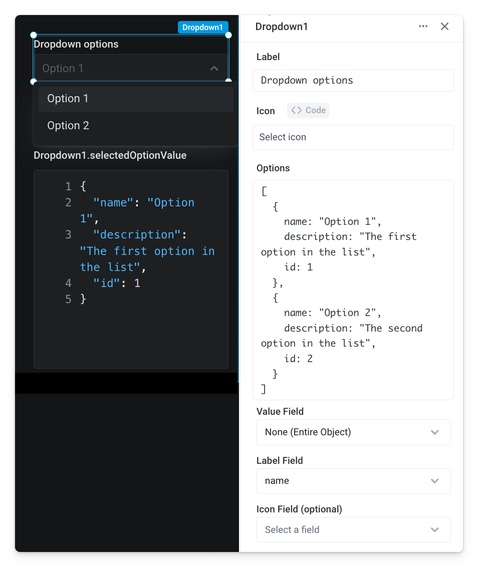
You can pass a list of strings or numbers, like
["option 1", "option 2", "option 3"]. Using this format sets both thelabeland thevalueto the list item.
Making the dropdown multi-select
To allow users to select multiple options, toggle the Enable Multi-select switch in the properties panel.
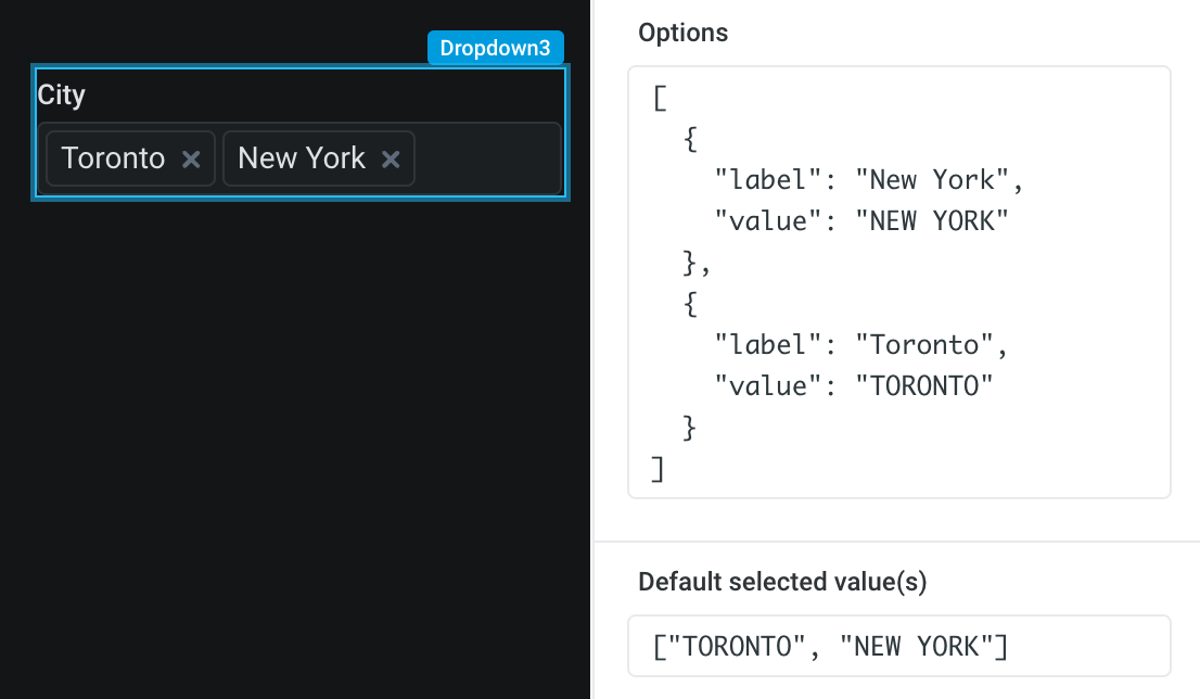
For multi-select dropdowns, the selected options data format is a list of options instead of a single option, since multiple items can be selected. This means:
- You will access the selected options using
{{<DROPDOWN_NAME>.selectedOptionValues}}, and this will return an array - You should pass an array of values for the
Default select option value(s)in the properties panel - for example["TORONTO", "NEW YORK"]. The values in this array should match to values in your dropdown options object.
Customize dropdown label and default text
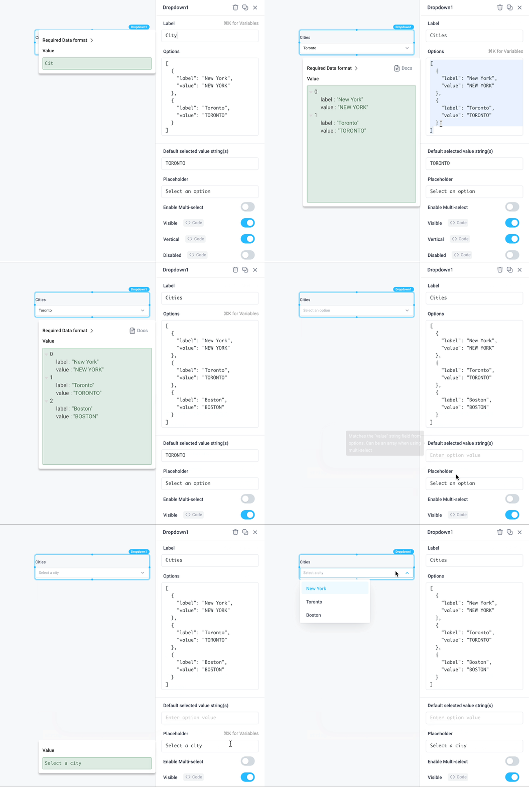
You can edit the dropdown Label. You can also set Placeholder text to show when no option is selected.
Toggle interaction and display settings
If selecting an option in the dropdown is necessary before proceeding to subsequent steps, enforce user input via Required. Additionally, the dropdown can be disabled by either setting user interaction as Disabled or toggling the Visible option to hide the component.
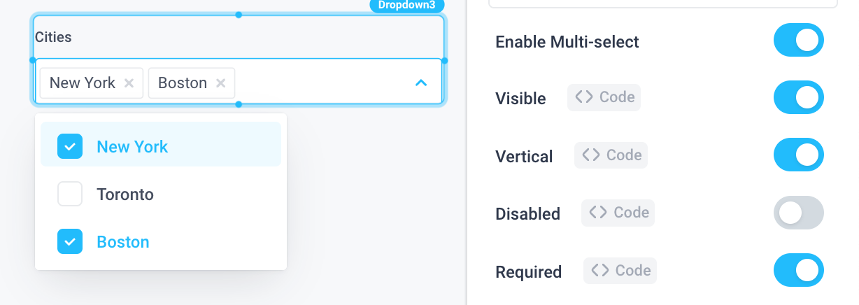
Dynamically set dropdown options from API response
You can set the dropdown options dynamically using a backend API. This API can either retrieve and load all possible options for the user to perform client-side filtering, or it can implement server-side filtering to retrieve and load only options based on the user's search.
Dropdown client-side filtering
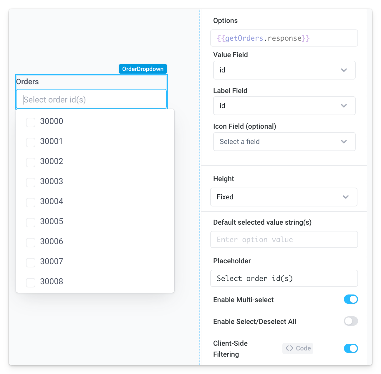
To load all possible options into the dropdown and allow users to filter these options client-side, create an API that fetches all the relevant fields on the backend. Here we've created an API called getOrders that queries the [Demo] Orders Postgres database for all orders:
SELECT * FROM orders

Reference the API response in the dropdown component Options via {{getOrders.response}}. Superblocks automatically configures the Value Field with one of the table columns from the resulting SQL response. Here, the Value and Label fields have been configured to be id. This allows users to select specific order ids from the dropdown and perform additional processing or investigation on them. Note, the Client-Side Filtering setting is enabled by default.
Dropdown server-side filtering
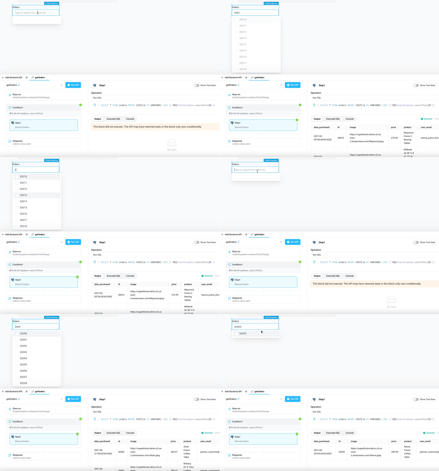
Alternatively, configure the dropdown and API so only values that include the user's search term are retrieved on the backend and loaded into the dropdown options (server-side typeahead).
Add dropdown Placeholder text to instruct the user to type for options (optional)
Disable the dropdown's Client-Side Filtering setting
Set the dropdown's onSearchTextChange event handler to run the
getOrdersAPI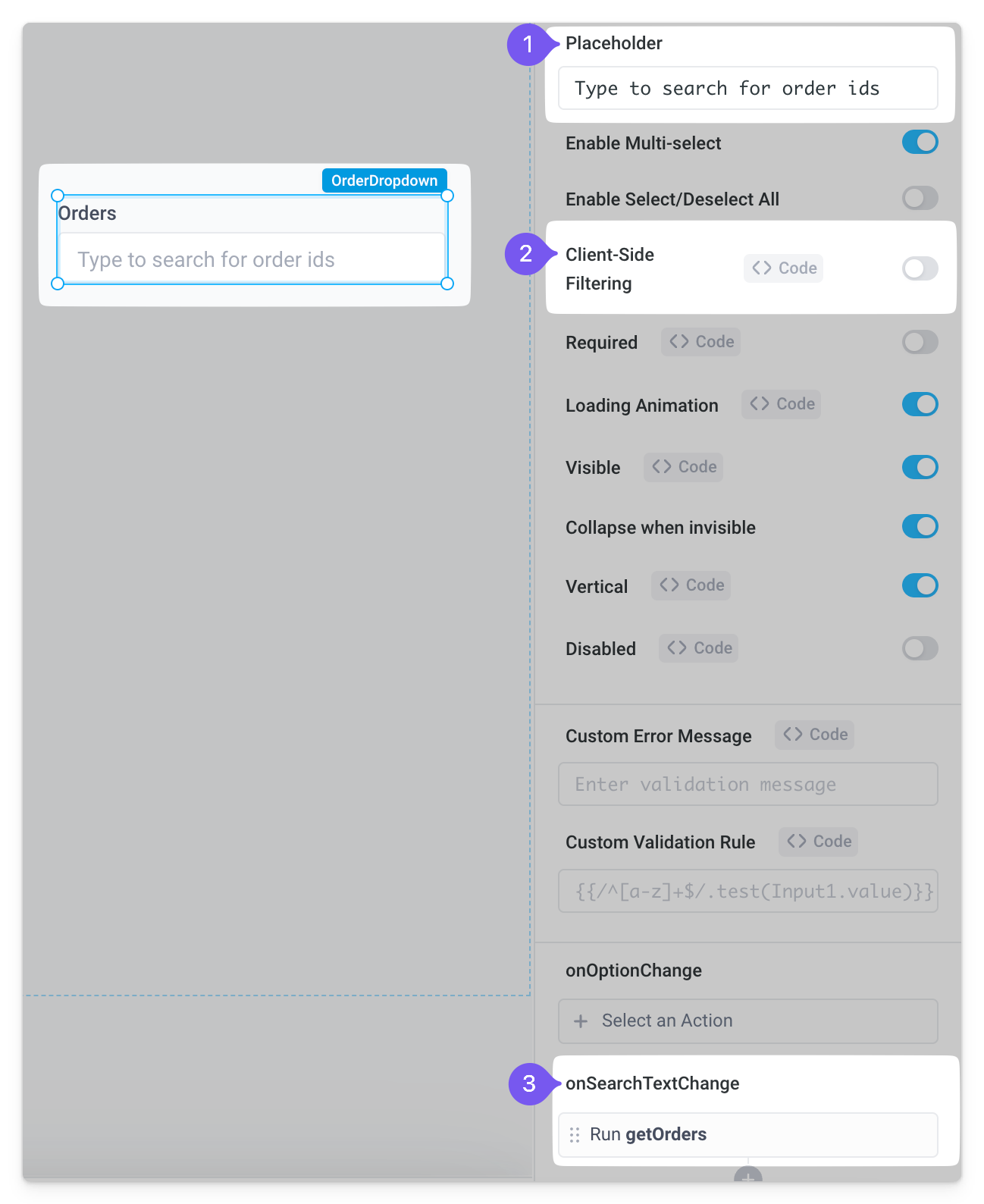
In the
getOrdersAPI, set Run on page load to "Never"Put the SQL step inside a Condition block where the If condition is set to
<DROPDOWN_NAME>.searchTextLastly, update the SQL query so it filters on the data typed into the dropdown. Here we're using the
LIKEoperator with the%wildcard character, to match any sequence of characters containing the dropdown's search text. Because we're searching on a column that is an integer type in the database, we've also cast this to a varchar before doing the pattern comparison:SELECT * FROM orders WHERE CAST(id AS VARCHAR) LIKE {{`%${<DROPDOWN_NAME>.searchText}%`}}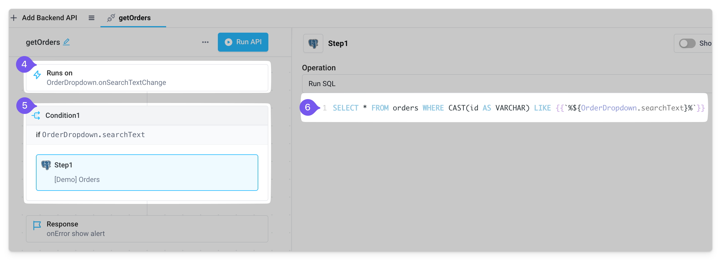
The end result is a dropdown that loads only the options the user searches.
Trigger an API on select
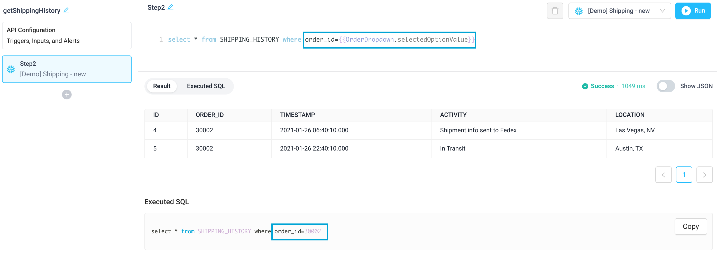
Using the previous example, the user can next filter a table of order statuses based on the selected order id. To do so, first create an API that gets the Shipping History for an order from Snowflake. Reference the selected order id with {{<DROPDOWN_NAME>.selectedOptionValue}}.
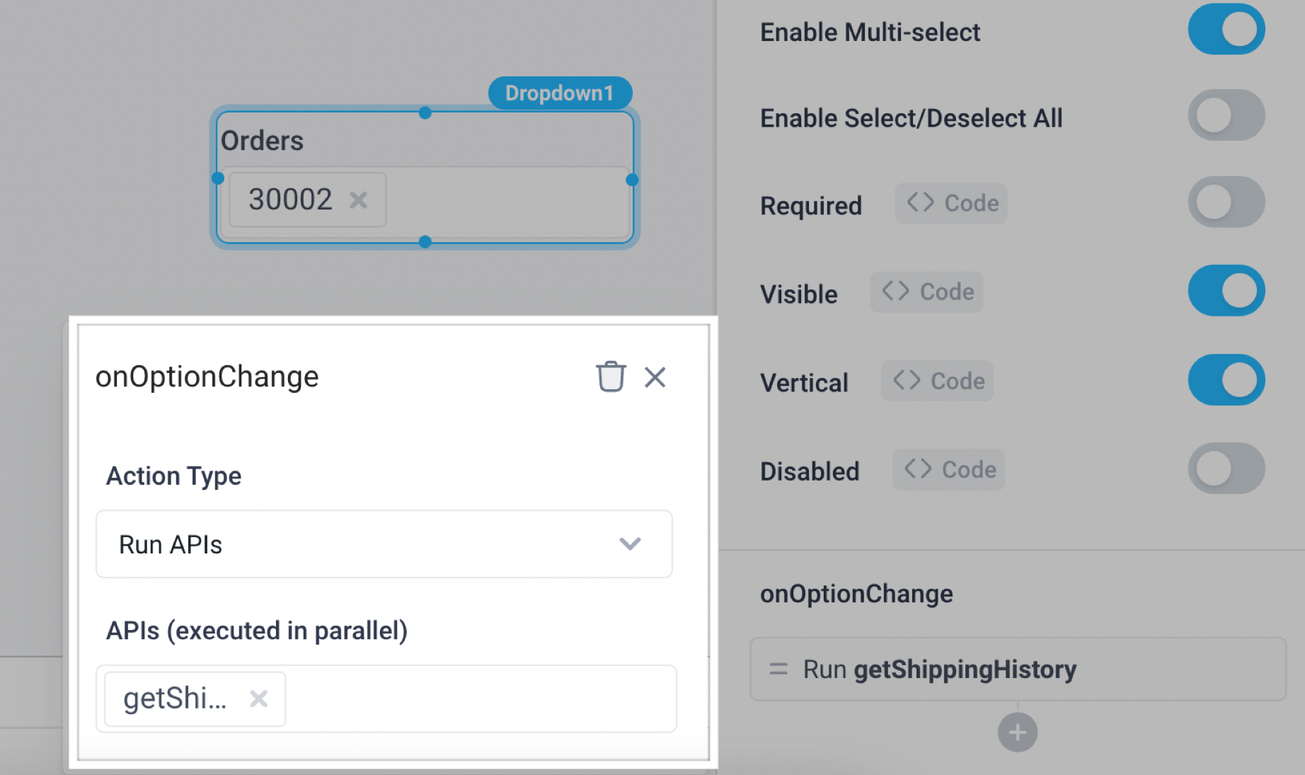
To ensure this API is called when the dropdown option is selected, configure the dropdown's onOptionChange trigger.
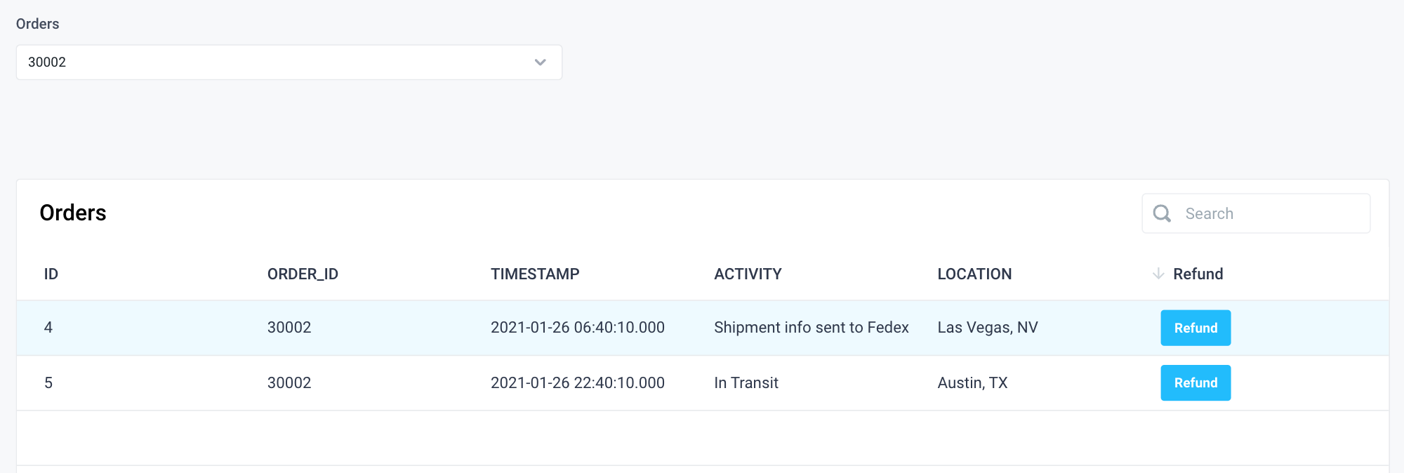
Add a Table component below the dropdown and configure the Table Data to bind to {{getShippingHistory.response}}. The table will now update to reflect the order id selected in the dropdown.
Use Python to convert lists to an array of JSON objects
In order to convert a list of labels and values to an array of objects to be used within the Dropdown component, a list comprehension can be used in Python to do this. For example, take the following list of labels and values:
my_labels = ["New York", "Toronto"]
my_values = ["NEW YORK", "TORONTO"]
The following code can be used in a Python step in order to generate an array of JSON objects seen below:
return [{"label": i, "value": j} for i,j in zip(my_labels, my_values)]
[
  {
    "label": "New York",
    "value": "NEW YORK"
  },
  {
    "label": "Toronto",
    "value": "TORONTO"
  }
]
Dropdown Properties
Component Properties
| Property | Description |
|---|---|
| Label | Set the text label for the dropdown |
| Icon | Select an icon to be displayed in the dropdown input. If the selected option has its own icon, it will override this icon. |
| Options | Enter an array of strings or an array of objects where each object has a property that will map to the option label, value and optionally icon. The label and icon will be presented to the user and the value will be returned as the {{dropdown.selectedOptionValue}} |
| Default selected value(s) | Choose the default value(s). If the dropdown is a single-option select, provide a single value. If it is a multi-option select, provide an array of values |
| Placeholder | Text to inform the user of action like "Select a city" |
| Enable Multi-select | Allows the user to select multiple options from the dropdown. The selected options can be accessed using {{dropdown.selectedOptionValues}} |
| Enable Clearing | When enabled, allows the user to clear selected options with an x button, values are a boolean |
| Required | Makes selecting an option mandatory, values are a boolean |
| Loading Animation | Controls the loading state of the component, values are a boolean |
| Visible | Set true to show and false to hide. Set dynamically using JavaScript with {{}} |
| Vertical | Toggles the location of the label, values are a boolean |
| Disabled | Disables user interaction with this component, values are a boolean |
Settable Properties
| Property Via Form / Via RunJS | Type | Example Value |
|---|---|---|
Selected Option / selectedOptionValue | One of:string, number, Array<string>, Array<number> | "TORONTO" , ["TORONTO", "NEW YORK"] |
Reference Properties
Properties can be accessed from other frontend components and backend APIs by adding the name of the Dropdown, and dot referencing the property. For a Dropdown named Dropdown1:
| Property | Description |
|---|---|
Dropdown1.selectedOptionValue | Returns the selected value of the dropdown |
Dropdown1.selectedOptionValues | Returns an array of the selected values of the dropdown |
Dropdown1.searchText | Returns the string value in the search input in the dropdown (often used for server-side typeahead filtering of options) |
Dropdown1.options | Returns an array of the options of the dropdown |
Dropdown1.isVisible | Returns the boolean value of the component's visibility (True, if it is visible) |
Dropdown1.isDisabled | Returns the boolean value of the component's disabled state (True, if it is disabled) |
info
In order to reference other values from the underlying data structure of a dropdown, please see the example in option 2.
Events
The following events are triggered by user interactions with Dropdown components. Use event handlers to trigger actions in response to user events.
| Property | Description |
|---|---|
| onOptionChange | Trigger an action when the selected option is changed |
| onSearchTextChange | Triggers an action when a user types in the search box (often used for server-side typeahead filtering of options) |
| onClear | Trigger an action when the dropdown is cleared |